Title Design, On Air Design, Documentary Graphics, Shorts, Trailer
Motion design opens a world, compresses a story, builds a trailer argument, invents a campaign, handles documentary evidence, gives a format its visual narrative, or turns a short film into a complete authored sequence. This section proves narrative judgment, timing, genre control, editorial creativity, and the ability to translate content into moving-image language.
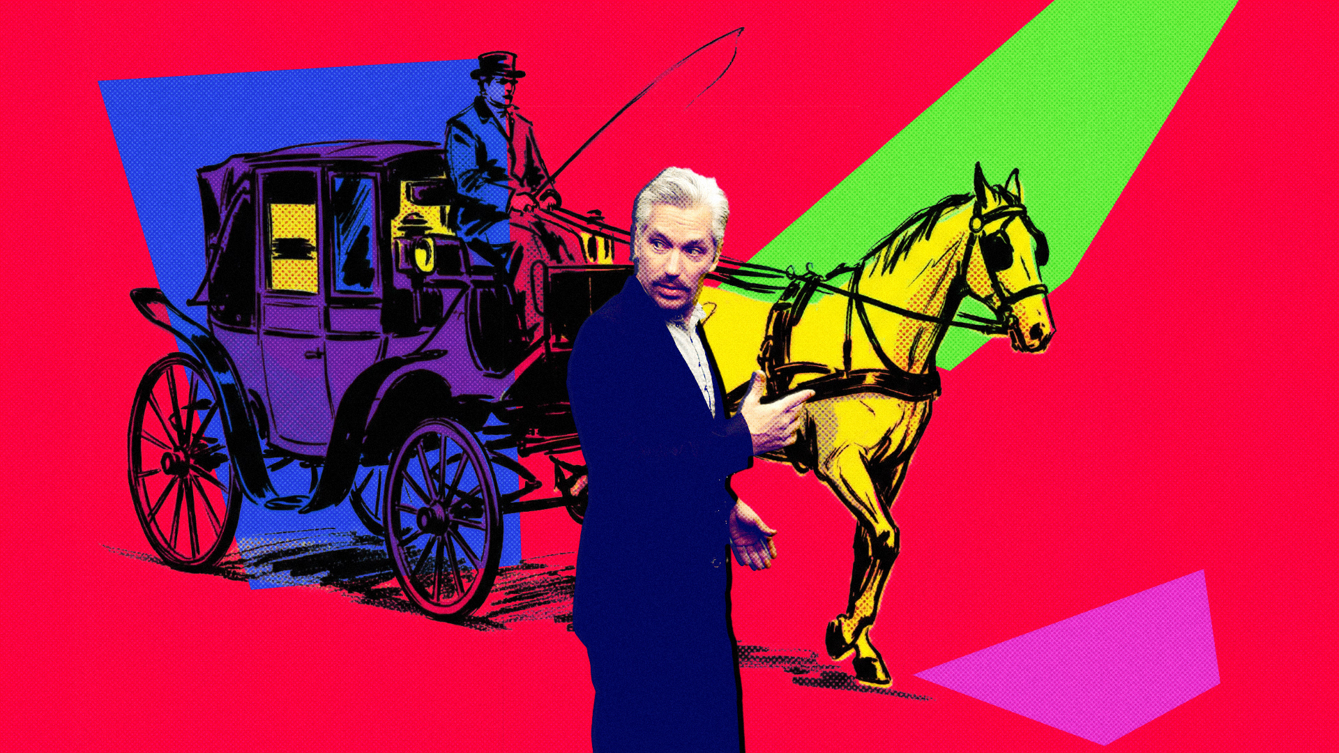
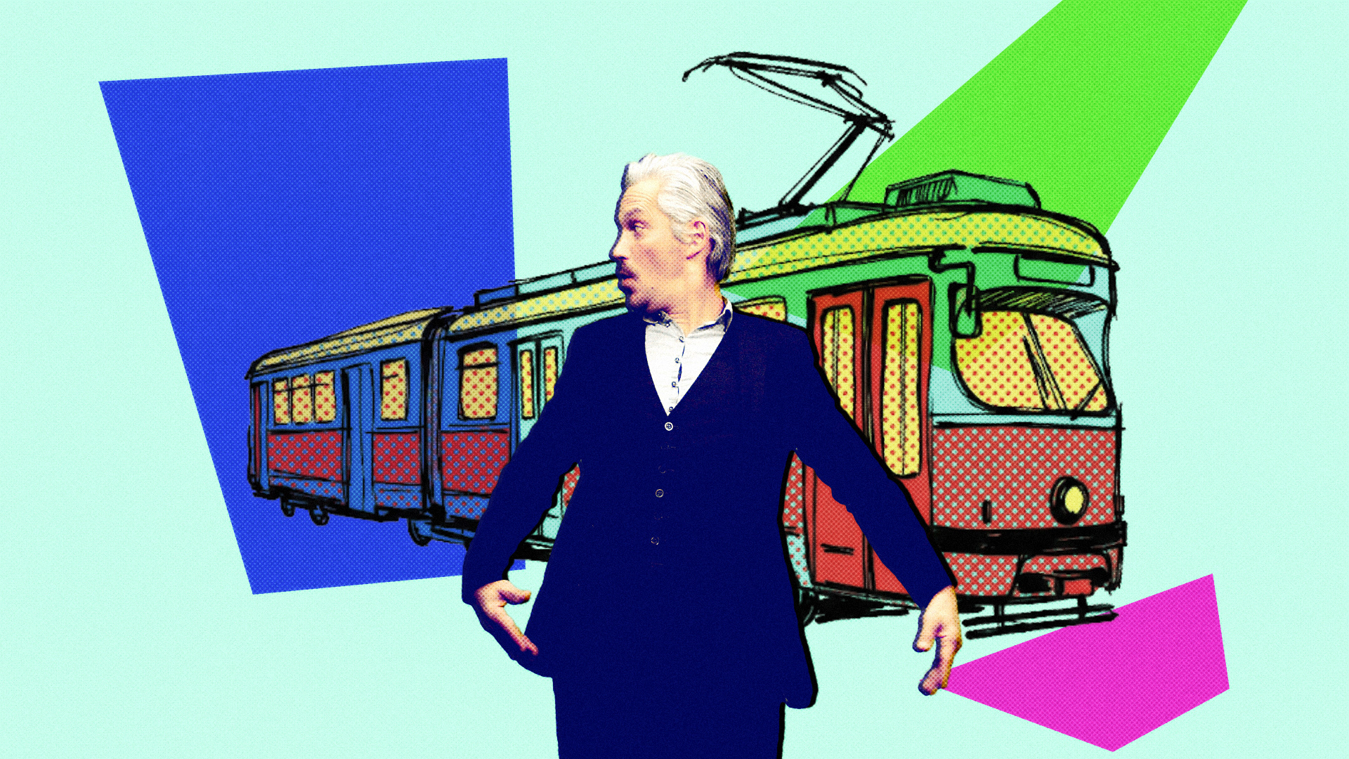
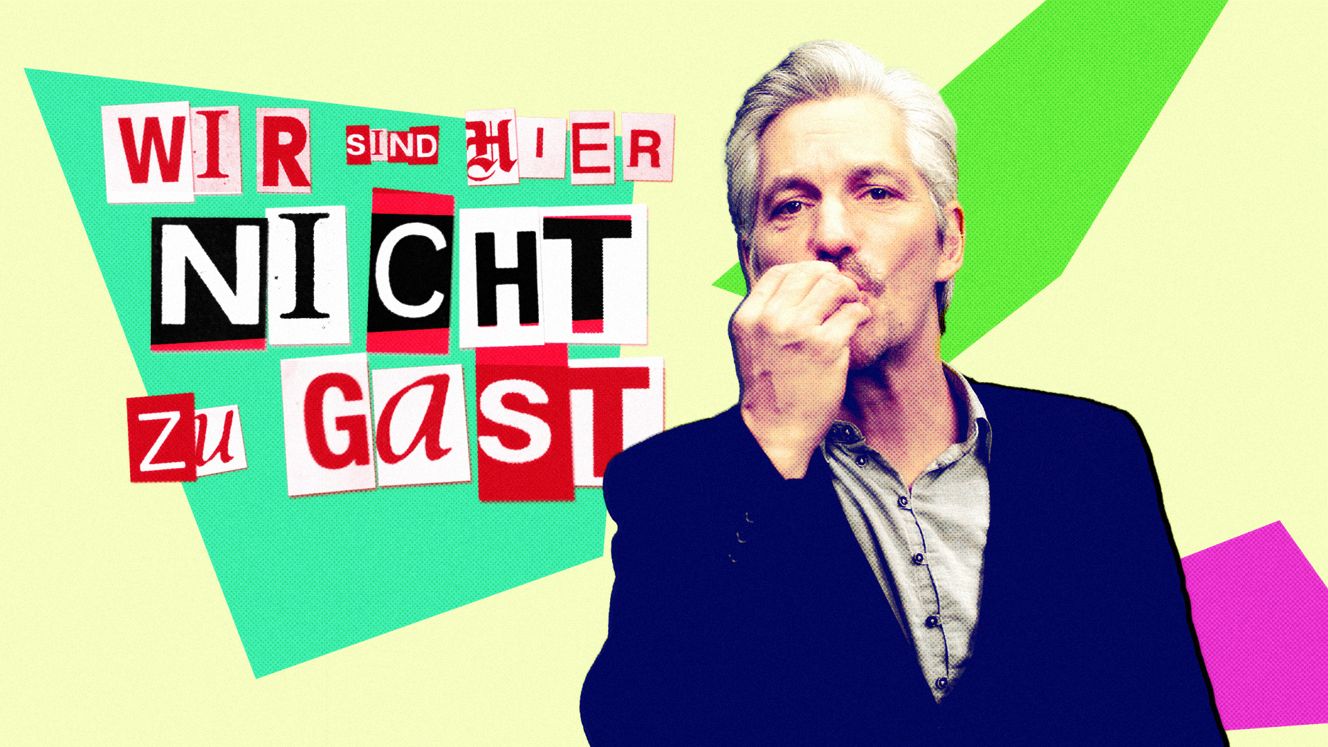
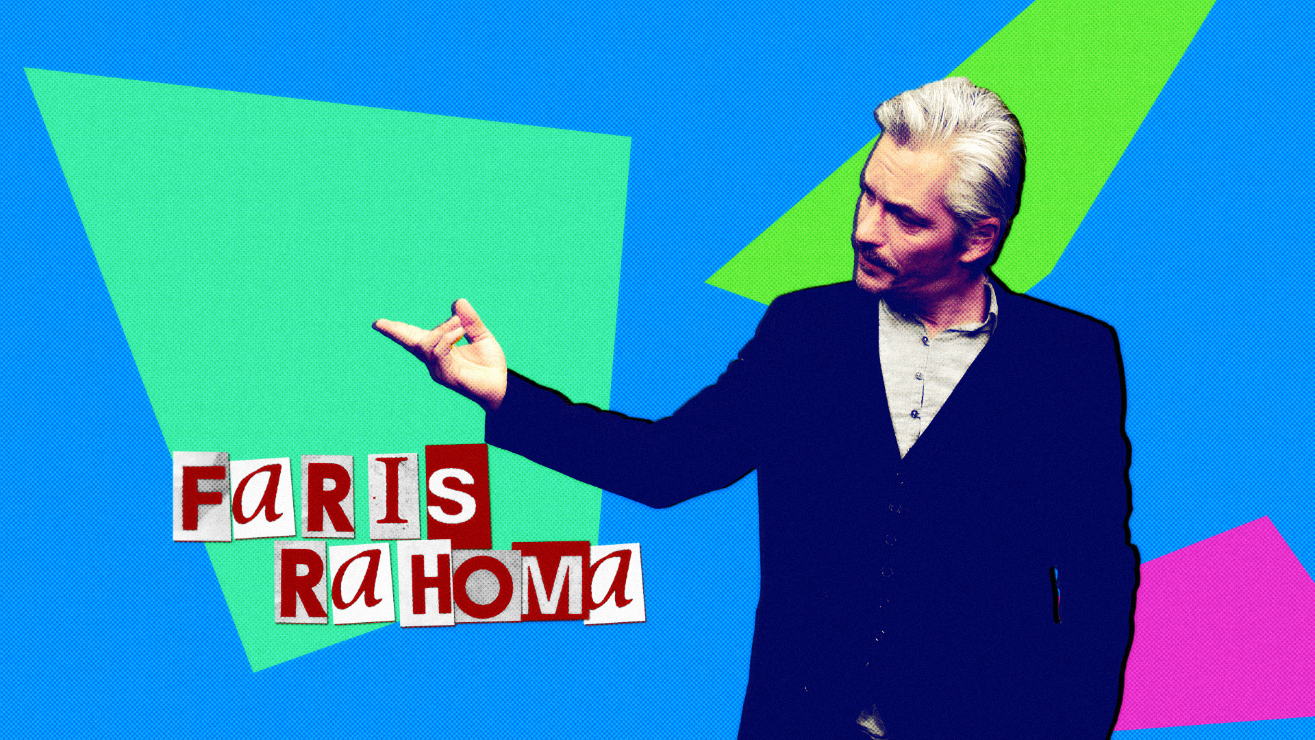
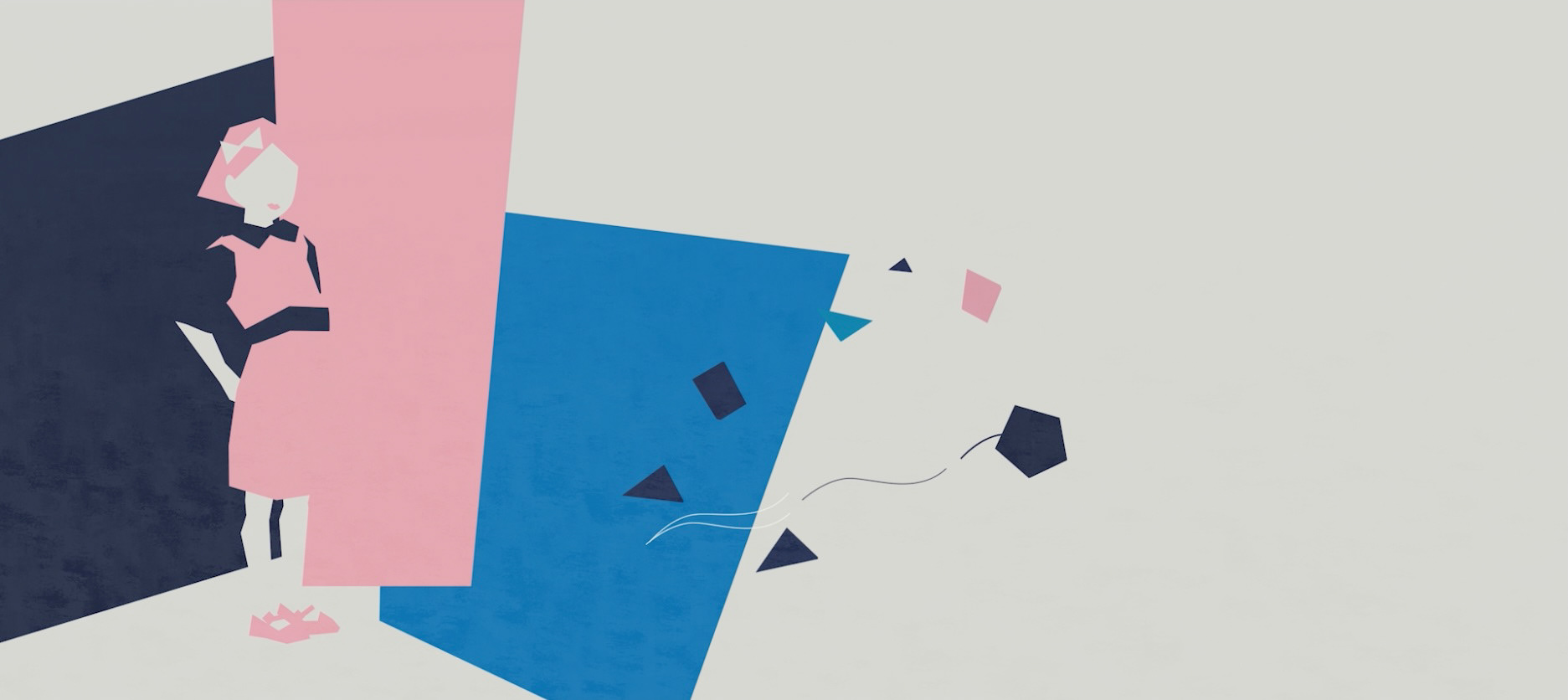
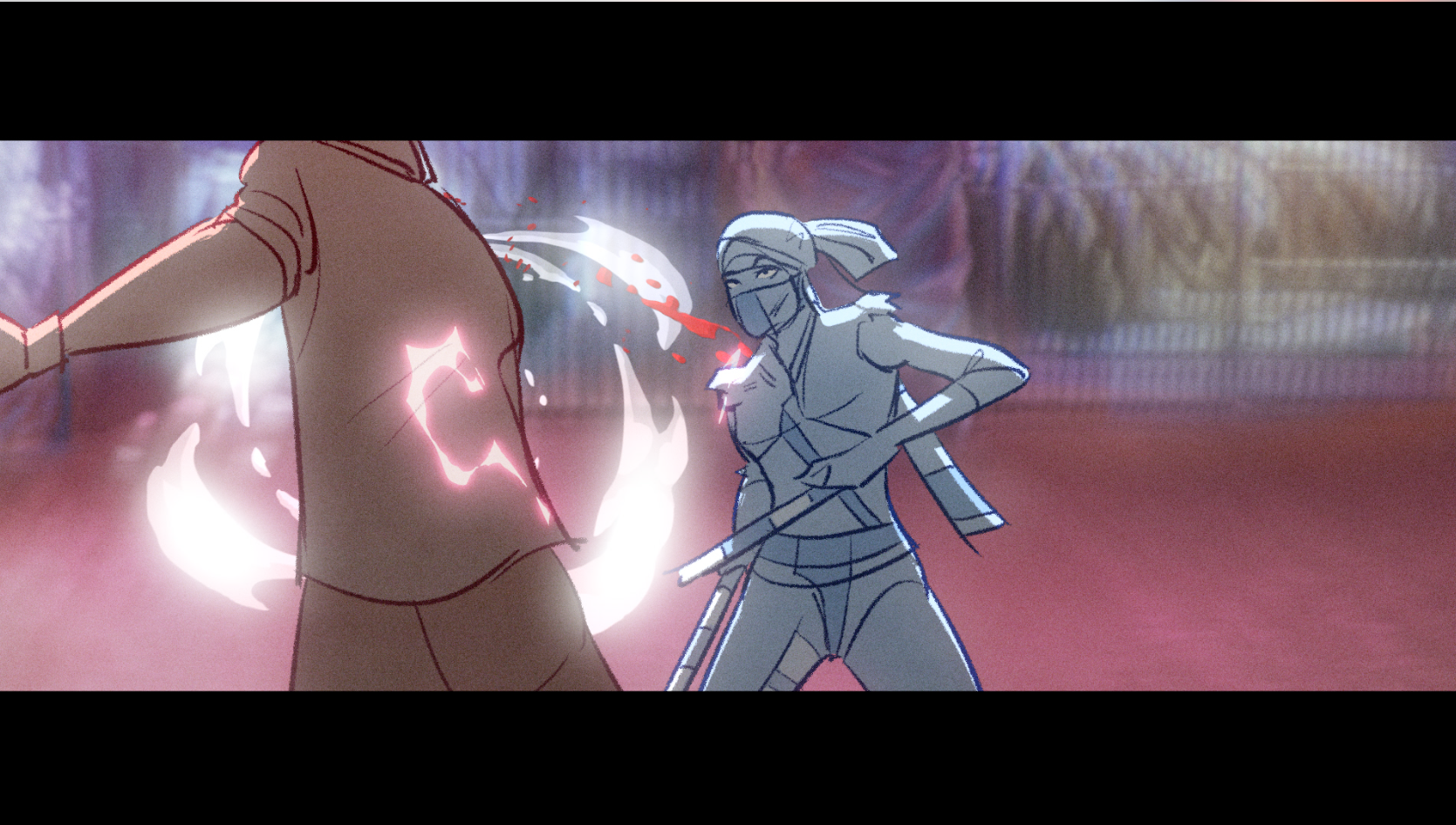
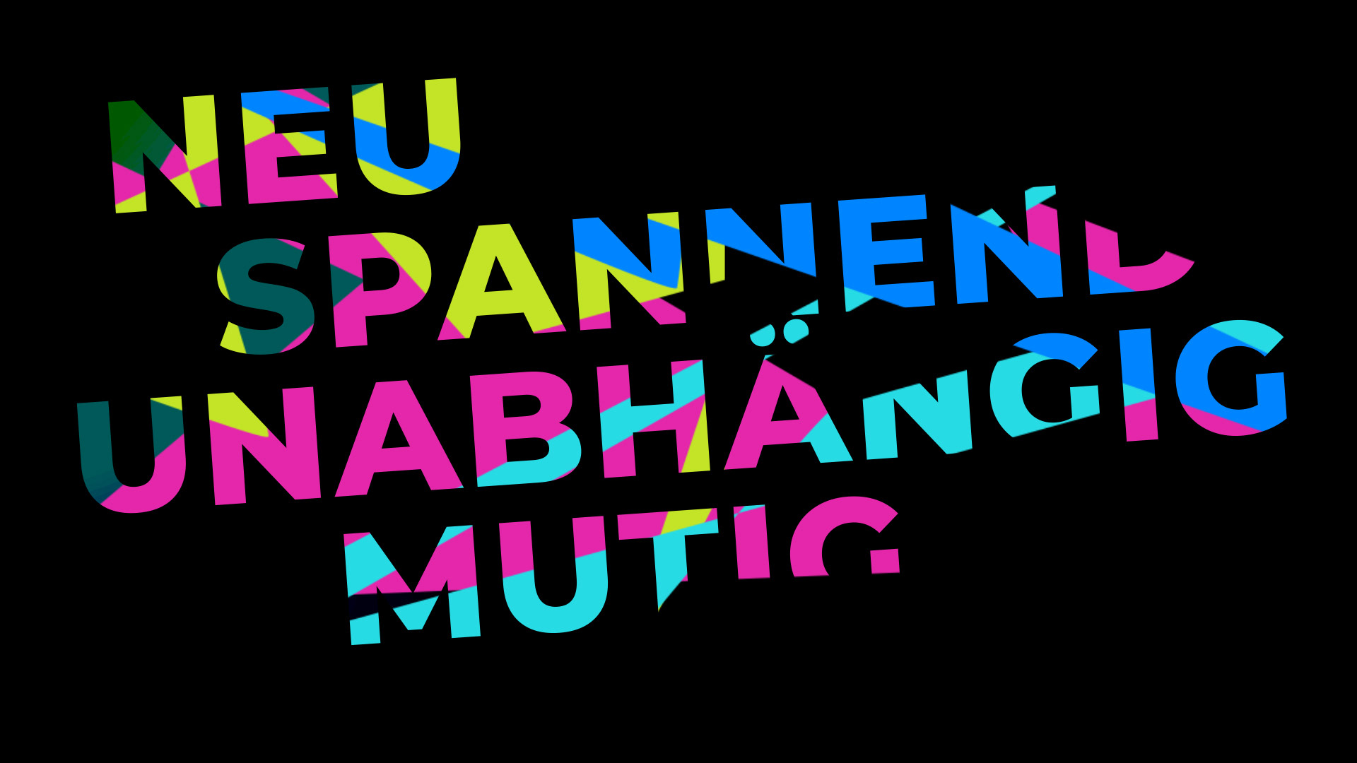
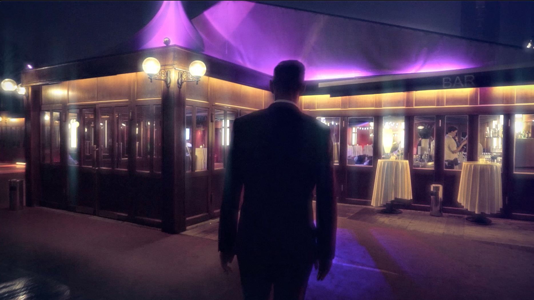
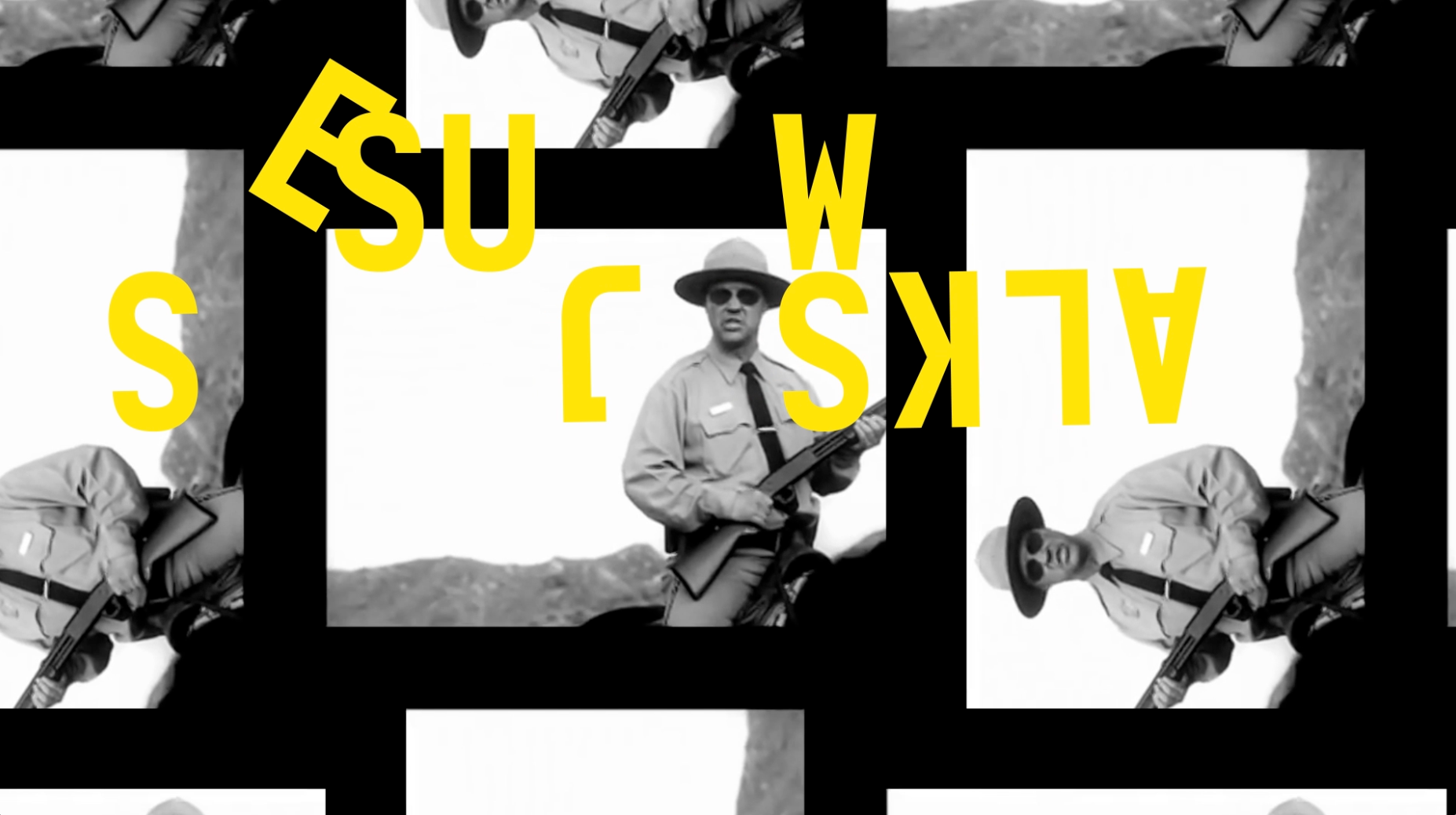
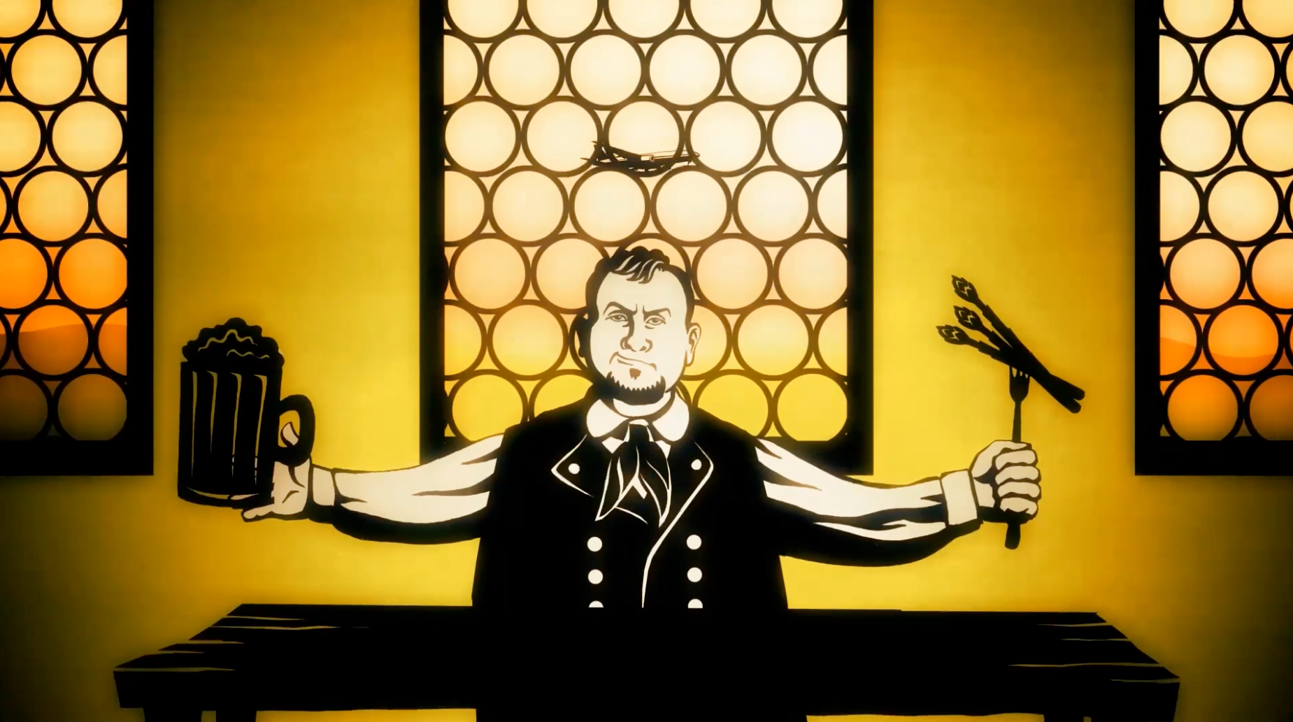
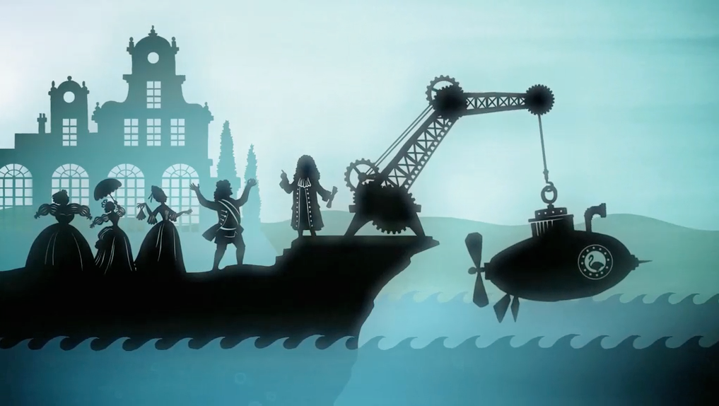
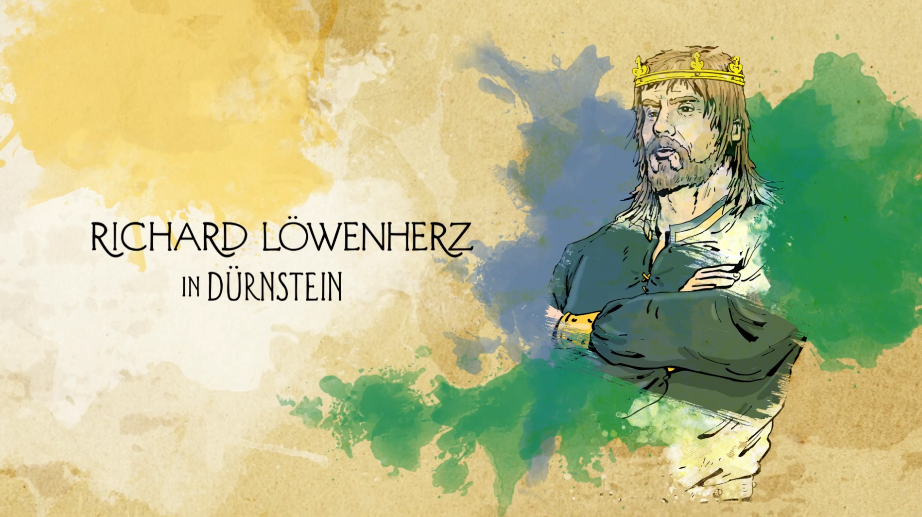
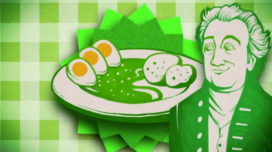
WIR SIND HIER NICHT ZU GAST
Title Design, Directing, 2026
Talk Show, OnAir Films, Neuzeit Film, Heikel Ben Bouzid, Martin Mayer
Starring Faris Rahoma, Esra, Stefan Lenglinger, Cherrelle Olukemi, Yasmo
Task: Create a title sequence for a format about immigrants as part of Austrian culture, joining it, changing it, and adding to it.
Method: Culture-to-title translation through live-action staging, bright color fields, Austrian landmarks, transport icons, collage logic, cutout typography, and direct performer interaction with the visual world. Austria appears as an open, colorful construction made from places, symbols, languages, movement, and people.
Result: A title sequence that frames migration as cultural participation rather than outsider status. The design turns Austria into a vivid shared stage where inherited symbols and new voices meet, move, and become part of the same visual language.
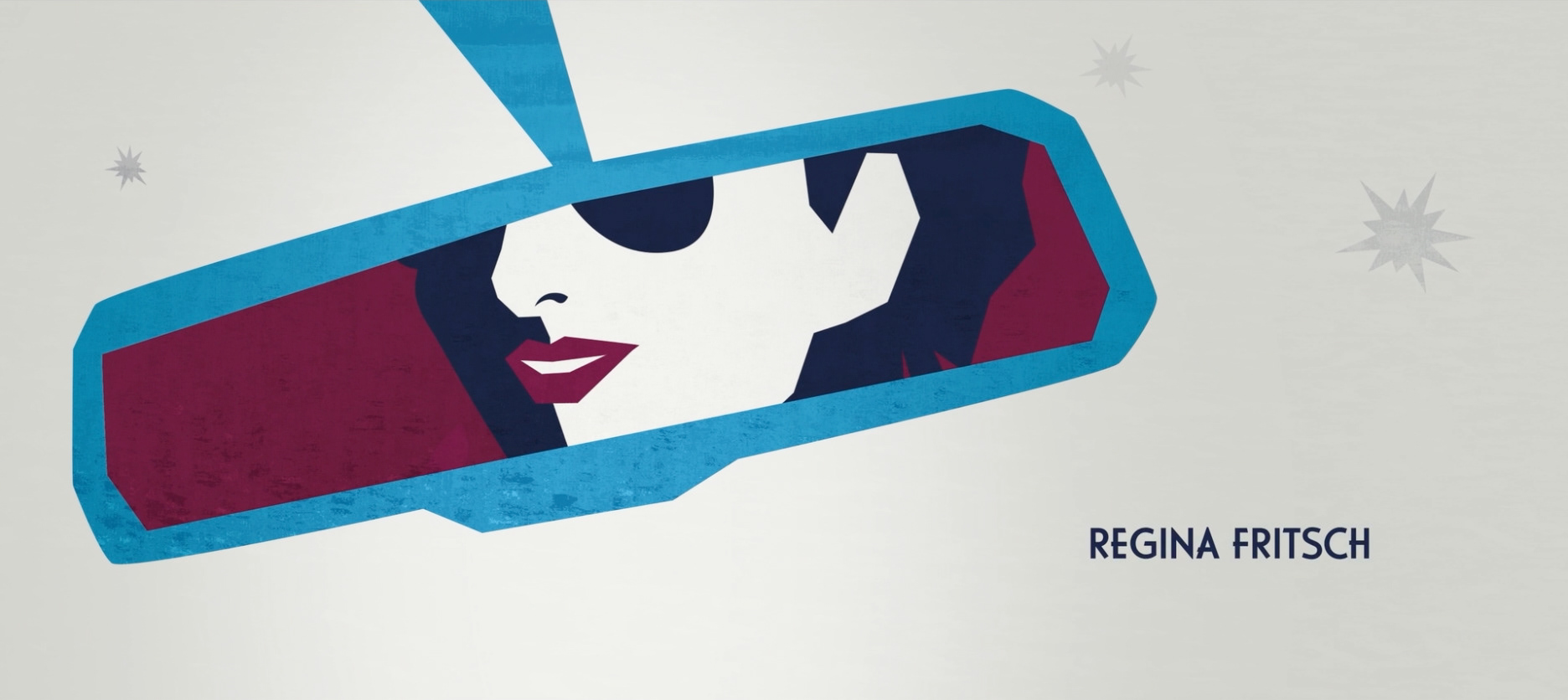
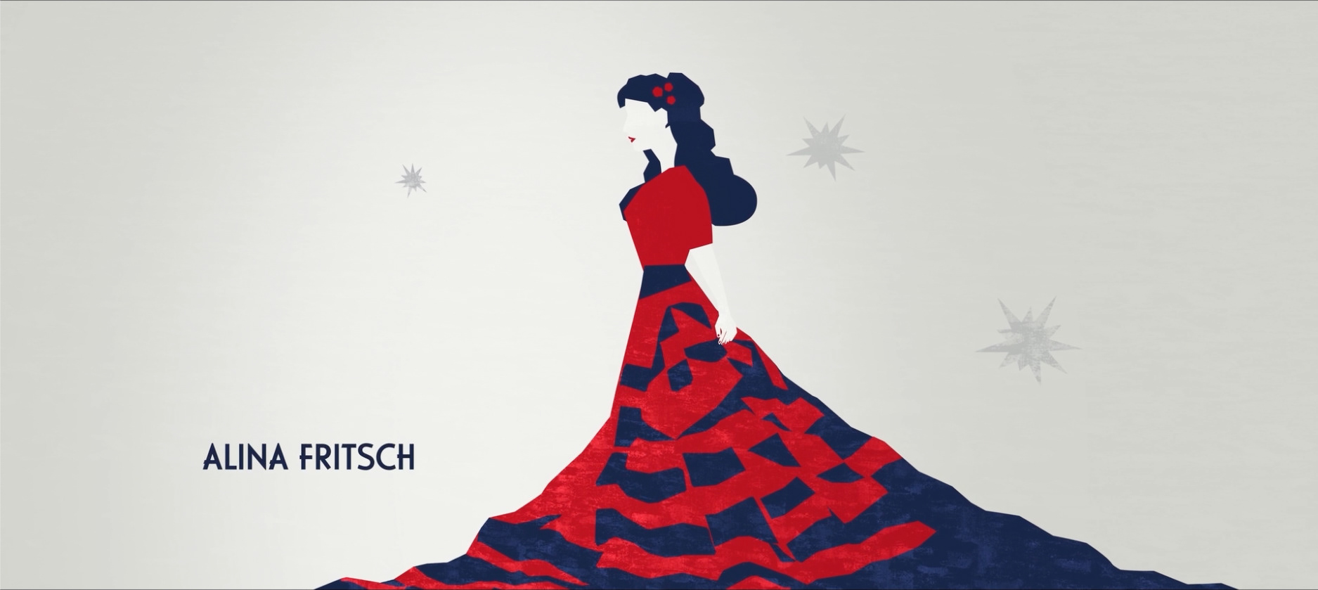
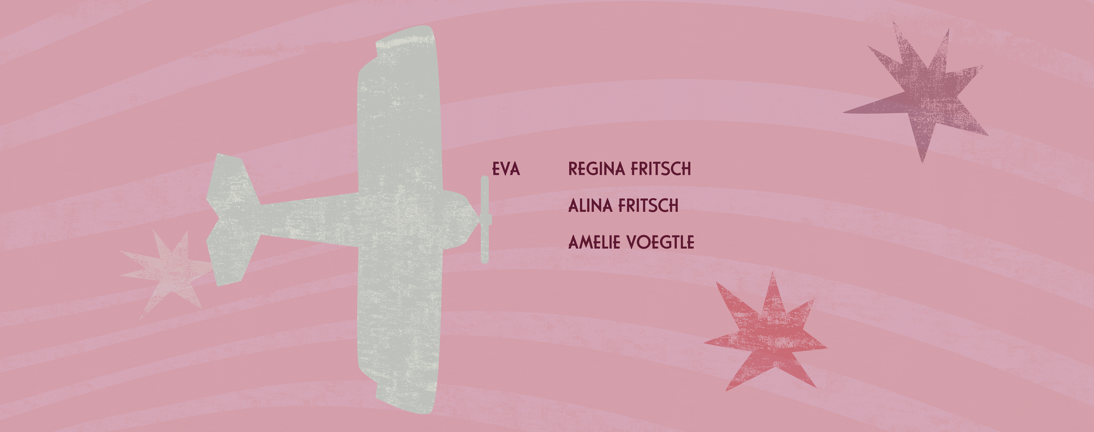
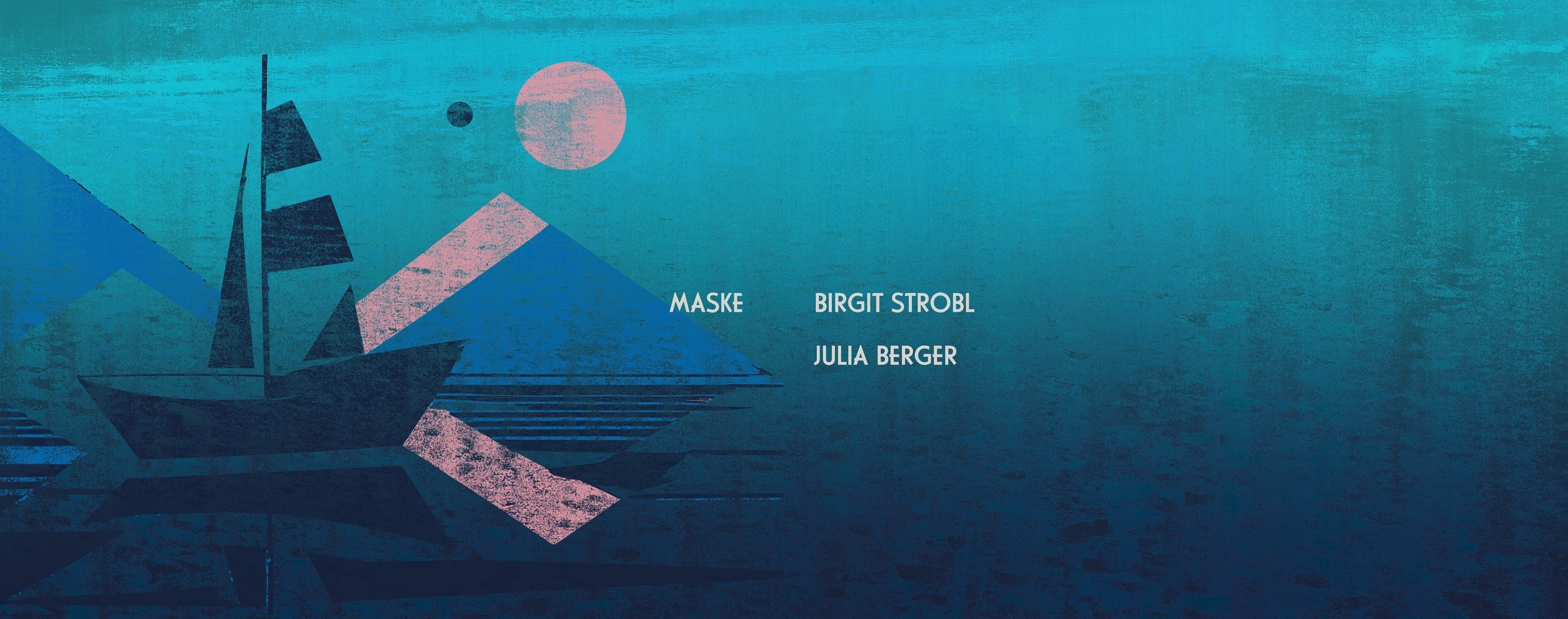
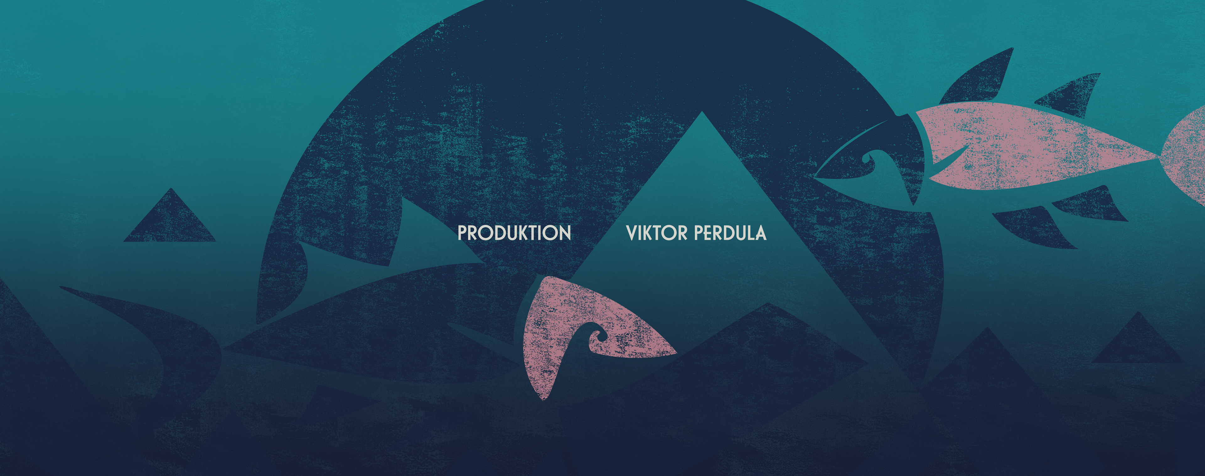
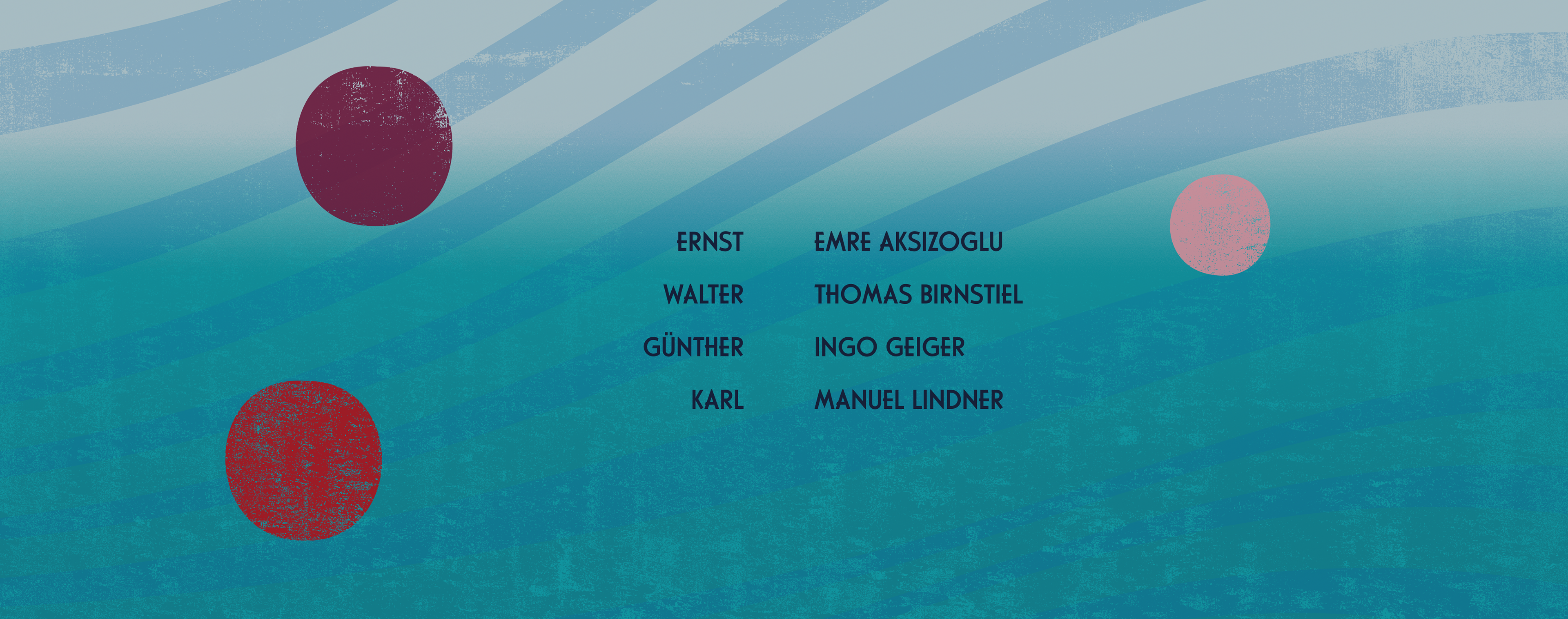
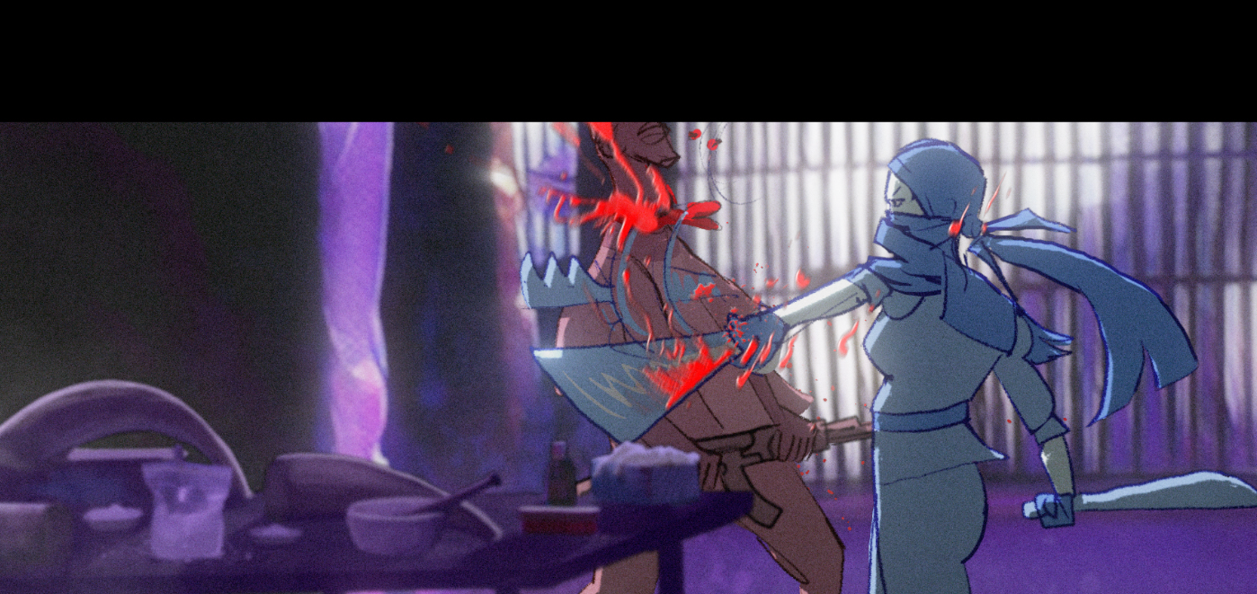
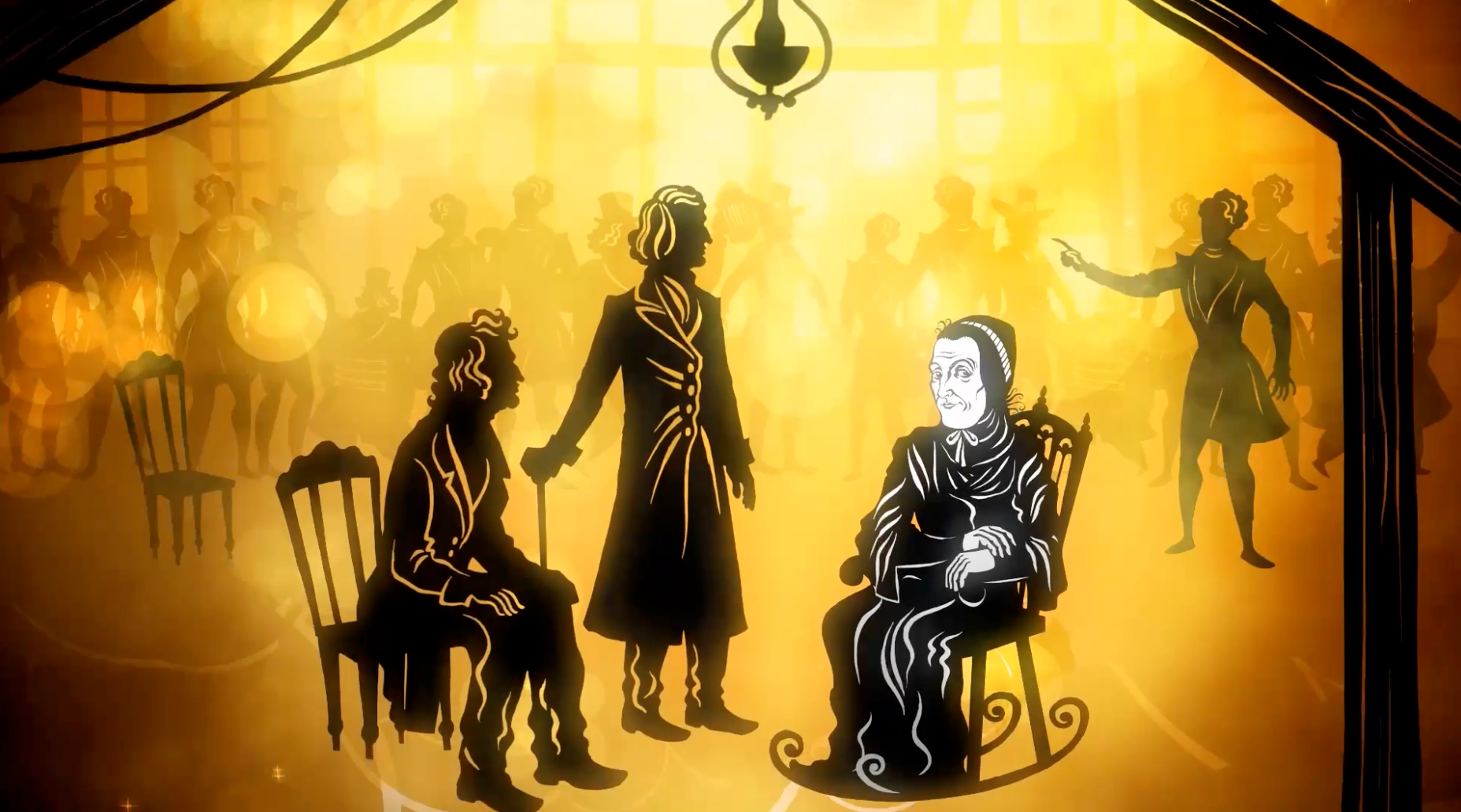
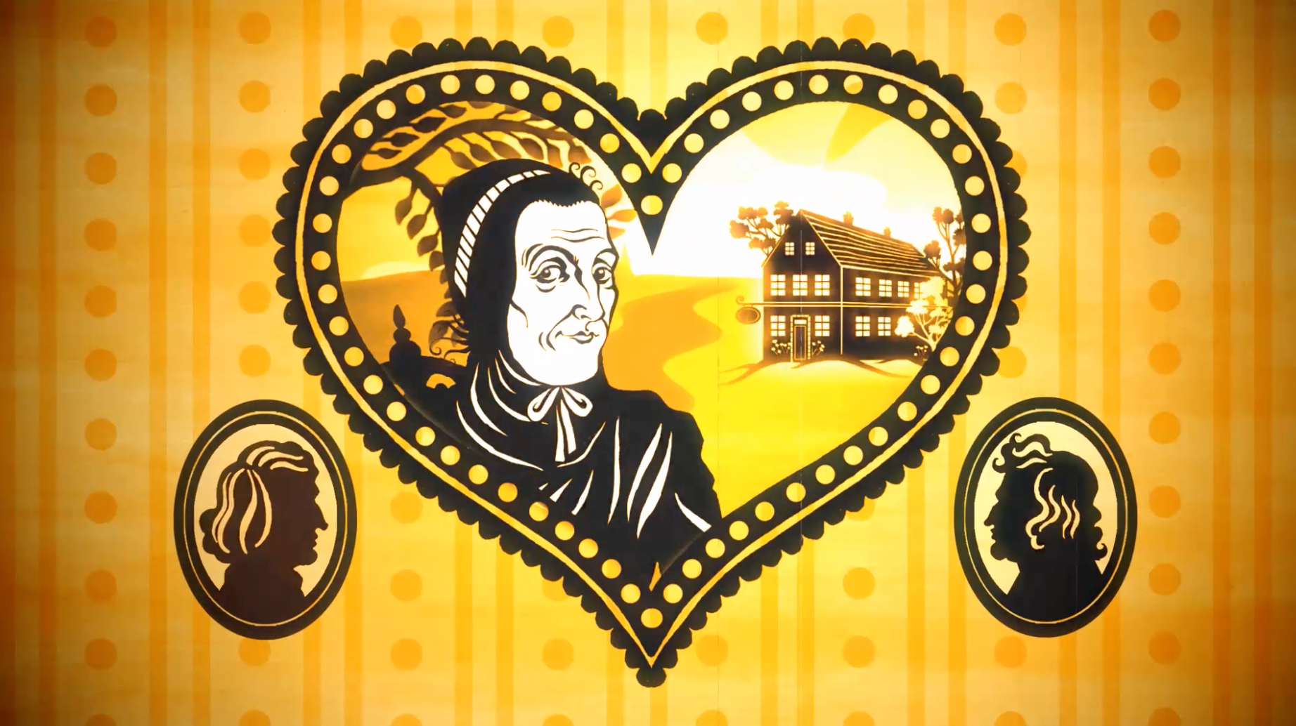
BLAUE WUNDER - A THOUSAND QUESTIONS AND A MIRACLE
Title Design, End Credits, Animated Scenes, Illustrations, 2025
Short Film, Esther Wenger, Jewellabs Pictures, Helene Sorger, Viktor Perdula
Starring Regina Fritsch, Alina Fritsch, Emre Aksizoglu, Thomas Birnstiel
Task: Express female aging, visibility, and social disappearance without literal exposition.
Method: Social theme-to-symbol translation through cutout imagery, metaphor, and sequence. A unique, beautiful illustrated world alongside the live action footage for animated scenes that support and extend the story unusually.
Result: Animated visual scenes in which the illustration conveyed the emotional and social logic of becoming unseen. Winning multiple awards and international recognition
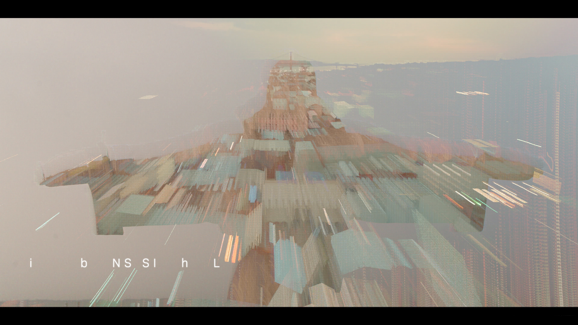
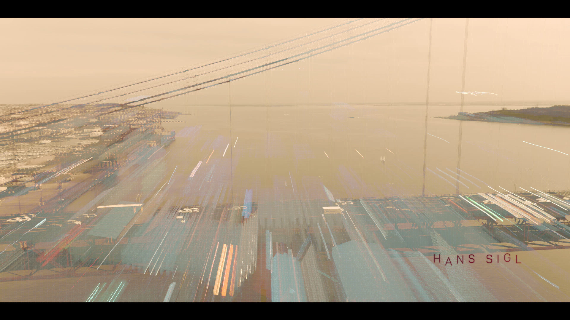
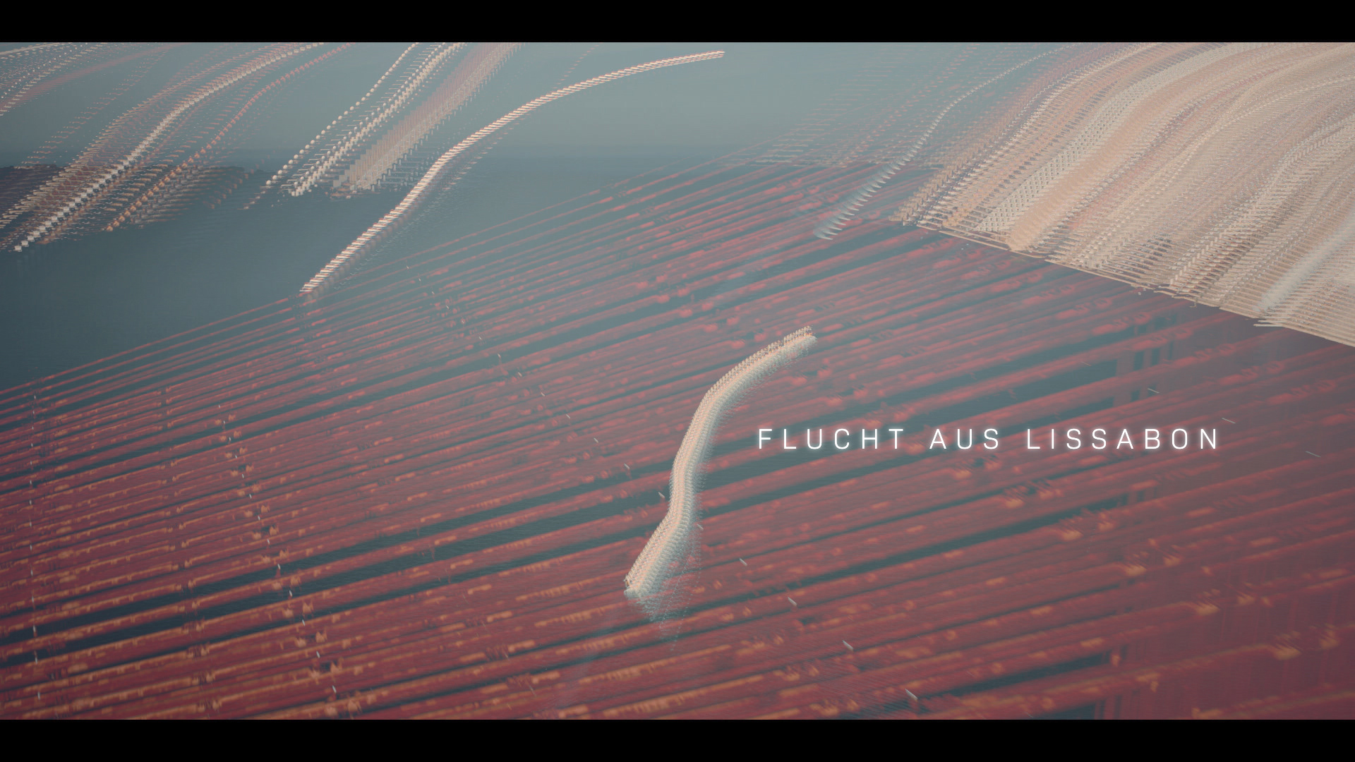
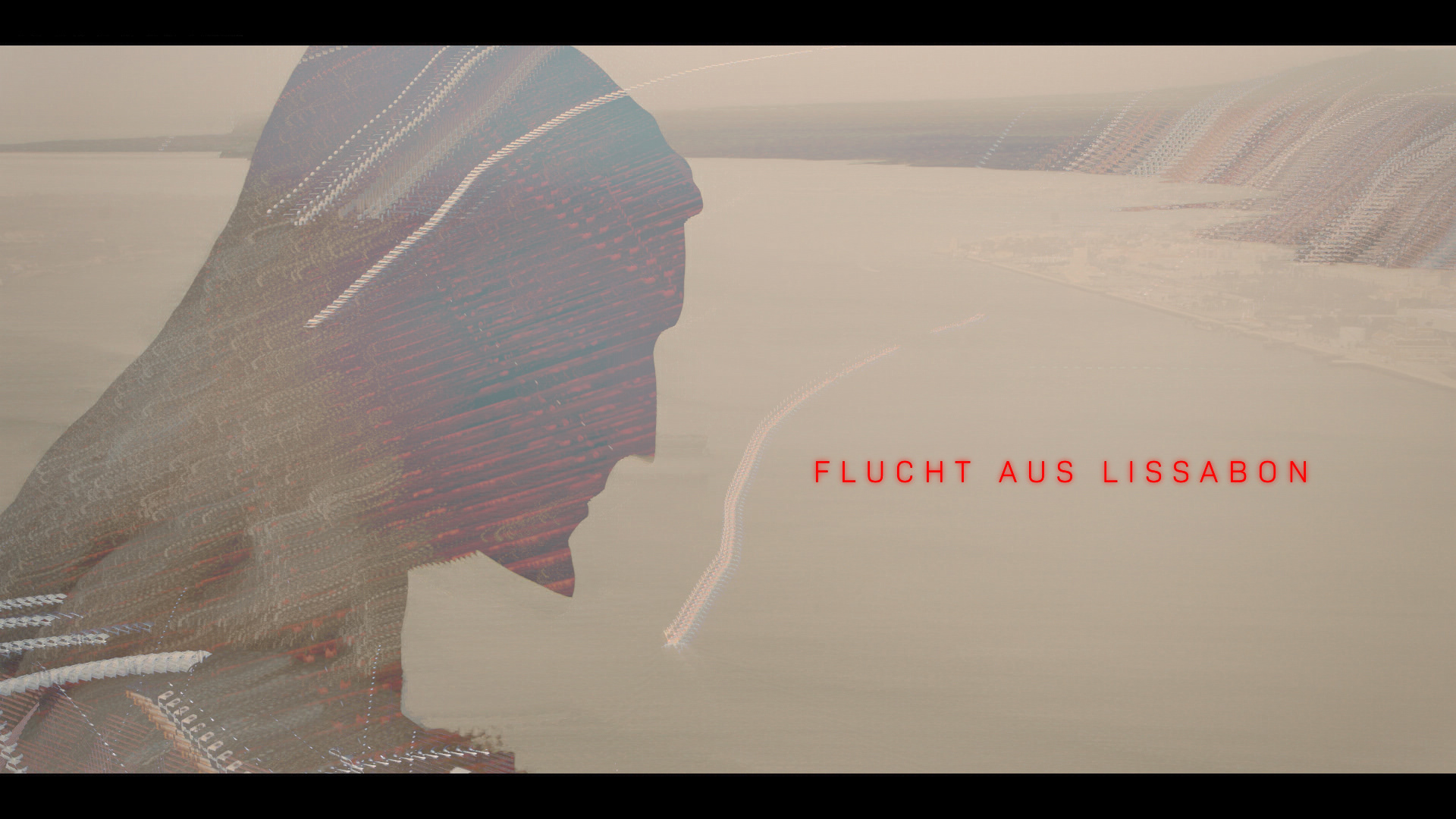
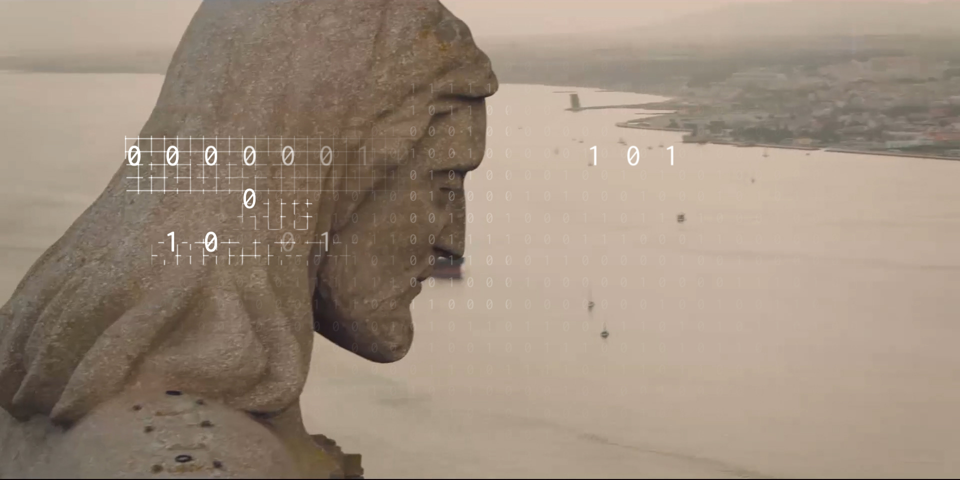
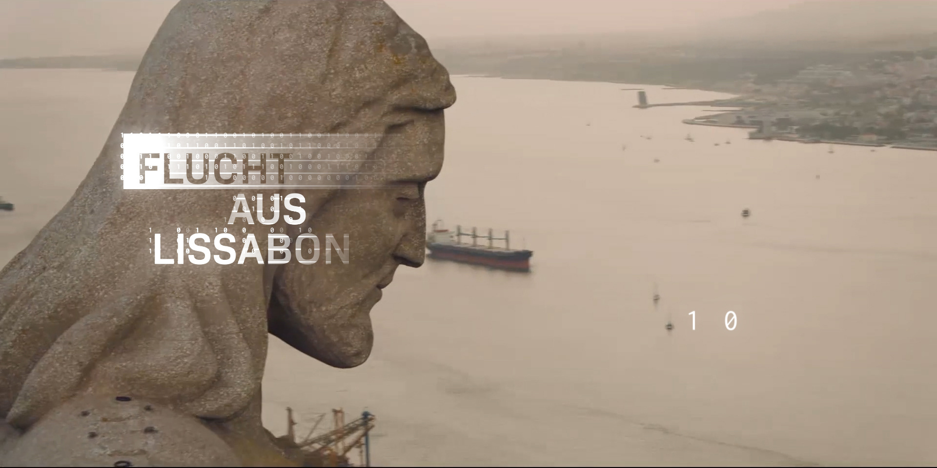
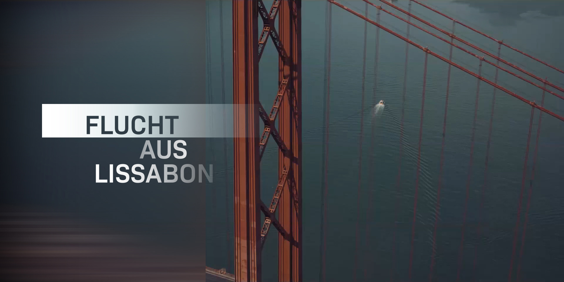
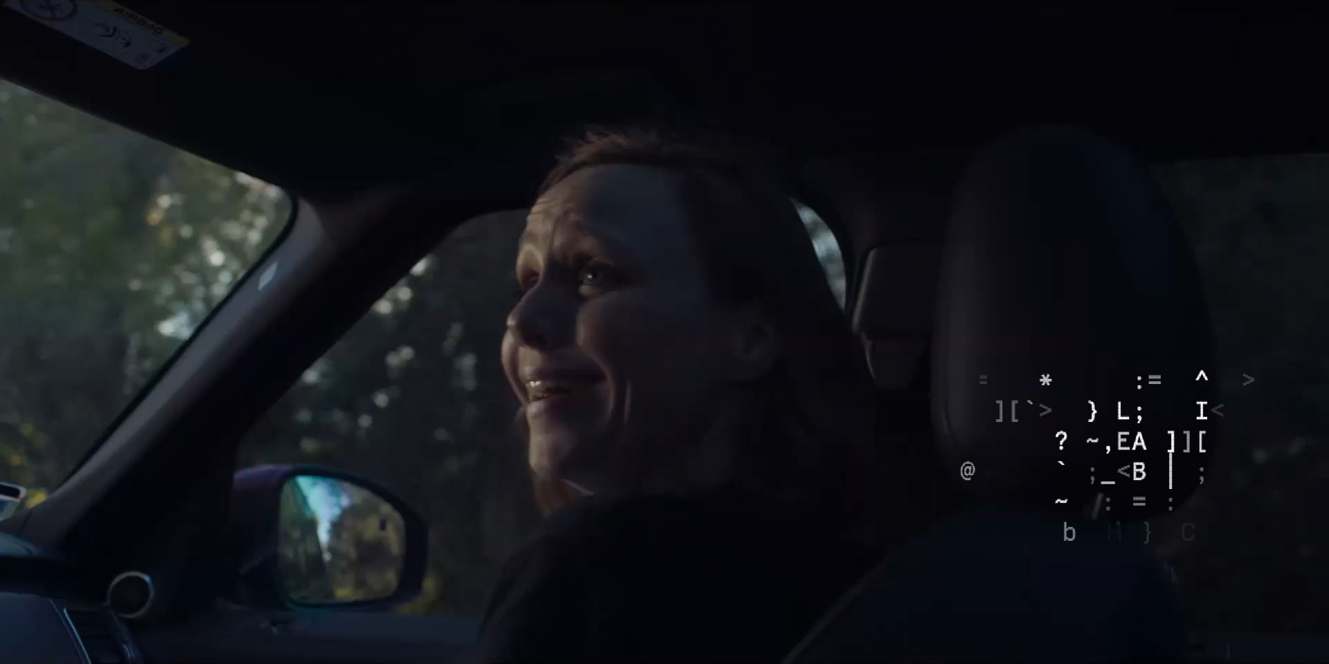
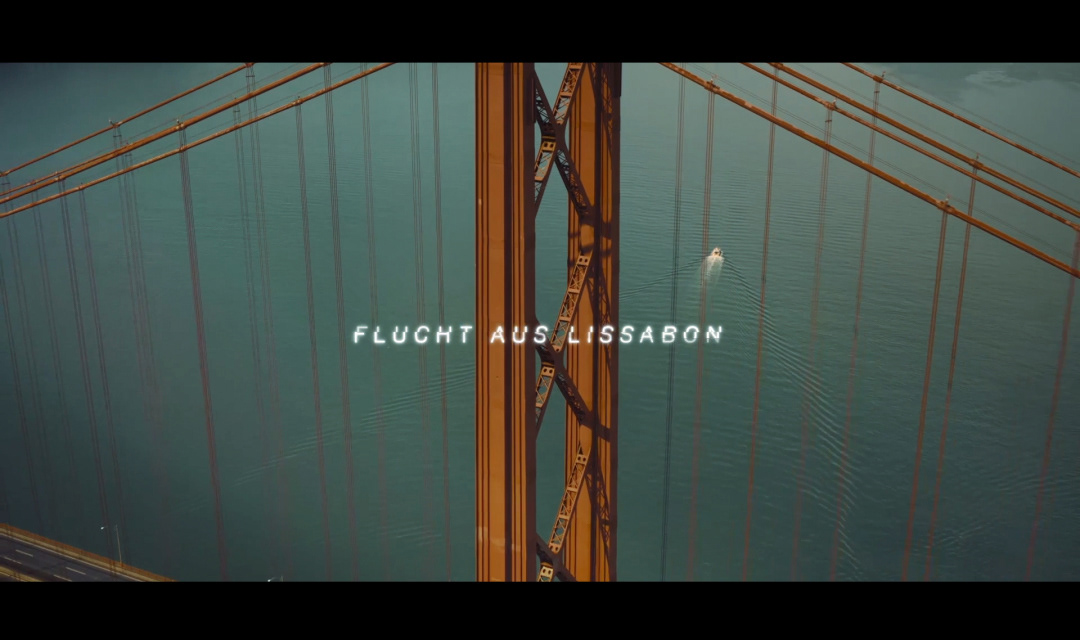
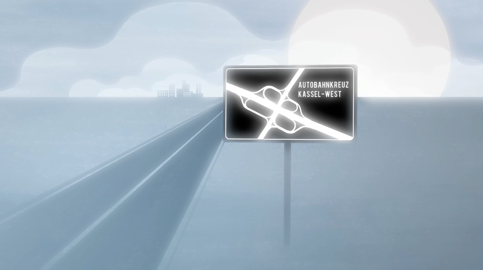
FLUCHT AUS LISSABON
TV Title Design, 2025
nDF, ZDF, Servus TV, Steffi Doehlemann, Hans-Hinrich Koch
Starring Hans Sigl, Marion Kracht, Christoph Franken
Task: Carry the logic of deepfakes, political sabotage, and election interference through the title language.
Method: Threat-to-title translation through typography, fragmentation, signal disruption, and motion.
Result: A title system in which visual fracture carried manipulated reality, unstable evidence, and political destabilization. The film attracted approximately 5.83 million viewers in March 2025, securing a market share of 22.8%.
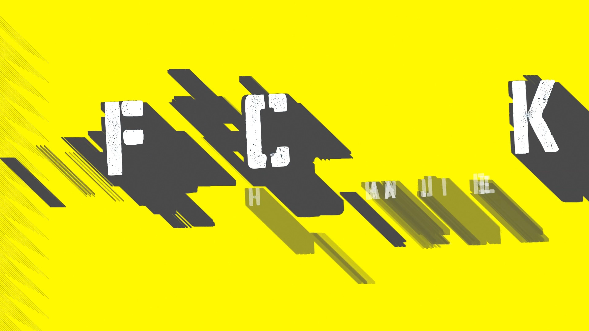
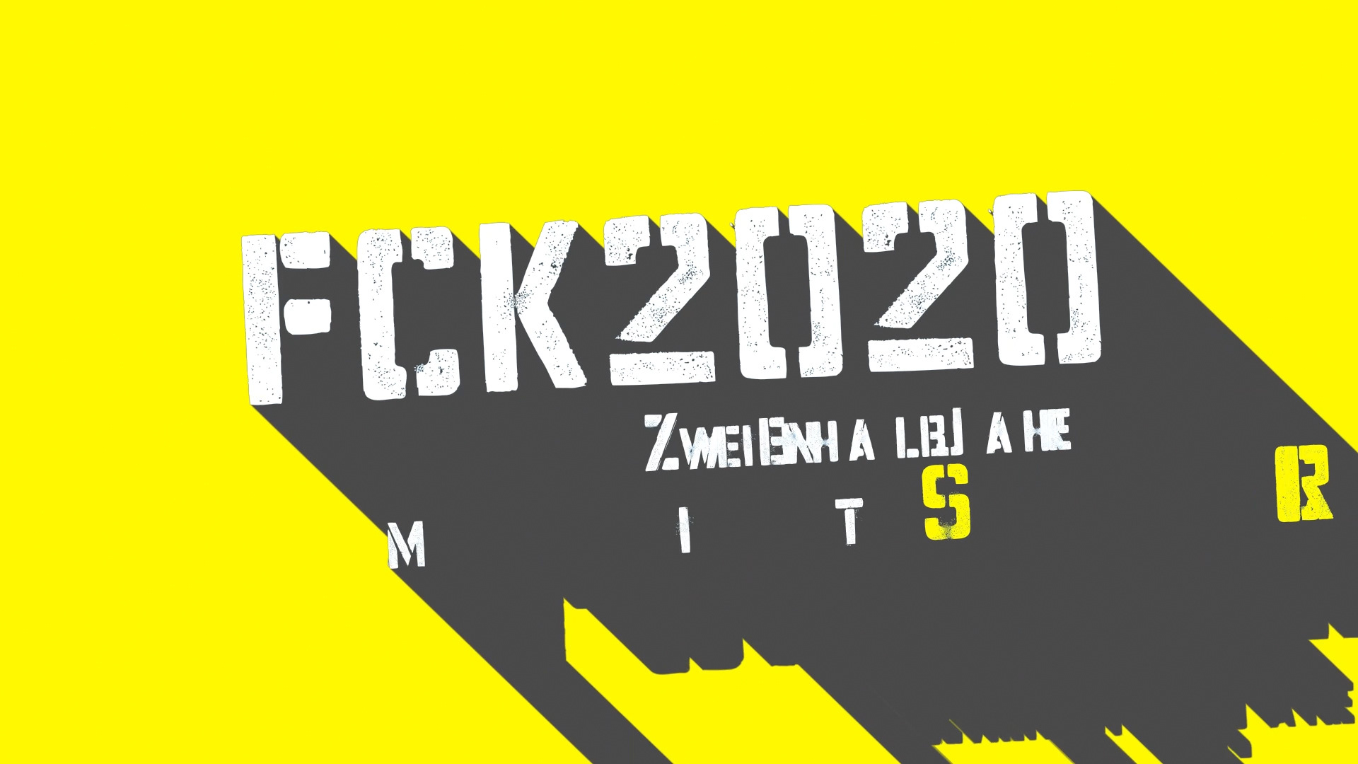
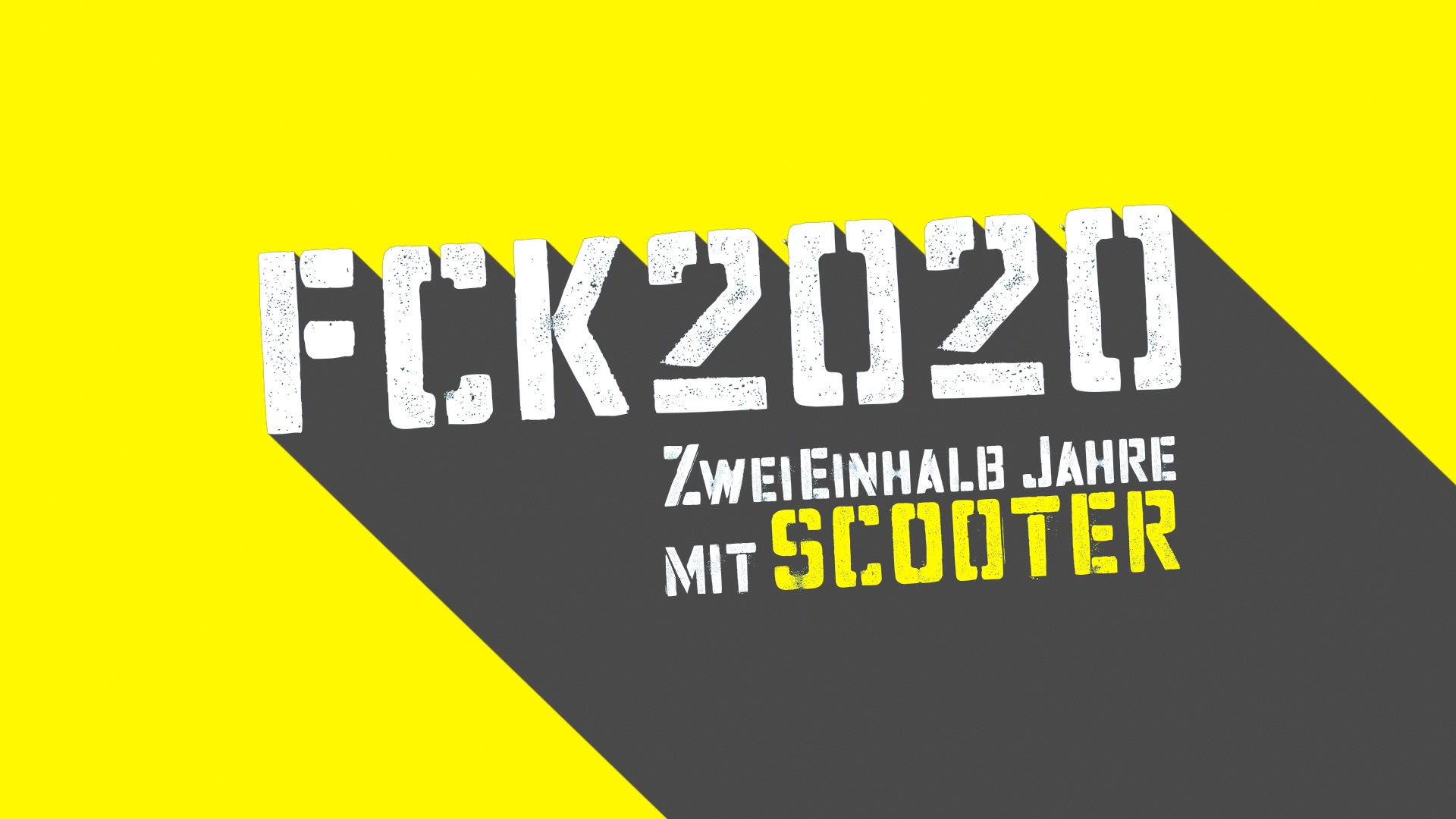
FUCK 2020
Trailer Title Design V01
wild bunch, avanti media fiction, OVersions, Cordula Kablitz-Post
Starring H.P. Baxxter, Michael Simon, Jens Thele, Rick J. Jordan
Task: Create a trailer title animation for a music documentary about Scooter during the pandemic shutdown.
Method: Band-to-title translation through high-contrast yellow, hard shadow, distressed typography, abrupt impact cuts, and rave-poster aggression. The title treats “FCK 2020” as a visual hit: loud, direct, damaged, and anti-polished, matching the film’s collision of pandemic standstill, touring disruption, anarchic humor, and Scooter’s techno energy.
Result: A title animation that turns the documentary’s core tension into graphic form: the world stops, the typography refuses to behave, and the title crashes onto the screen with the force of a concert announcement.
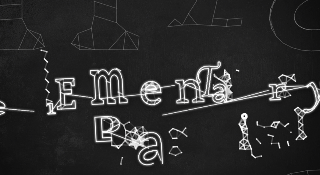
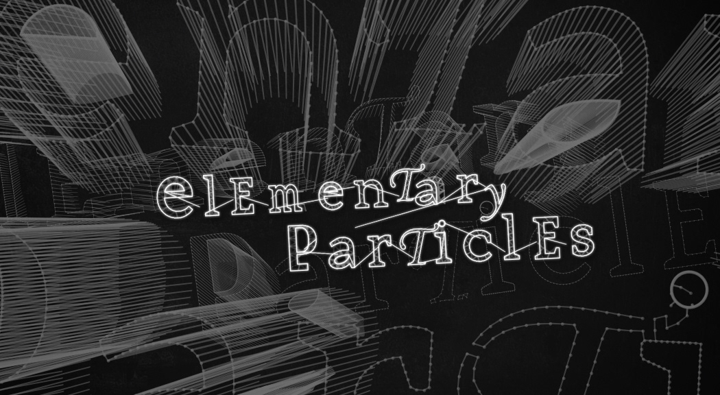
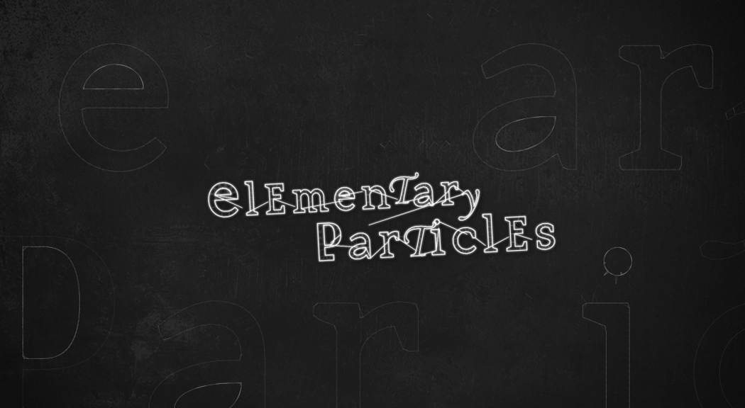
Michel Houellebecq - ELEMENTARY PARTICLES
Book Trailer Design
Task: An animated logo title.
Method: Novel-to-title translation through physical letterforms, particle behavior, collision, attraction, fracture, and decay. The letters try to assemble into language, then break apart again, making the title behave like unstable matter.
Result: An animated logo in which typography becomes the theme: connection forms briefly, identity loses stability, and the title dissolves into particles, carrying the book’s logic of human fragmentation, failed connection, and reduction to matter.
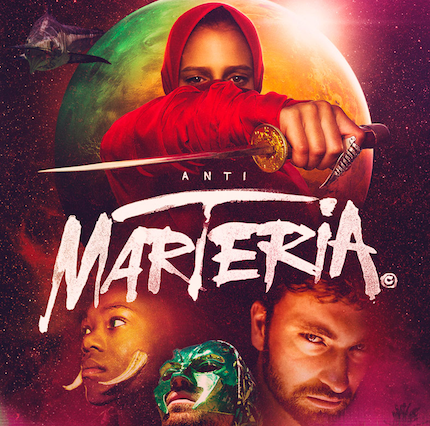
ANTIMARTERIA
Compositing, VFX, Particles, Character Animation, Atmospheres
Specter Berlin, Doity Berlin, NÖT, Jan Siggel
Starring Marteria, Frederick Lau, Emilia Schüle, Paul Ripke, Trystan Pütter
Task: Enhance and enrich the atmosphere of illustrated and animated scenes for a music film .
Method: Mood-to-image translation through VFX, animation, atmospheric continuity, light, dust, depth, color, particles, and illustrated non-frame-by-frame scenes.
Result: An animation and VFX layer integrated into the film’s emotional and musical environment. Released in full on YouTube, with 776,000 views.
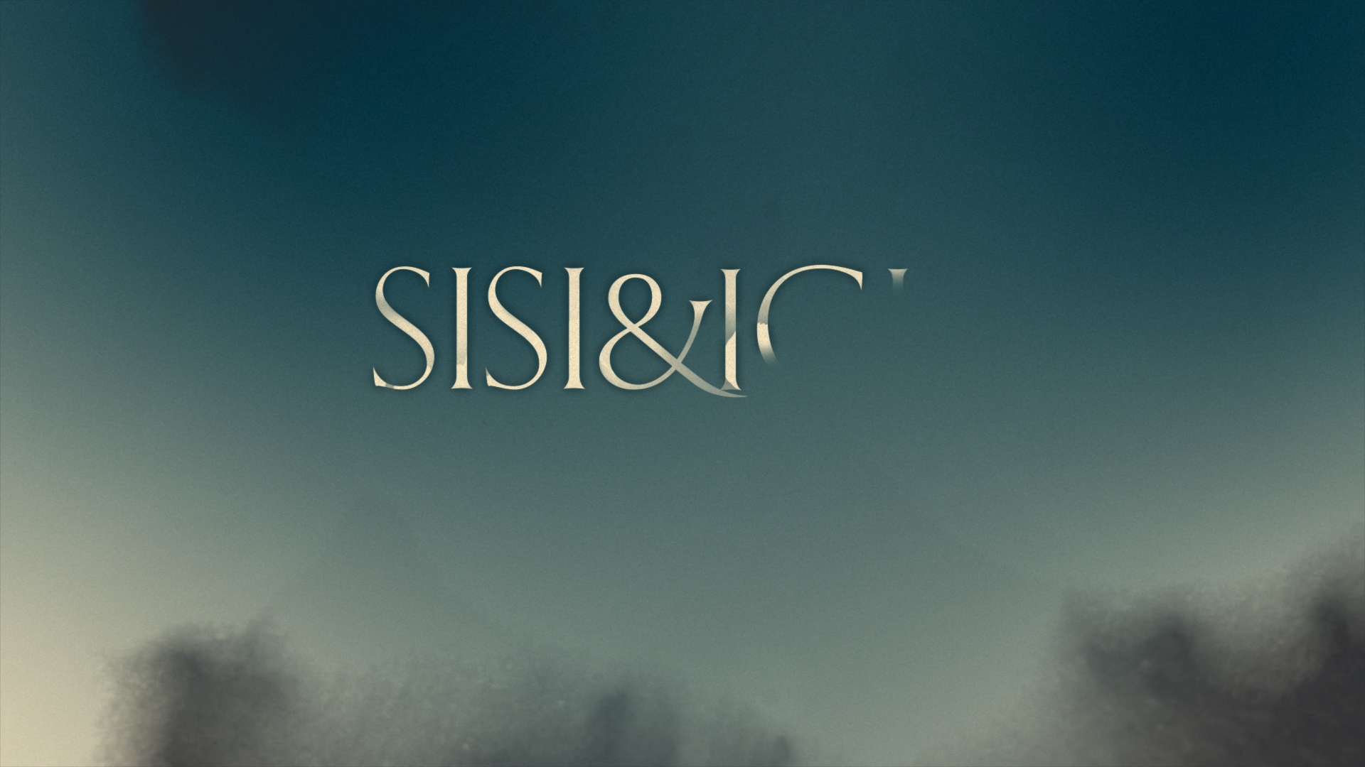

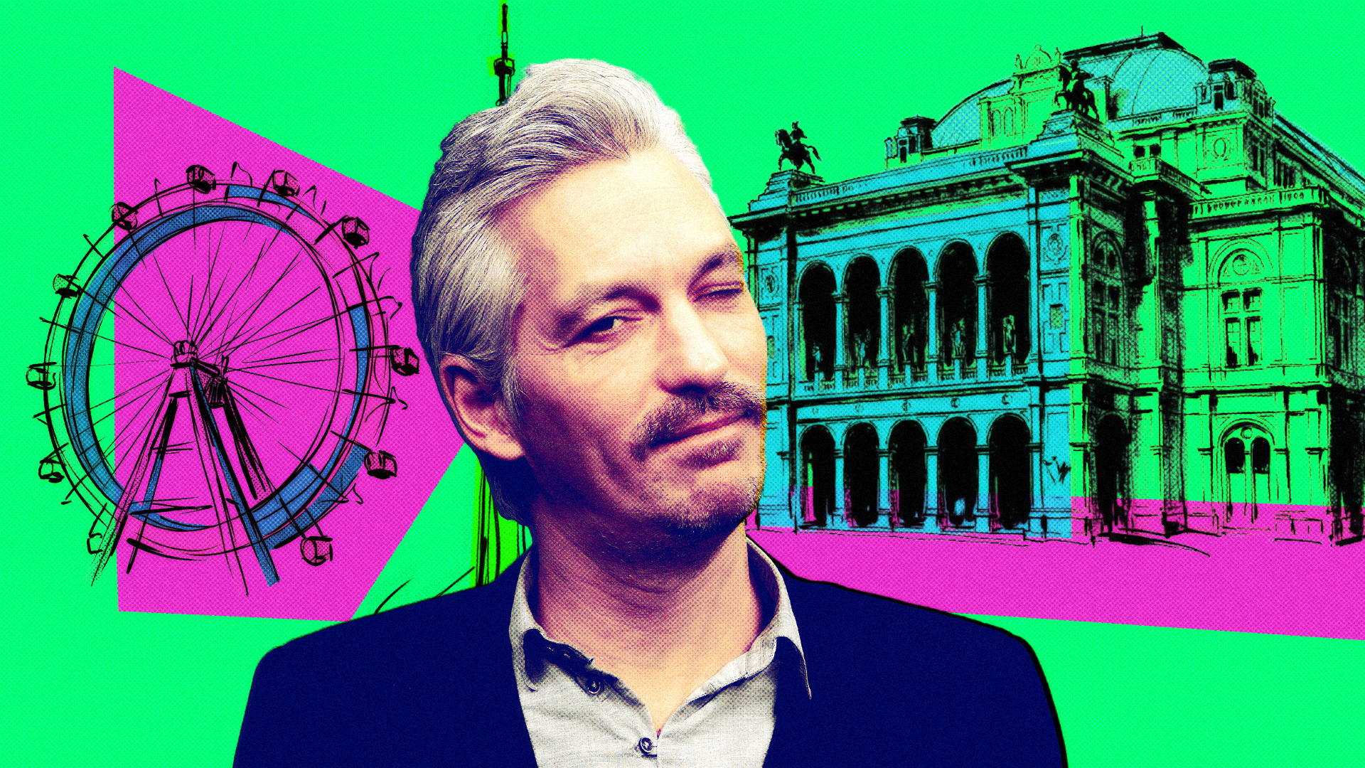
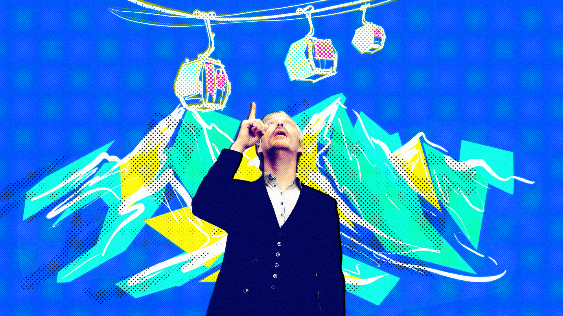
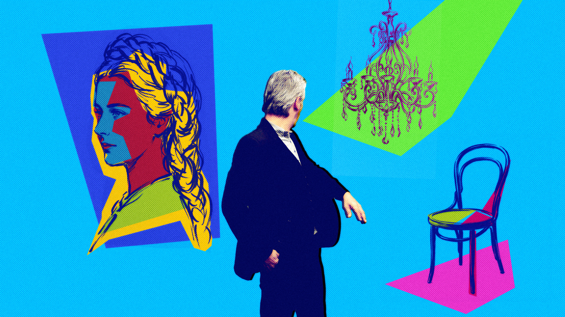
SISI&ICH
Trailer Title Animation
DMC, OVersions, Frauke Finsterwalder, Christian Kracht
Starring Sandra Hüller, Susanne Wolff, Stefan Kurt
Task: Create a trailer title for Sisi&Ich that carries the film’s emotional tension and historical atmosphere.
Method: Film-to-title translation through smoke, muted color, fine typography, old-camera jitter, soft dissolution, and controlled instability. The title emerges from haze into the logo and background field, creating elegance, fragility, and slight disturbance.
Result: A refined trailer title system in which smoke, color, typography, and subtle disruption make the title feel unstable, sensitive, and emotionally charged.
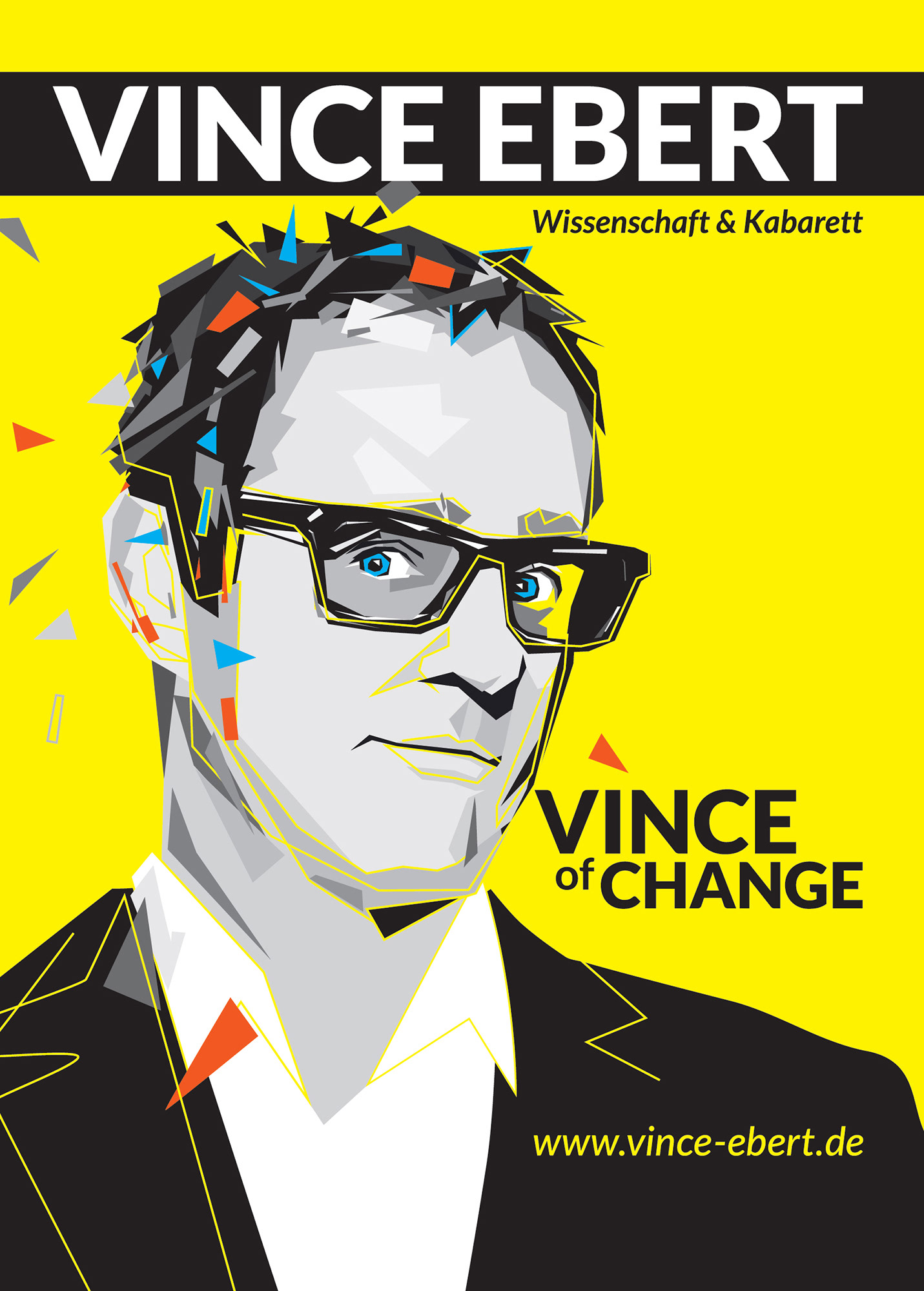
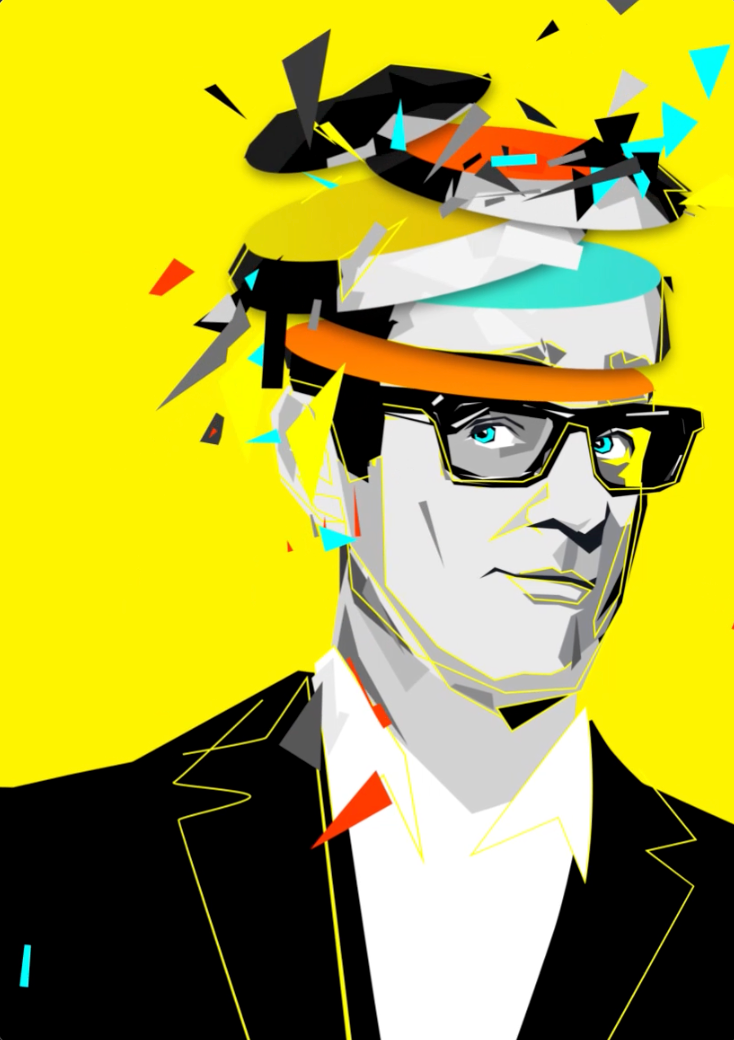
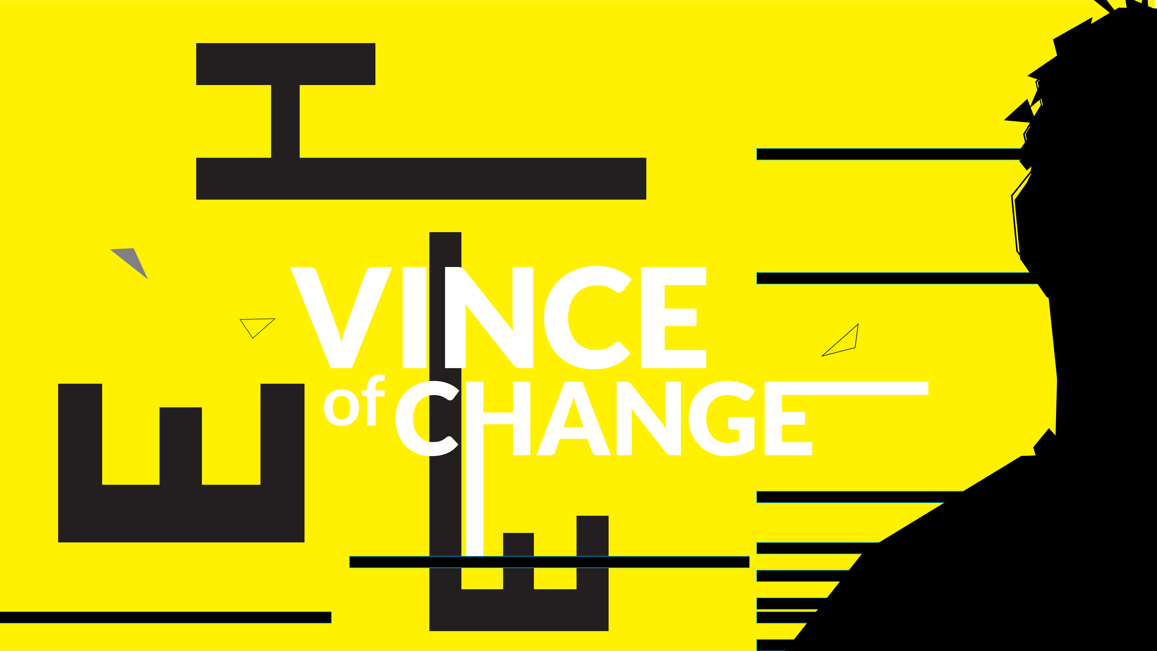
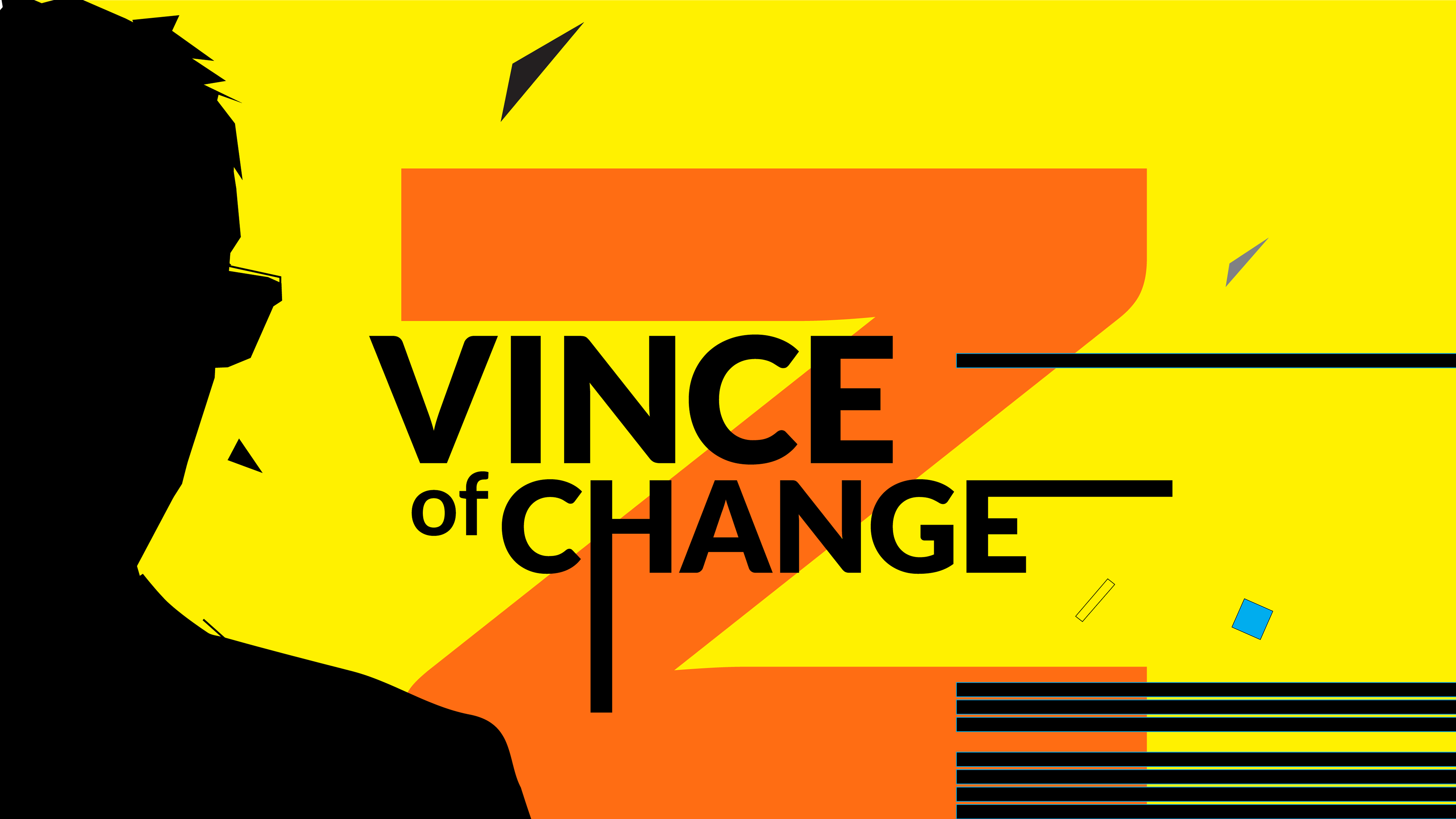
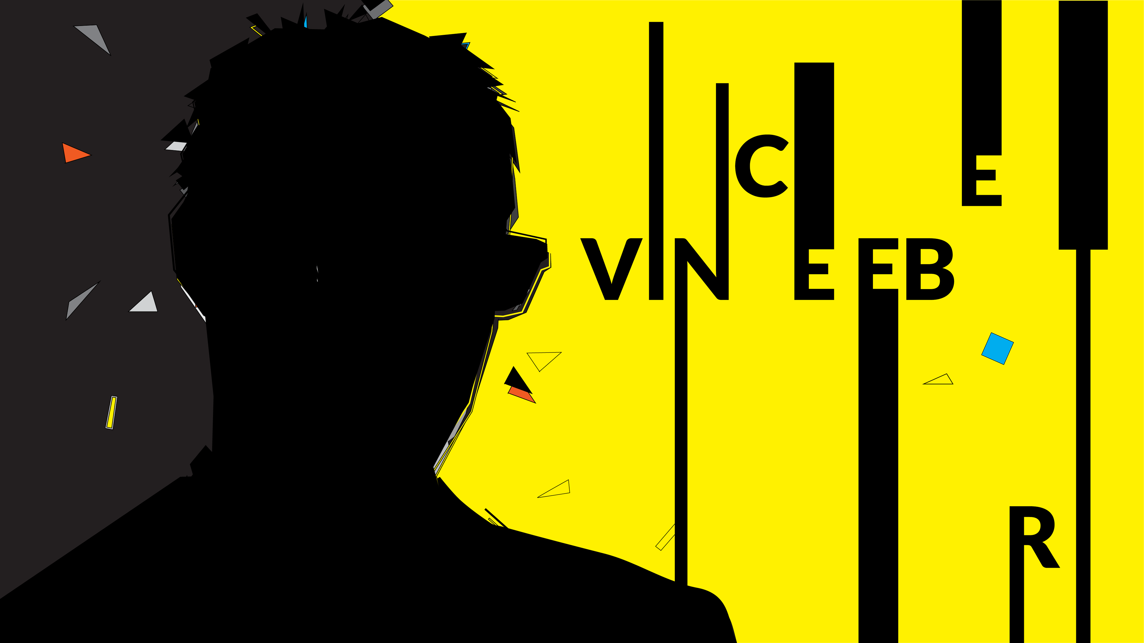
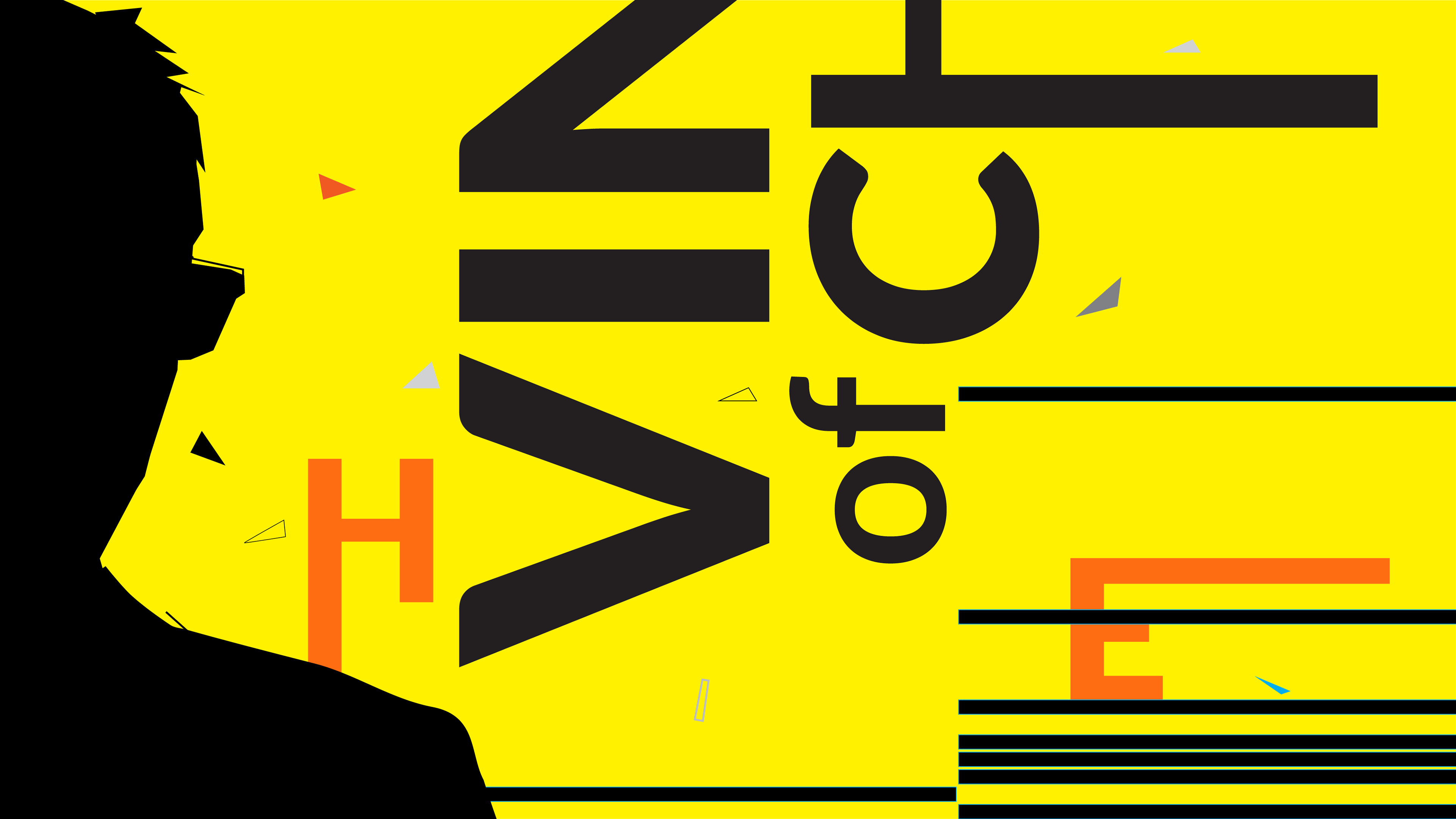
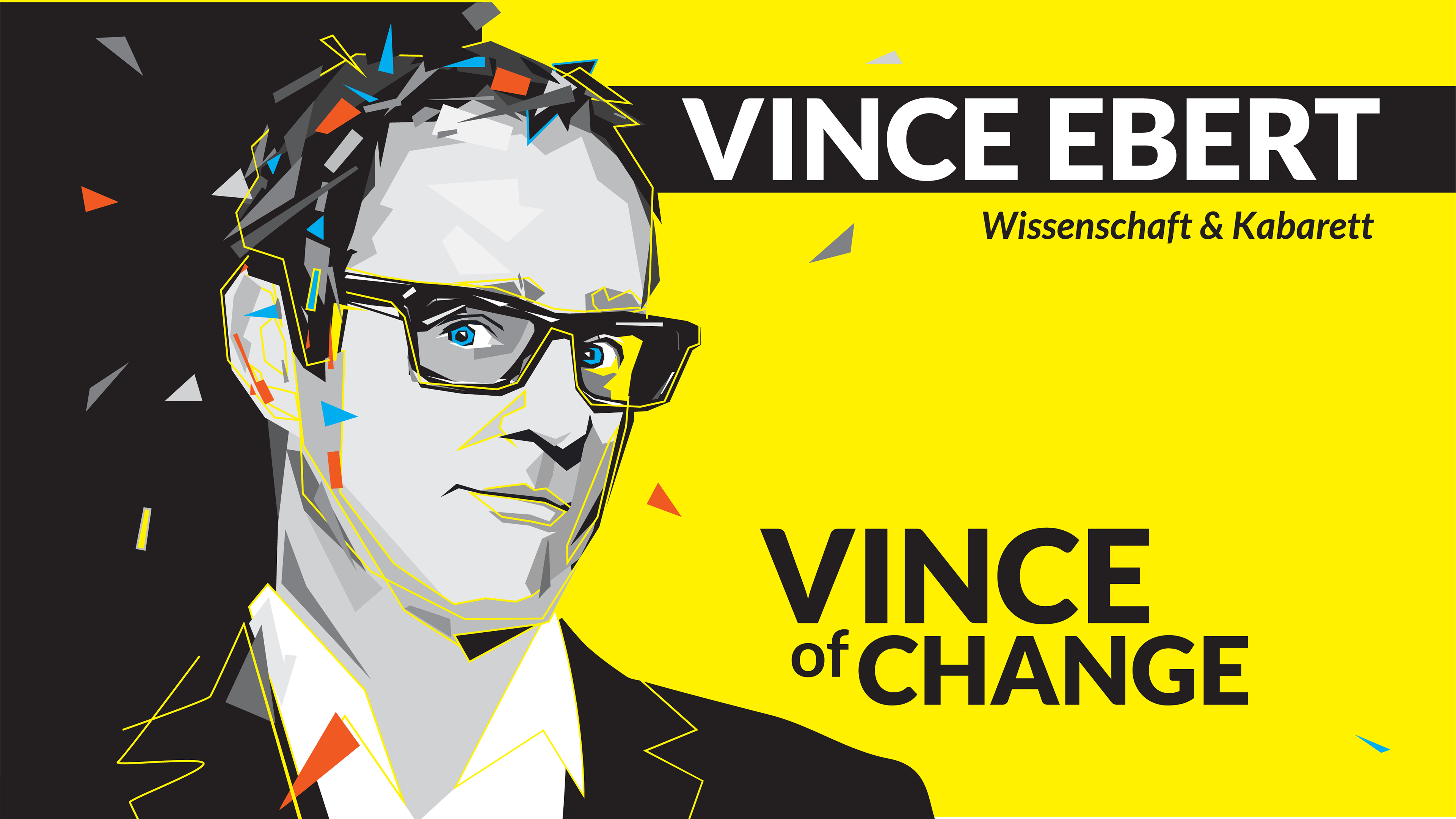
VINCE OF CHANGE
Logo, Illustration, Poster Design, AR Animation
Task: Create a visual identity for Vince Ebert’s stage program, translating his science-cabaret persona into a sharp graphic system.
Method: Performer-to-poster translation through portrait illustration, hard yellow contrast, fragmented typography, angular geometry, and visualized thought energy. The illustration treats Vince Ebert as a stage figure whose ideas cut through the frame: the brain becomes an active mechanism, opening in layers and releasing small triangular fragments as signs of insight, wit, and mental acceleration.
Result: A poster and logo system extended through Artivive into an AR animation. When scanned, the static portrait came alive: the head opened in layered motion, revealing the animated thought structure behind the performer and turning the poster into a small stage for his ideas.
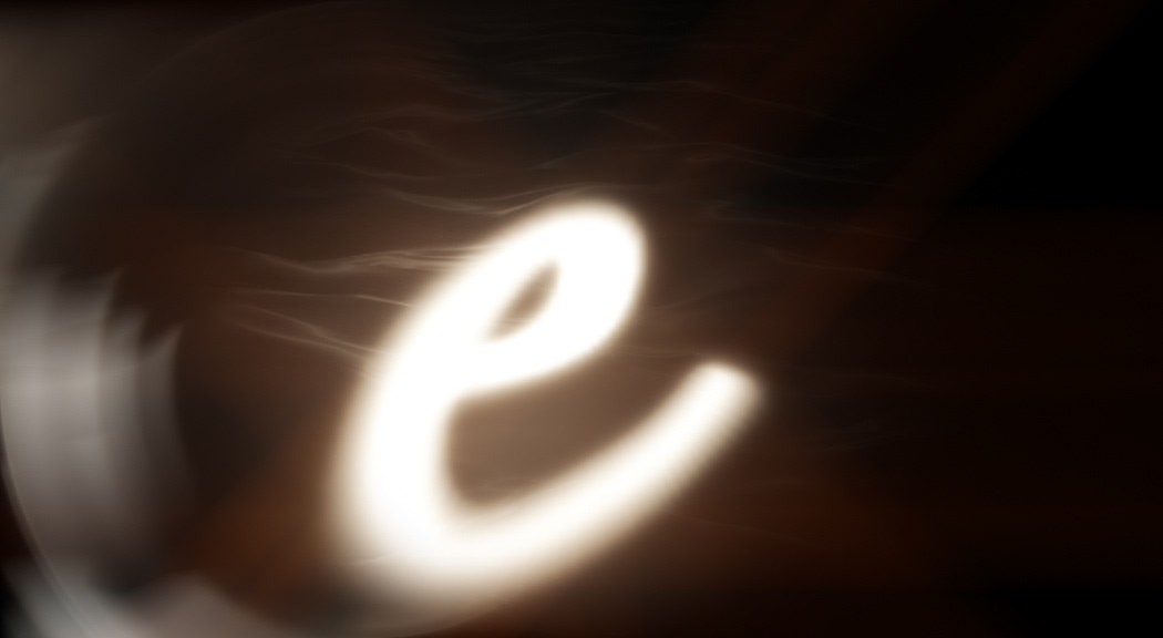
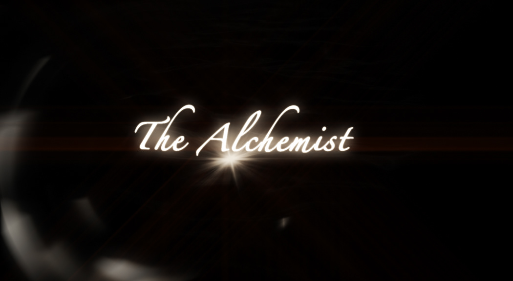
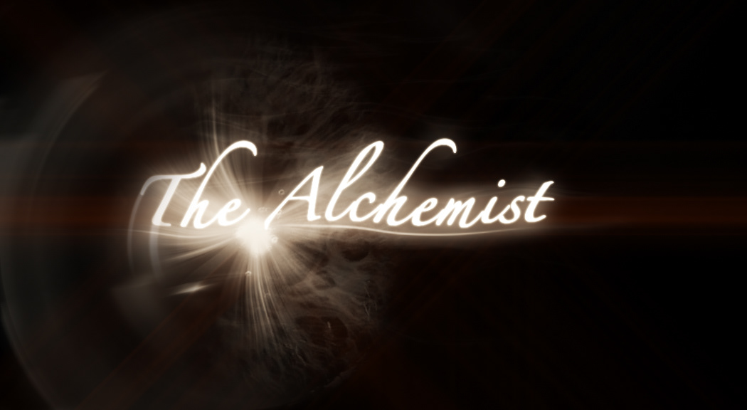
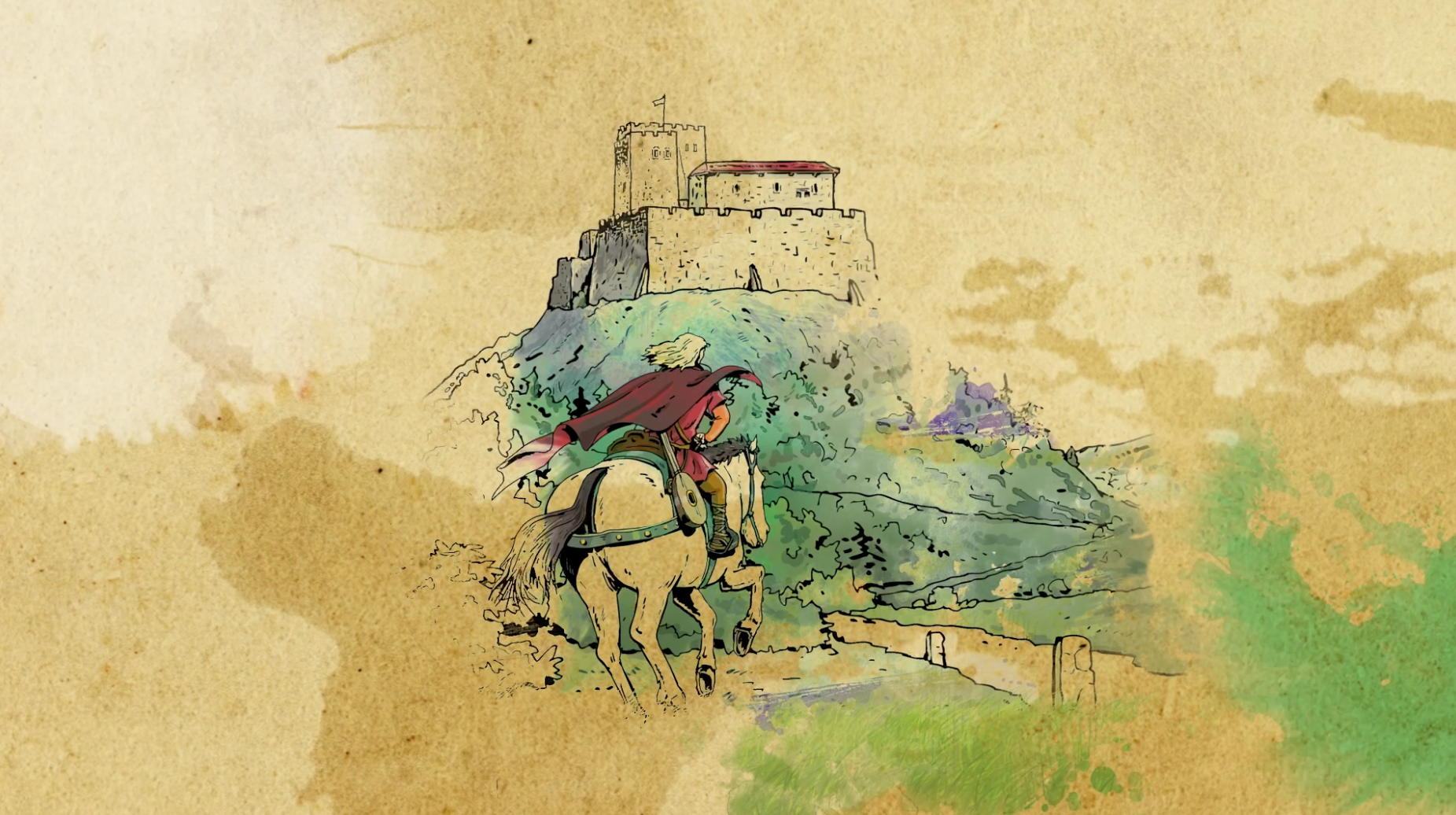
THE ALCHEMIST
Book Trailer Design
Task: Create a cinematic title sequence for The Alchemist.
Method: Literature-to-title translation through eye imagery, light, smoke, desert texture, scripted typography, and slow transformation. The eye becomes the point of perception and inner search: looking outward into the world, then inward toward signs, intuition, and destiny. The title appears as something revealed rather than placed, emerging from dust, vision, and alchemical change.
Result: A book-title sequence translating the novel’s journey from external search to inner recognition. The eye, the light, and the dissolving atmosphere carry the story’s movement between desert, dream, omen, and self-discovery.
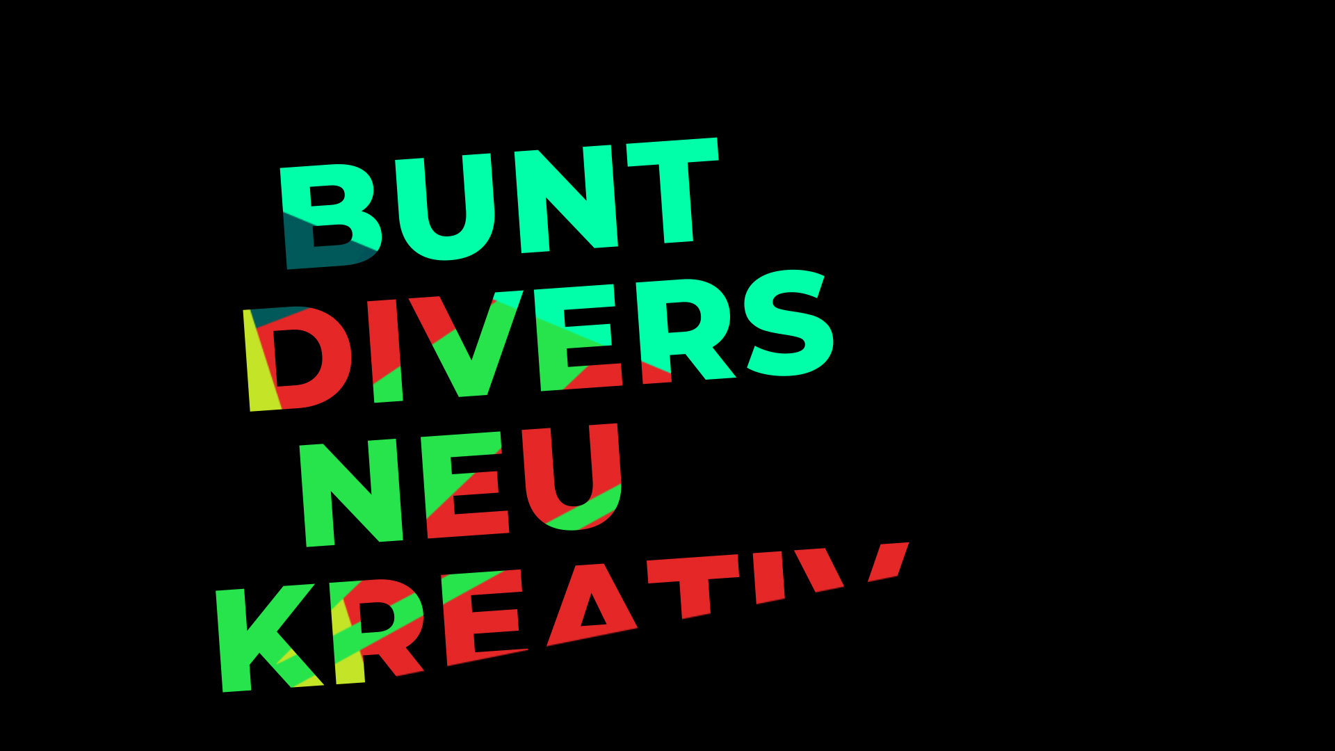
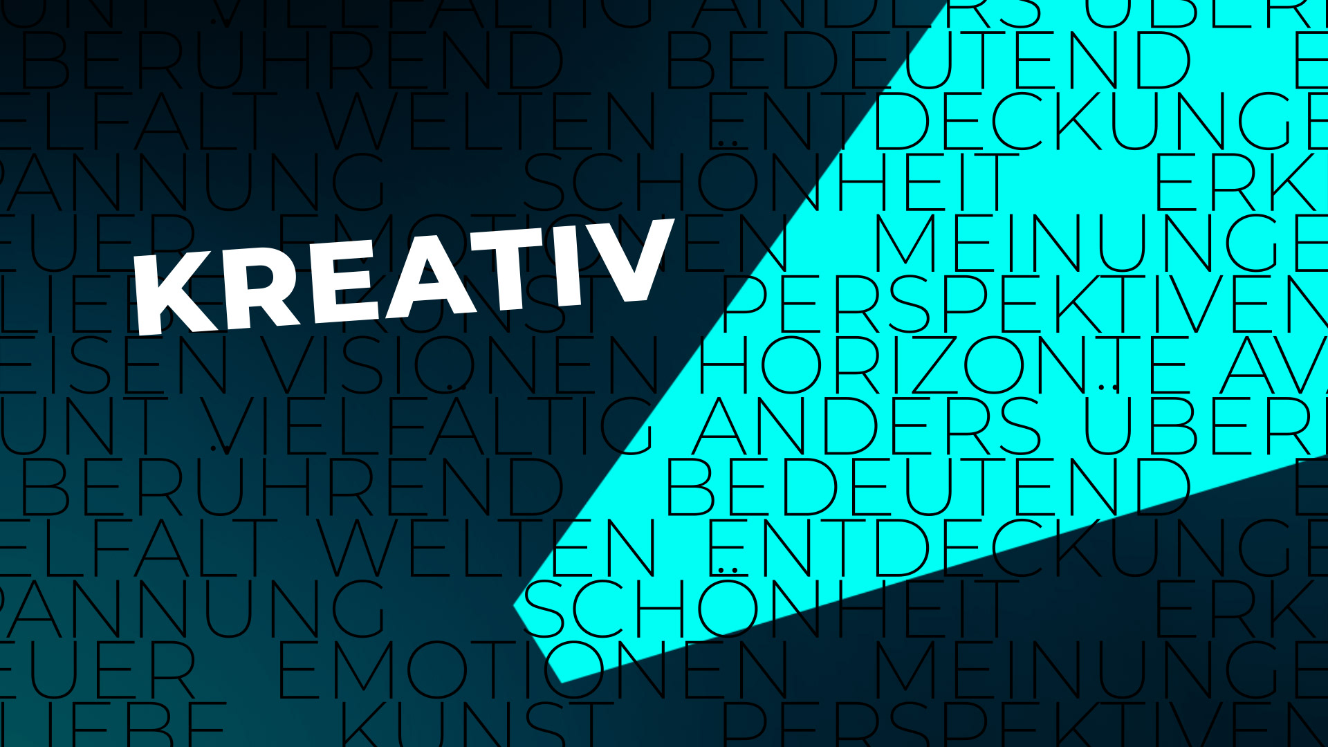
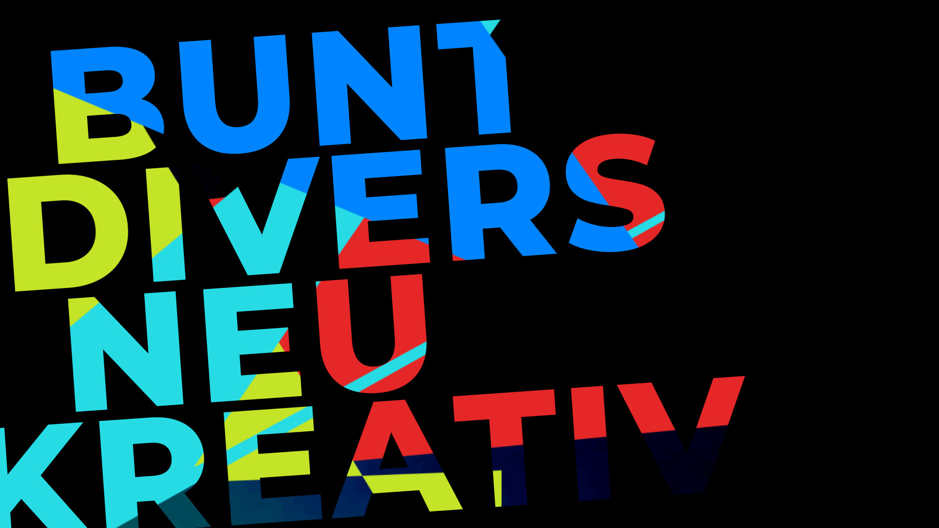
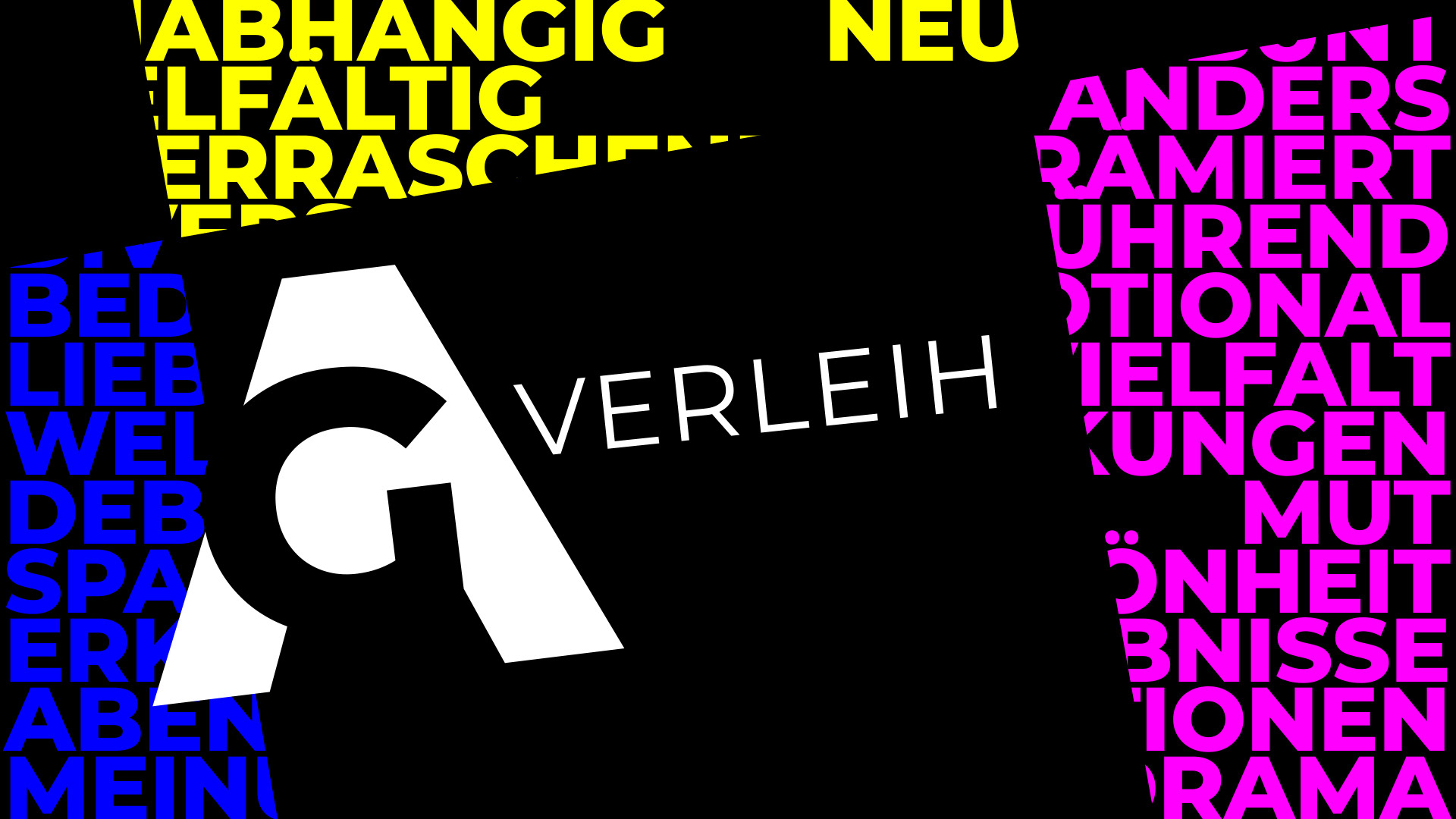
VANITY CARD
Concept & Styleframes
Concept & Styleframes
AG Verleih, OVersions
Task: Create a film-opening vanity card for the AG Verleih logo.
Method: Brand-value-to-logo translation through typography, color, darkness, and reveal logic. The words the brand wanted to claim, diverse, colorful, independent, new, creative, exciting, first appear as fragmented graphic material. A moving light cone searches through them, activates them, and finally becomes the “A” of the AG Verleih logo.
Result: A logo opener in which the brand mark emerges from its own claimed values. The concept turns “diverse, colorful, creative” from static adjectives into a visual mechanism: language becomes light, light becomes form, form becomes identity.
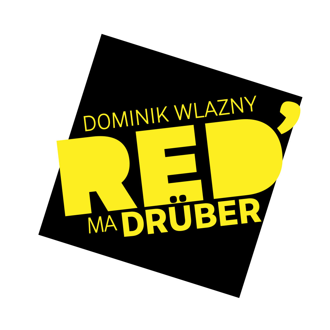
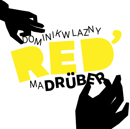
RED MA DRÜBER
Show Package Design, Logo Design, Animation
YT Show, Dominik Wlazny / Marco Pogo, 2023
Task: Create a bold, visual, provoking design package for a fast-moving political-cultural voice.
Method: Voice-to-system translation through identity logic, graphic behavior, media rhythm, and public recognizability. Reduced, punk-influenced paper-cutout graphics slam the titles onto the screen. Elegant movement clashes with disruptive graphic force, underlining the critical topics and pushing viewers out of passive reception.
Result: An identity system able to carry political communication, personality, and media presence. The political format with former presidential candidate Dominik Wlazny reached a wide online audience with strong viewer engagement. Episodes consistently drew tens of thousands of views and sparked active community response.
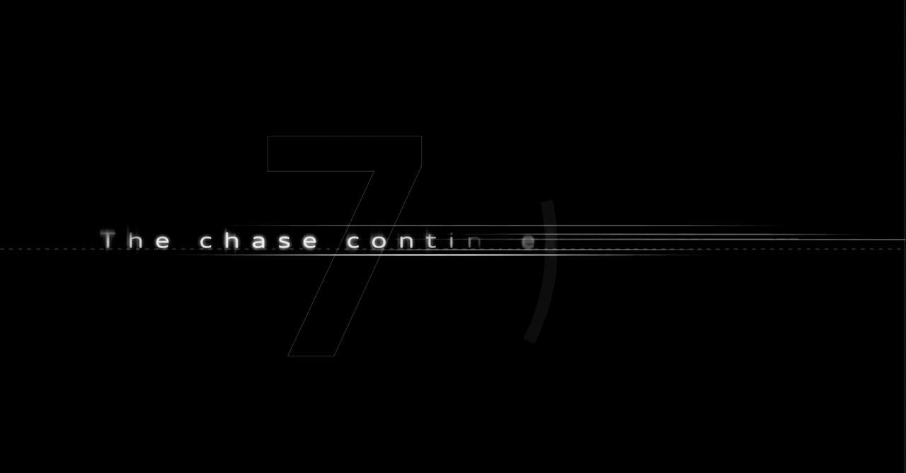
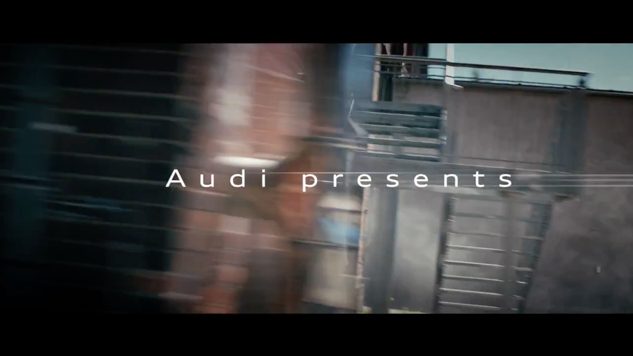
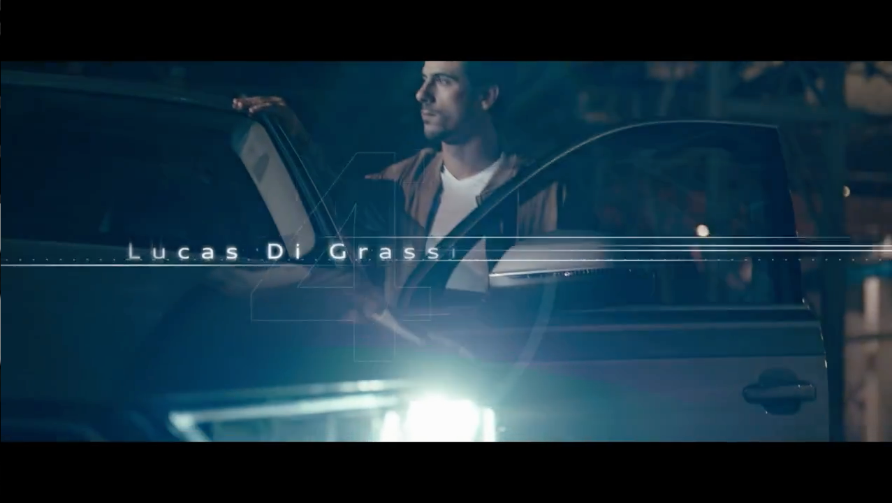
e-tron - The ultimate e-chase
Series, Title Design, Animation, Editing
AUDI, Stink Films, Celluloid VFX GmbH, Holger Hummel
Starring Lucas di Grassi
Task: Align electric performance, technology, and cinematic chase logic in title design.
Method: Product-to-cinematic translation through pacing, tension, movement, and performance framing. Created the Film Main Title Design for Audi’s flagship film featuring Formula E champion Lucas di Grassi.
Result: A title system connecting automotive technology with filmic speed and pursuit logic, created as part of the brand’s global push into electric performance.
DIE FLORIAN SCHROEDER SATIRESHOW
Title Design, Concept, Directing, Editing, Animation, 2016-2022
ARD, RBB, HR, Florian Schroeder, Herbert Management, Kreuzberger Kind, Magnus von Keil, Cedric Wrieden, Cornelia Schad
Task: Position political satire with immediate editorial clarity.
Method: Public-discourse framing through rhythm, edit, typography, visual argument, late-night atmosphere, and host-driven city imagery. Conceptualized and directed the on-air package shoot, overseeing editing and animation of the show’s visual identity, including inserts and studio graphics.
Result: A show package directed, edited, designed, and animated as a visual frame for the format. Managed the Satirekanal’s visual content for four years, creating numerous hand-illustrated thumbnails that captured current political themes.
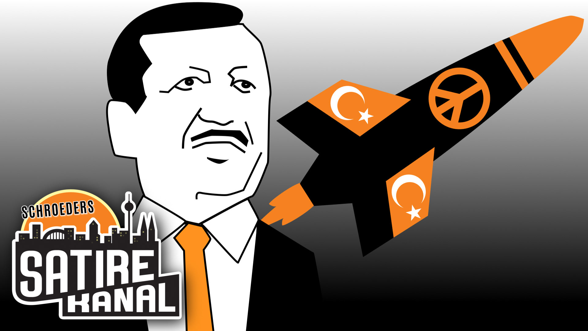
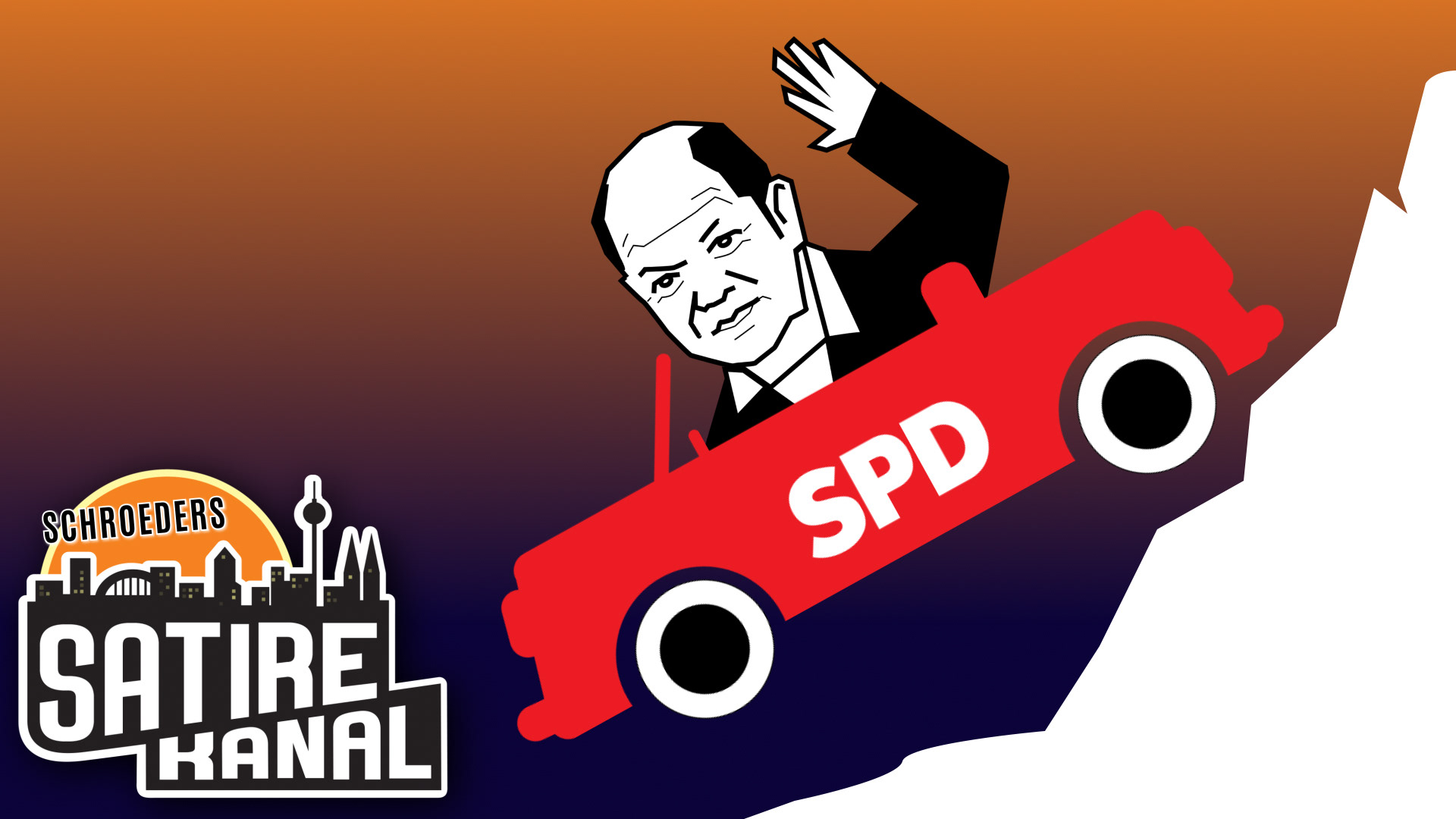

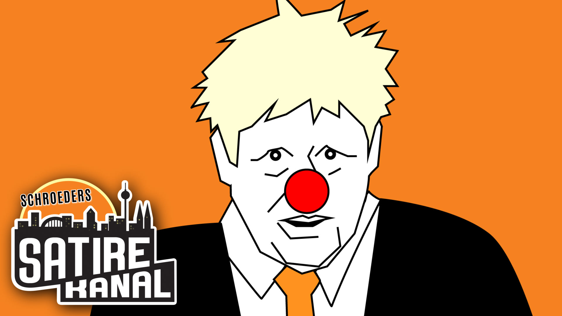
SCHROEDERS SATIREKANAL
Thumbnail Design, Illustrations
Florian Schroeder, YouTube Show 2020-22
Task: Create fast, recognizable thumbnail visuals for a political satire channel reacting to current topics.
Method: News-to-satire translation through hand-drawn caricature, reduced symbols, bold typography, orange-black channel coding, visual punchlines, and immediate topic recognition.
Result: A consistent thumbnail system for political YouTube content, making each episode quickly readable while carrying the channel’s satirical tone and editorial edge.
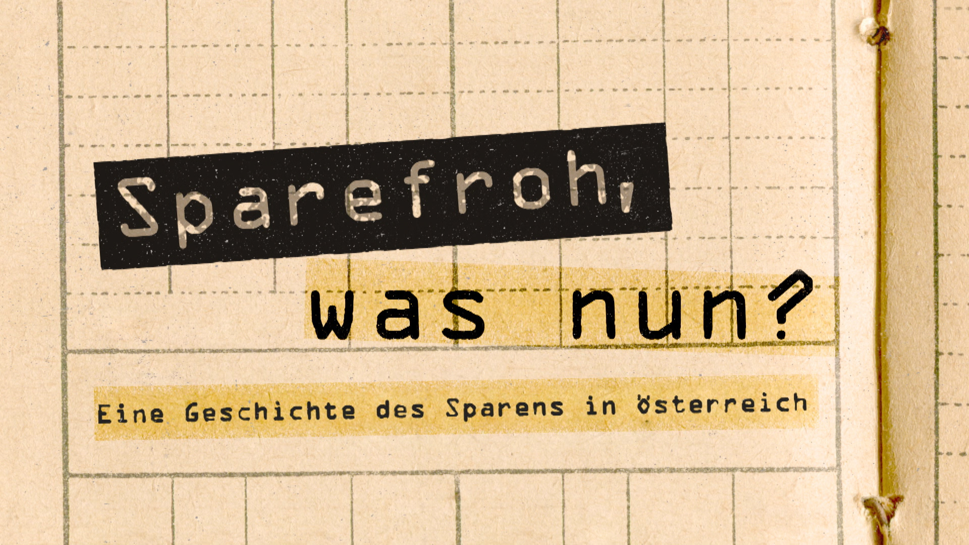
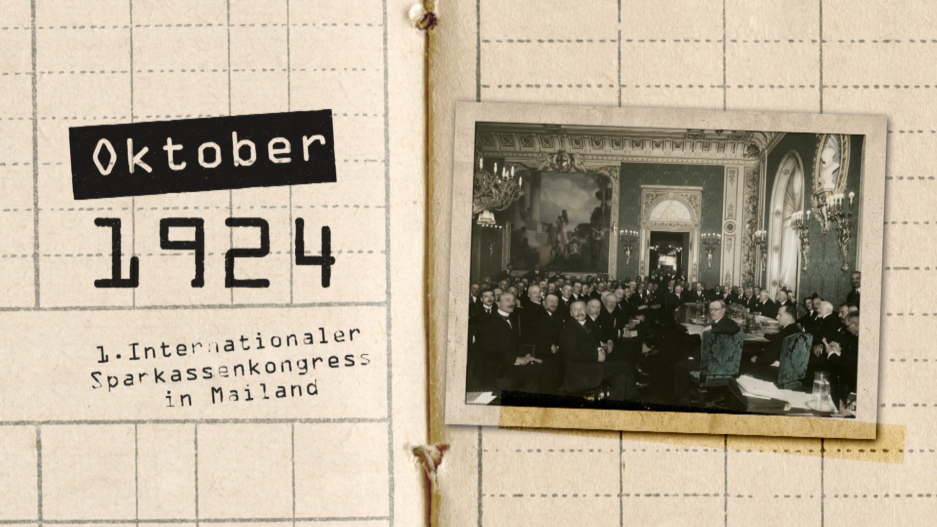
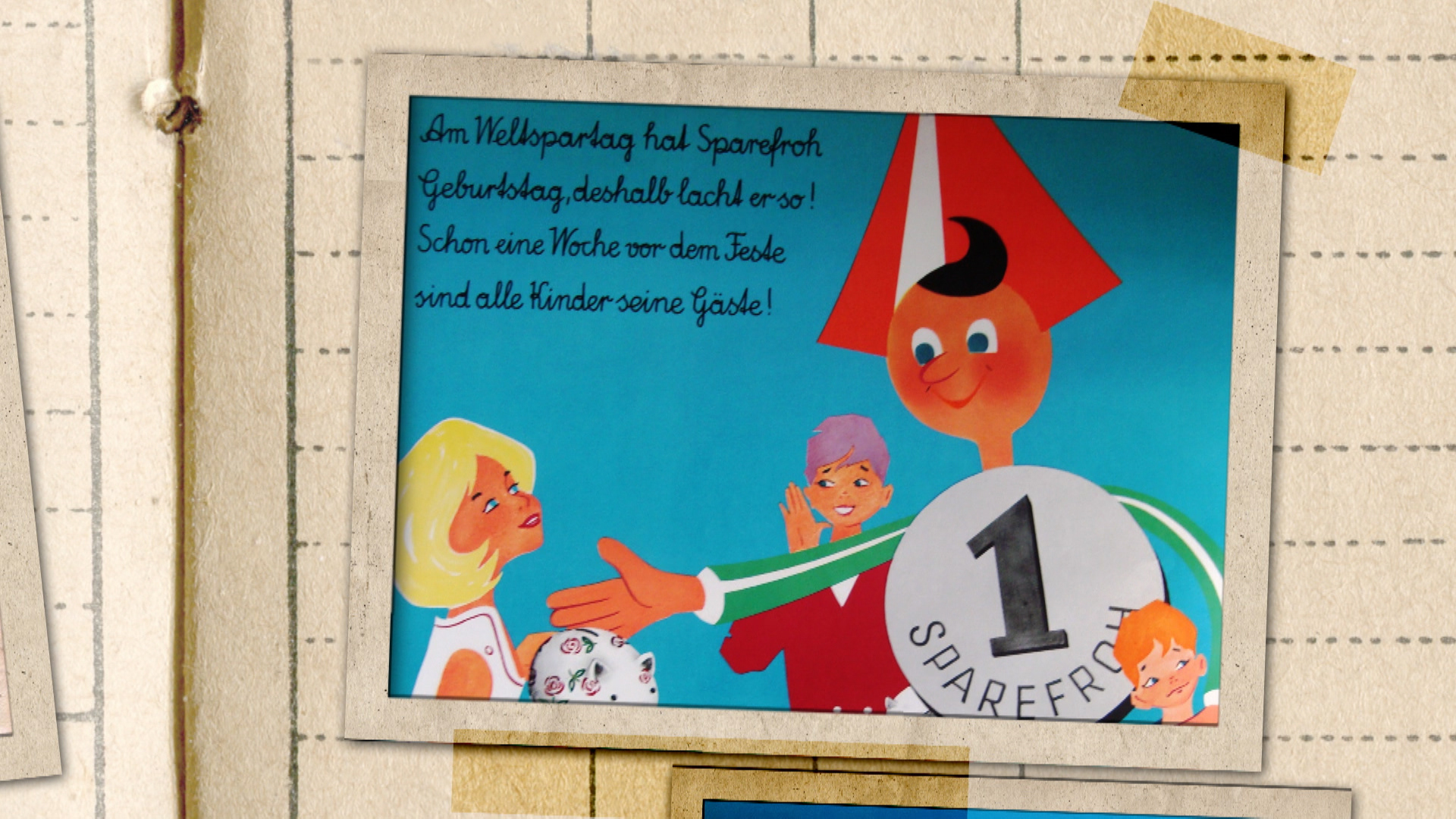
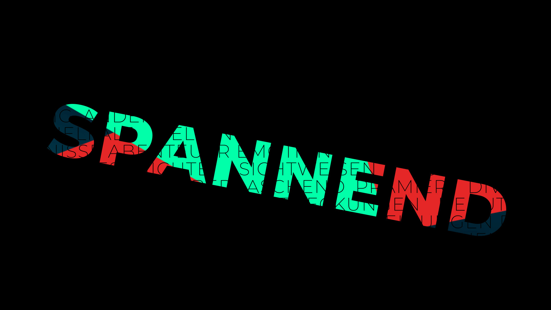
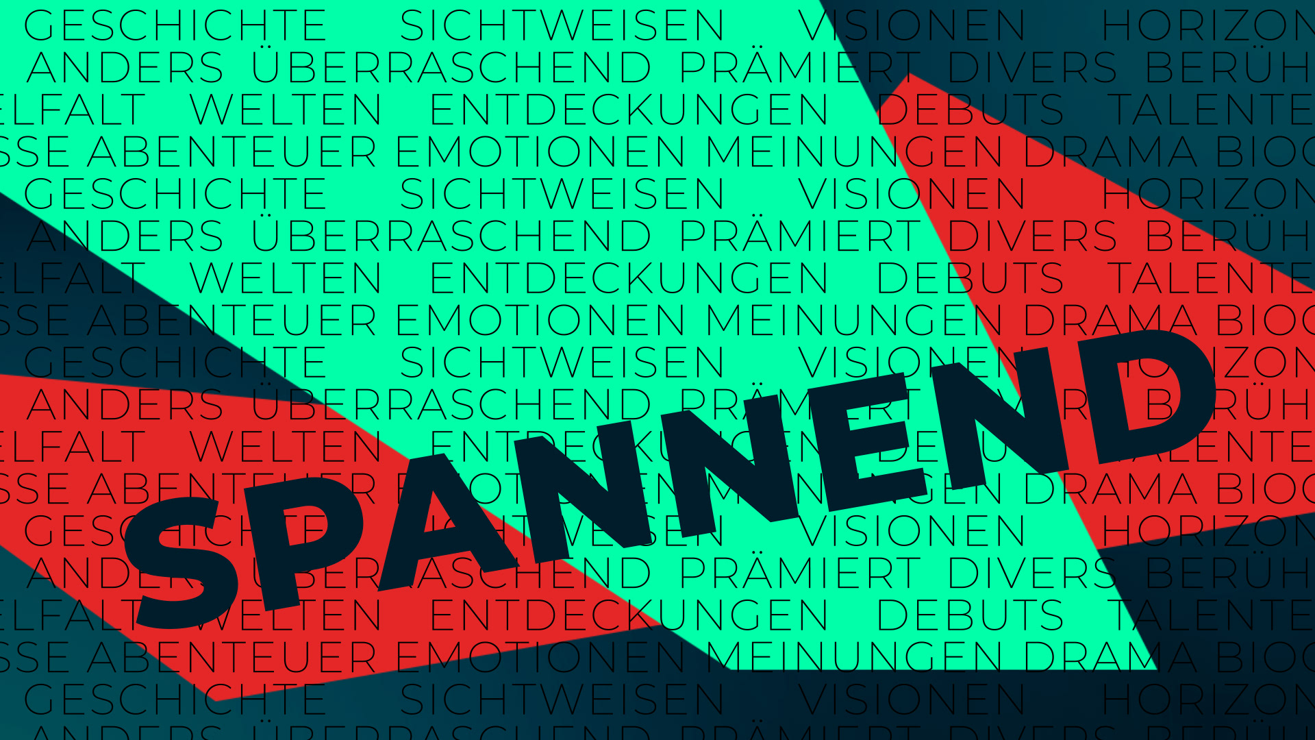
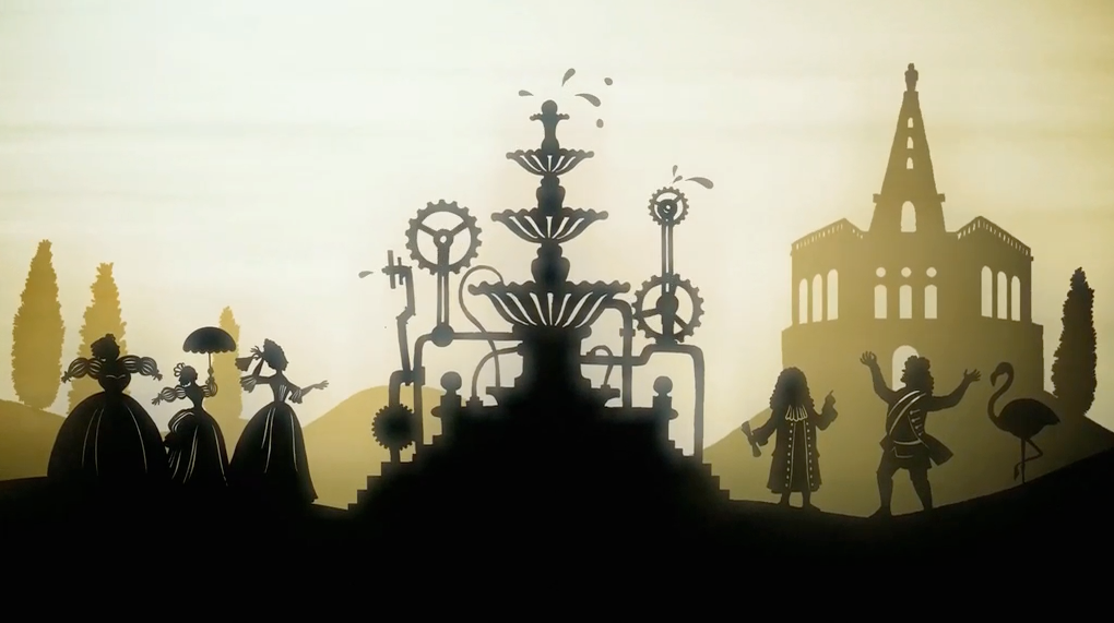
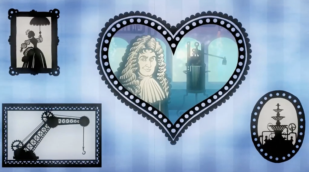
SPAREFROH, was nun?
Broadcast package, design, and animation for a documentary
ORF III Doku, Neuzeit Films, Martin Mayer, 2025
Task: Frame the history of private saving in Austria through a familiar public symbol.
Method: Cultural-economic translation through public memory, documentary framing, and symbol adaptation.
Result: A visual time travel from the origins of private savings to the first World Savings Day in 1925, on to today, connecting financial history to a recognizable Austrian savings icon.
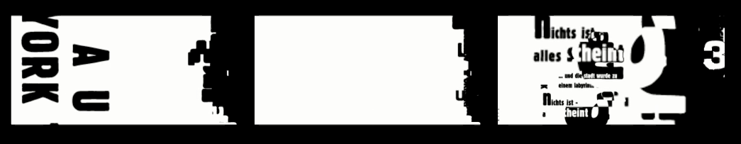
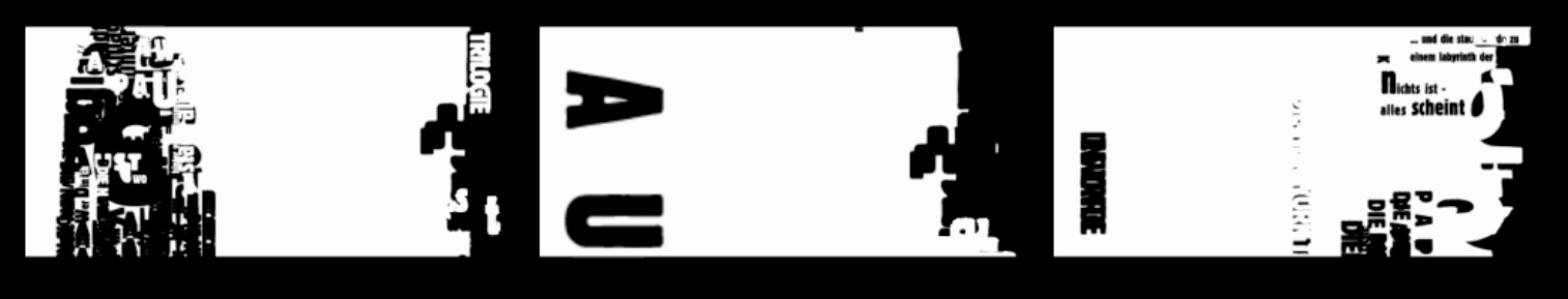
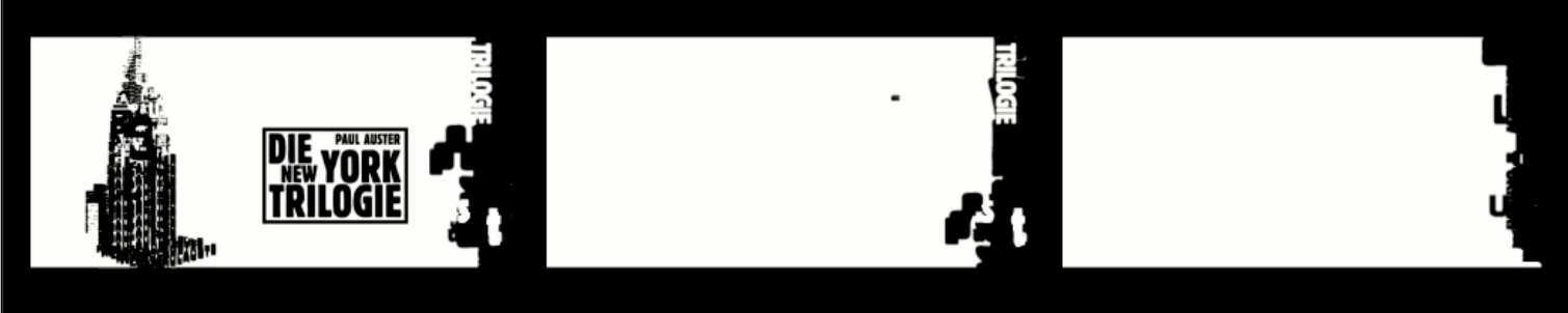
PAUL AUSTER’S NEW YORK TRILOGY
Audiobook Packaging, Poster Design, and Later Book Trailer Design
Audiobook Packaging, Poster Design, and Later Book Trailer Design
Frankfurter Akademie für Kommunikation & Design
Task: Translate the trilogy’s narrative logic of identity loss, urban disorientation, authorship, and disappearance into a visual system.
Method: Narrative-to-typography translation. New York first appears as a city, then resolves into language: buildings become sentences, streets become text fragments, and the visible city dissolves into the words that construct it. The design follows the books’ detective logic, where searching for a person turns into searching for meaning, and identity breaks into names, roles, doubles, traces, and absence.
Result: An audiobook packaging system and skyscraper-format poster in which New York became a typographic structure built from the book’s own sentences. The later trailer extended this logic in motion: city, text, identity, and disappearance collapse into one black-and-white visual narrative.
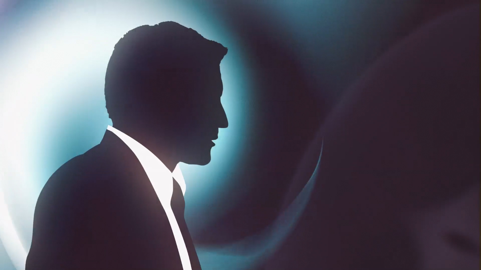
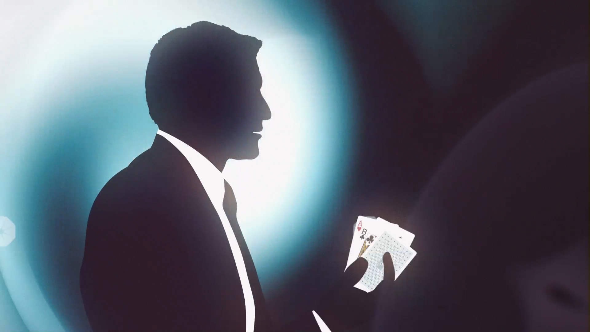
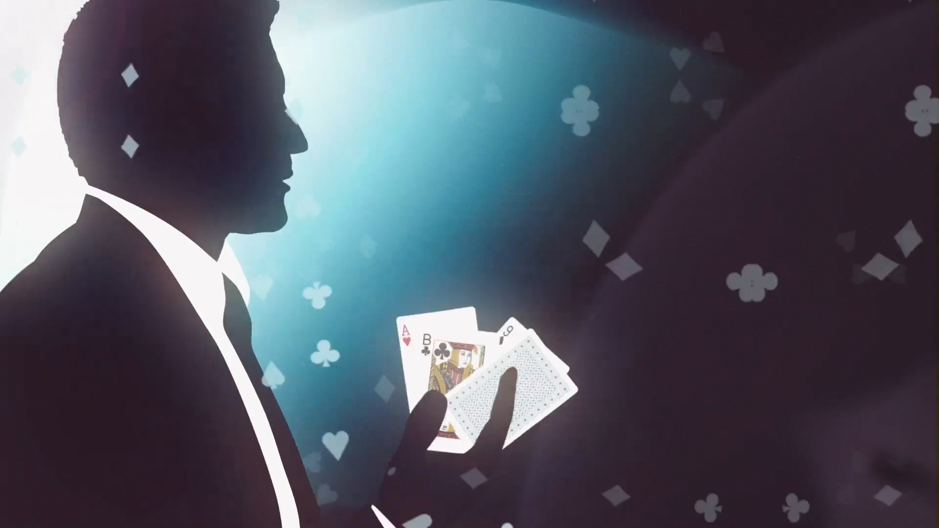
SKILL7
Game Trailer Concept, Design, Illustration, Animation, Editing
Game Trailer Concept, Design, Illustration, Animation, Editing
Task: Create a game trailer for a card-game platform.
Method: Game-to-trailer translation through James Bond-style silhouette staging, casino iconography, playing-card graphics, dramatic backlight, suspense pacing, and elegant title rhythm.
Result: A trailer that turned digital card gaming into a stylized agent-world sequence, connecting game mechanics with glamour, secrecy, and cinematic tension with the atmosphere of a classic spy film.
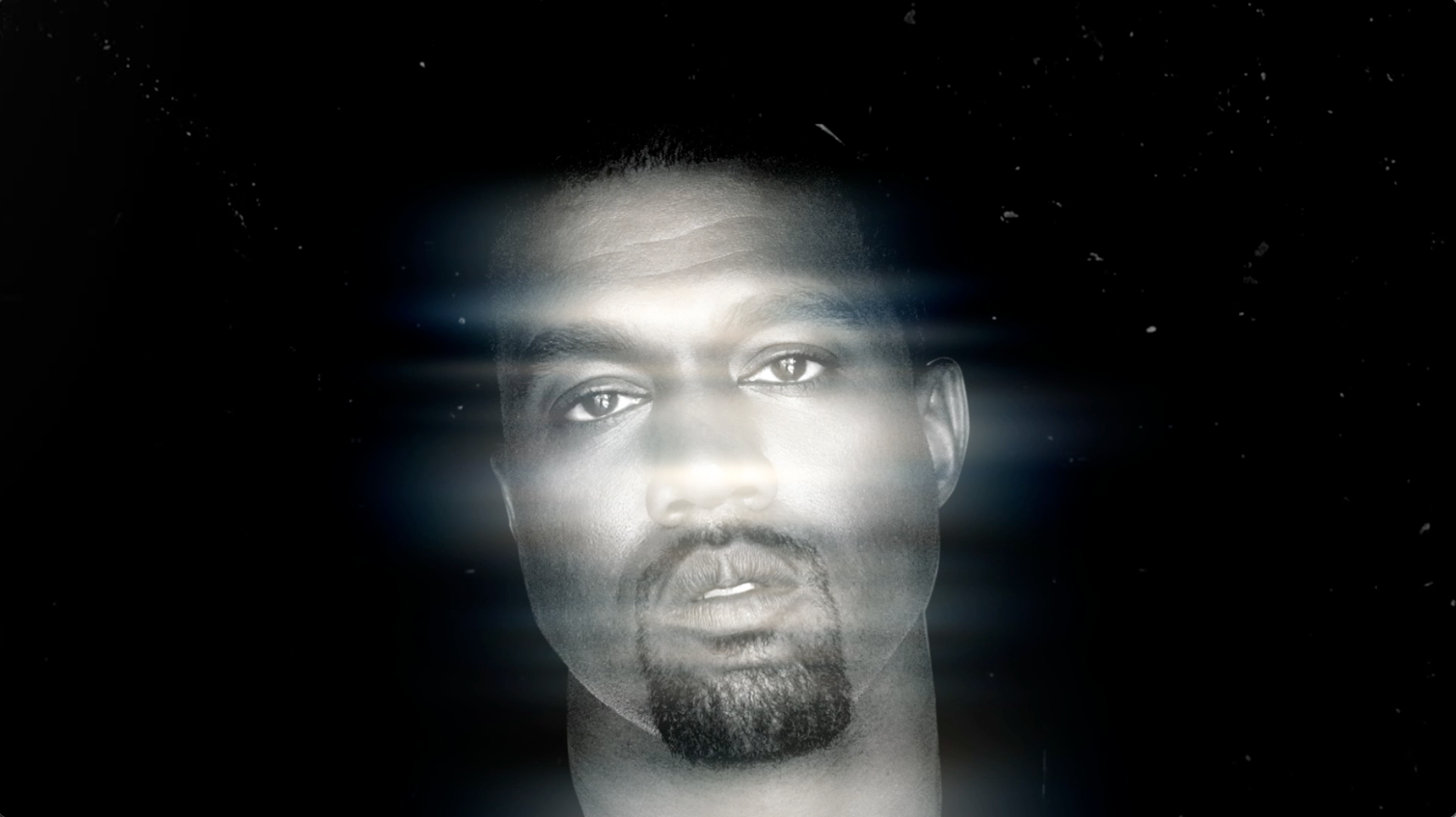
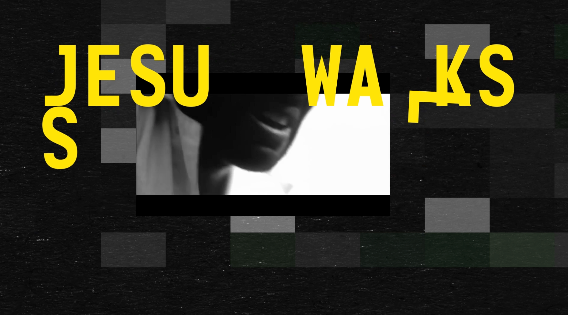
STOKED - HIP HOP FYI - Kanye West - JESUS IS KING
Episode Adaptation, Animation, Storytelling, Editing
Universal Music, Michael Seipel, Annegret Feiertag
Task: Adapt the existing STOKED – Hip Hop FYI design package for individual YouTube episodes, including an episode on Kanye West’s Jesus Is King.
Method: Template-to-episode translation through topic-specific image selection, editorial pacing, yellow-black graphic language, fragmented typography, glitch rhythm, and adaptation of the existing visual system to each artist story.
Result: Episode-specific animated adaptations that kept the series identity consistent while making each topic visually distinct, fast, and editorially readable.
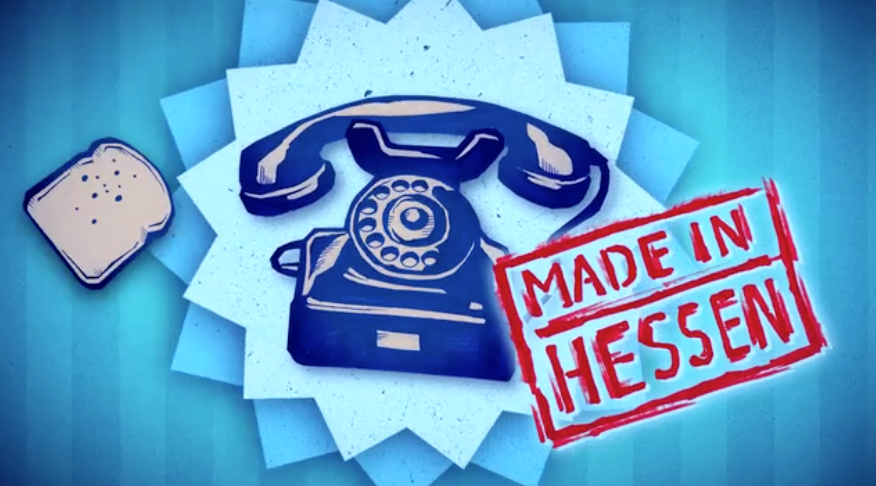
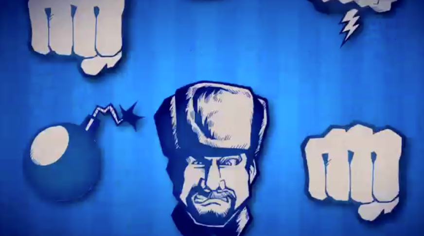
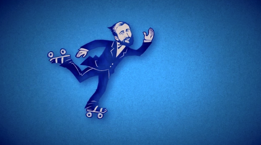
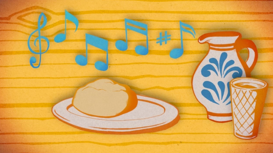
50 DINGE DIE EIN HESSE
Design, Animation, Concept Storytelling
Animated Shorts, HR, Tim Brackmann, Magnus von Keil
Task: Turn regional identity into compact animated storytelling.
Method: Culture-to-short-form translation through humor, character, timing, and visual reduction.
Result: Award-winning animated short films turning regional knowledge into lovable broadcast pieces. Awarded for exceptional visual storytelling and original concept execution. Commissioned second series after first round success.
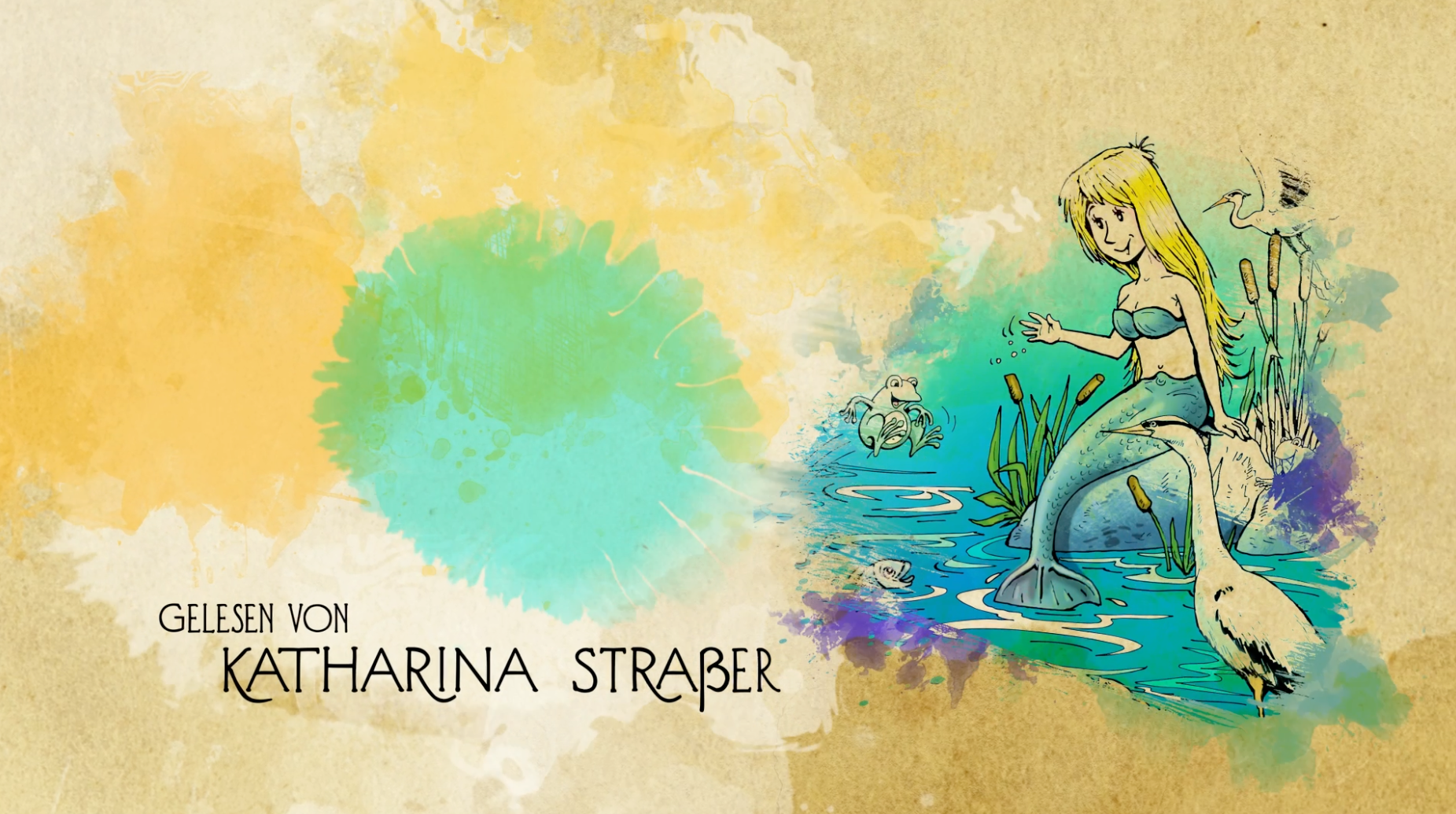
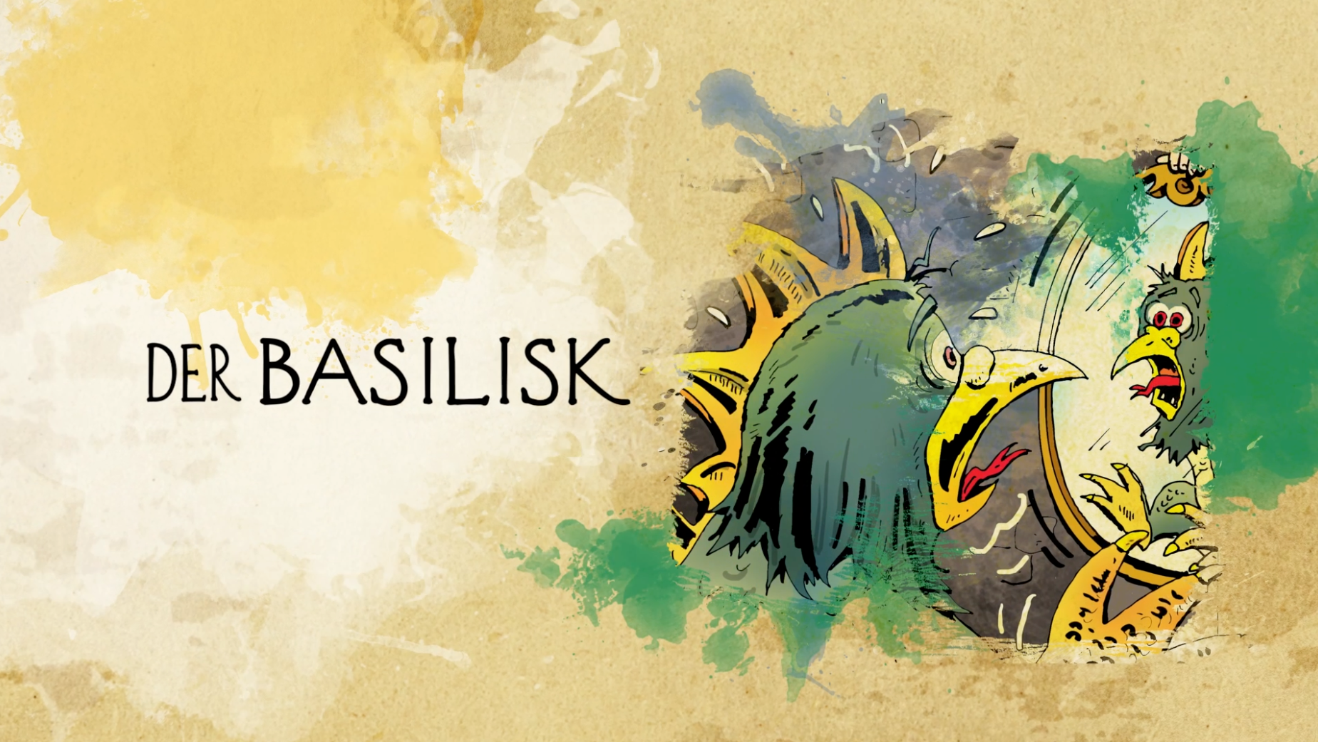
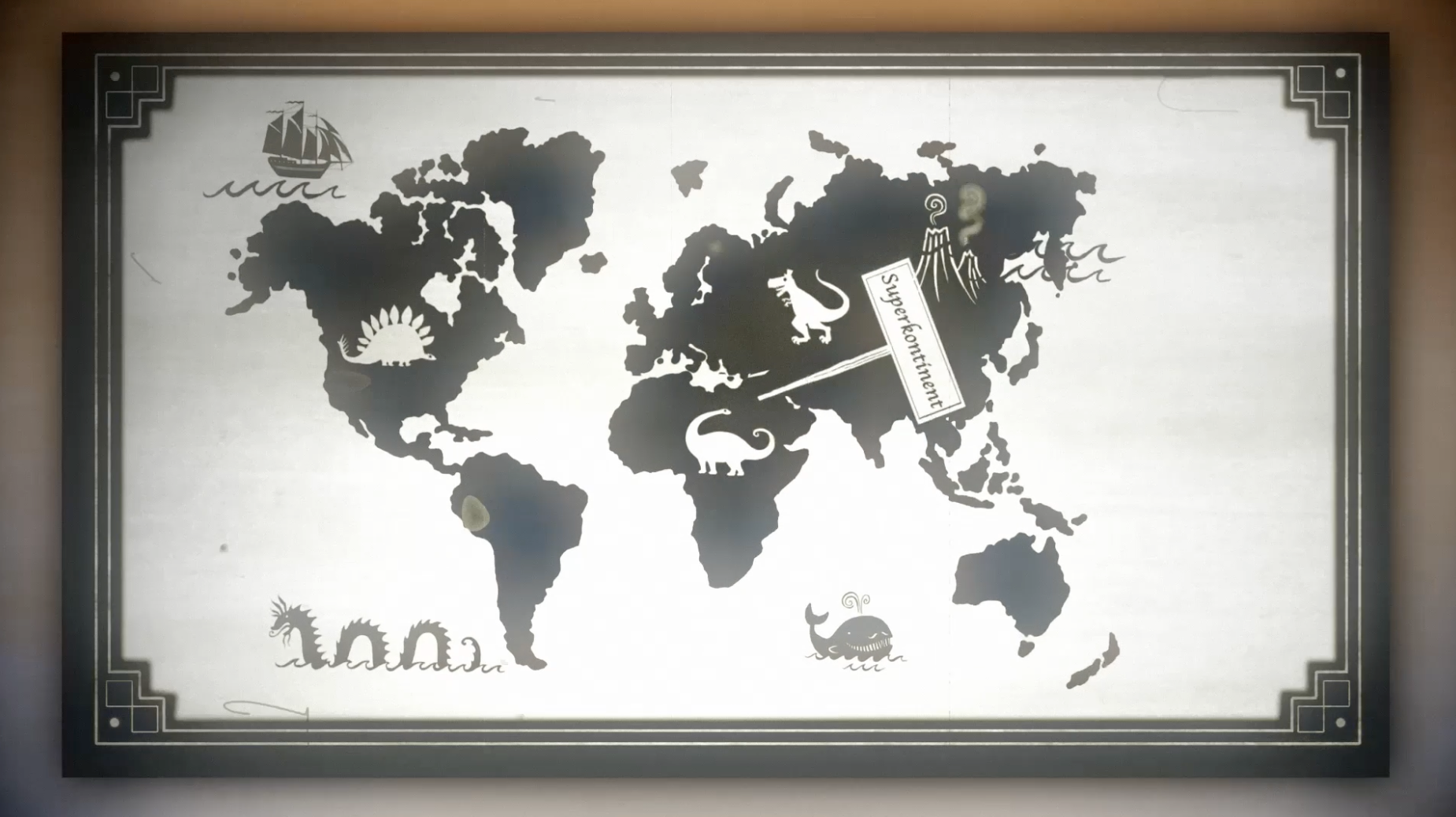
SAGEN AUS ÖSTERREICH
Logo Design, Title Design, End Credits, Animation, Insert Scenes
TV Series, ORF, Jewellabs Pictures, Marco Schleicher, Rudolf Schuppler, Starrring Katharina Straßer
Task: Make Austrian cultural history accessible to young audiences without flattening its mystery.
Method: Cultural-material translation through magic ink blot reveals logic, paper construction, narrative pacing, and visual curiosity. Blends historical folklore with a modern colorful and fun graphic identity.
Result: A title system that turned historical legends into an approachable youth-facing visual format. After the premiere, the series sparked major hype around Katharina Straßer. Episode 2 became ORF’s most-watched kids’ original that weekend.
50 DINGE DIE EIN HESSE
Design, Animation, Concept Storytelling
Animated Shorts, HR, Tim Brackmann, Magnus von Keil
Task: Turn regional identity into compact animated storytelling.
Method: Culture-to-short-form translation through humor, character, timing, and visual reduction.
Result: Award-winning animated short films turning regional knowledge into lovable broadcast pieces. Awarded for exceptional visual storytelling and original concept execution.
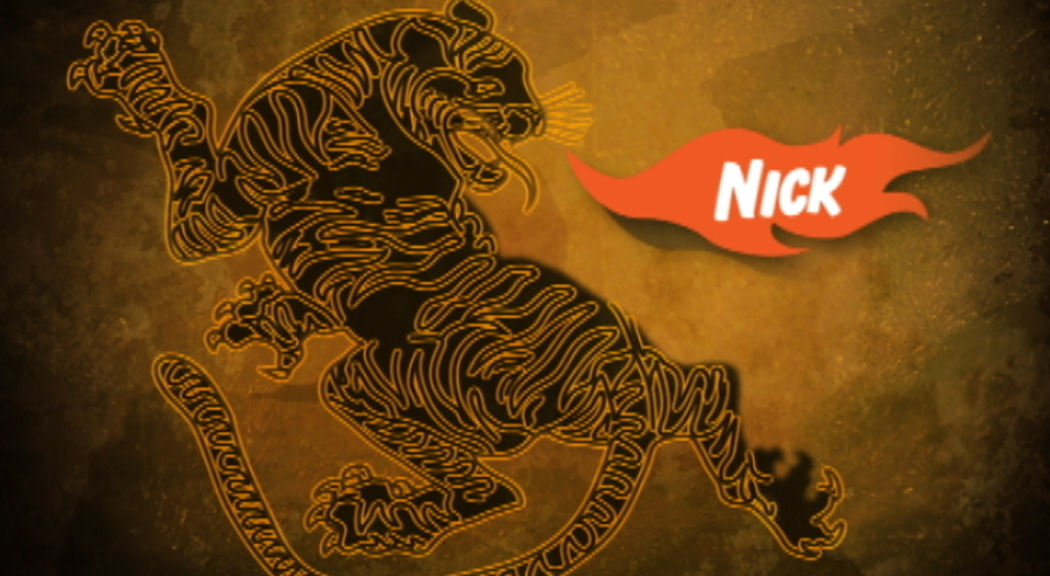
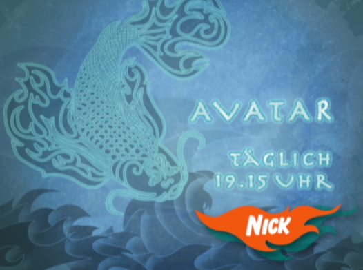
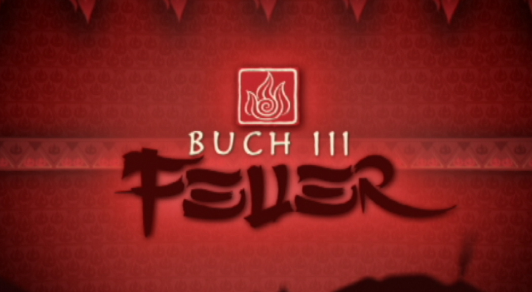
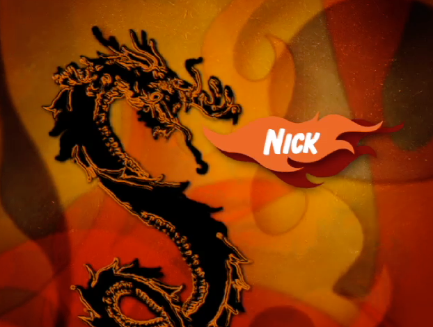
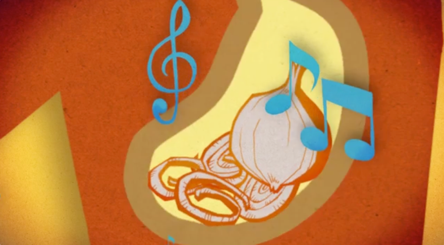
AVATAR – THE LAST AIRBENDER
Campaign Concept, Multiplatform Strategy, Design, Animation, Editing
TV Series Campaign, VO Joachim Kerzel, Nickelodeon, D/A/CH, 2006-2008
Task: Maintain world, tone, and narrative continuity across a multi-season youth franchise.
Method: World-to-campaign translation through teaser structure, pacing, continuity, and character of motion. Directed, designed, and managed the complete campaign, including the special teaser campaigns, which featured immersive design language and a visually stunning system to bring the world of Avatar to life. The elemental branding used throughout the series became a defining feature, with each teaser and trailer blending powerful visuals with a compelling narrative. I developed a stunning visual identity for the campaign, focusing on the elemental themes (Fire, Water, Earth) that mirrored the show’s soul. I created teaser materials for all seasons with a cinematic approach that built anticipation and drew in the audience through bold, cinematic storytelling. I oversaw the design execution, ensuring a cohesive visual experience that spanned multiple media platforms, increasing viewer engagement across TV and online.
Result: A full campaign system supporting all seasons through a coherent narrative and promotional rhythm. Created elemental motion branding for what became Nickelodeon Germany’s biggest franchise. The campaign was integral to the series becoming one of Nickelodeon Germany’s most successful animated series at the time and created a huge fan base in DACH.
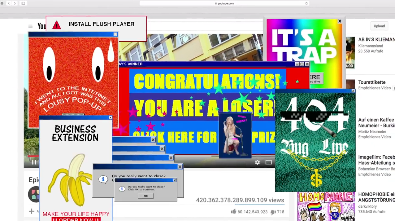
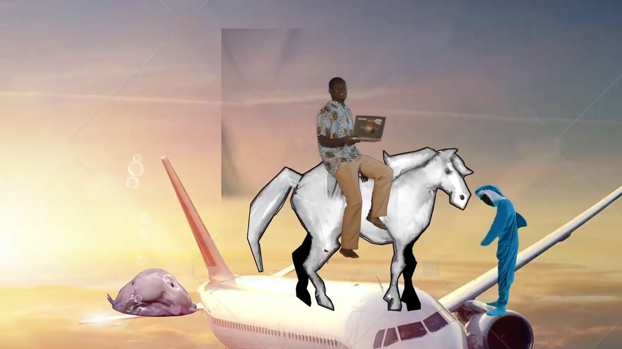
WHAT THE FU_K! Das Internet ist vorbei. Superviral.
Design, Animation
Launch Trailer, ARD, ZDF, FUNK! 2016
Dojo Fuckingyeah, Element E, David Aufdembrinkeamt
Task: Create animated launch visuals for FUNK’s youth-channel campaign, built around internet culture, meme logic, and the collapse of old broadcast behavior into platform-native chaos.
Method: Internet-to-campaign translation through meme overload, absurd visual collisions, browser clutter, emoji behavior, viral aesthetics, pop-up logic, digital trash, character absurdity, and fast-cut animation. The design turns the internet into a noisy living system: cute, aggressive, unstable, funny, grotesque, and overcoded at the same time.
Result: Animated campaign visuals for FUNK’s launch, framing the new ARD/ZDF youth offer as native to online culture rather than inherited TV language. The campaign was covered by Horizont as Dojo’s “Meme-Feuerwerk” for the ARD/ZDF youth broadcaster.
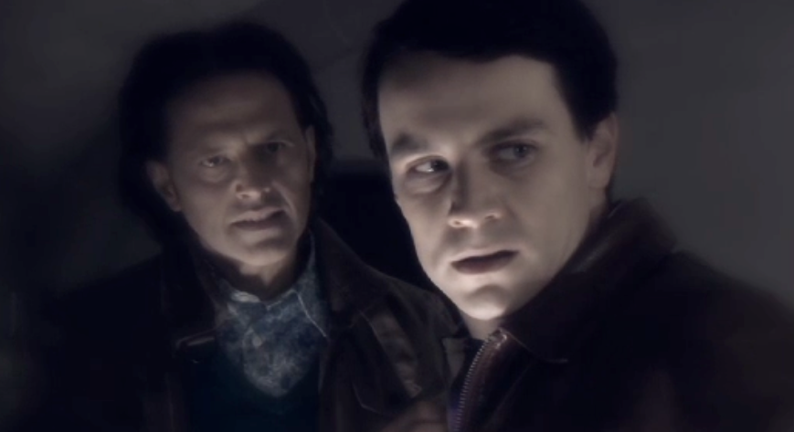
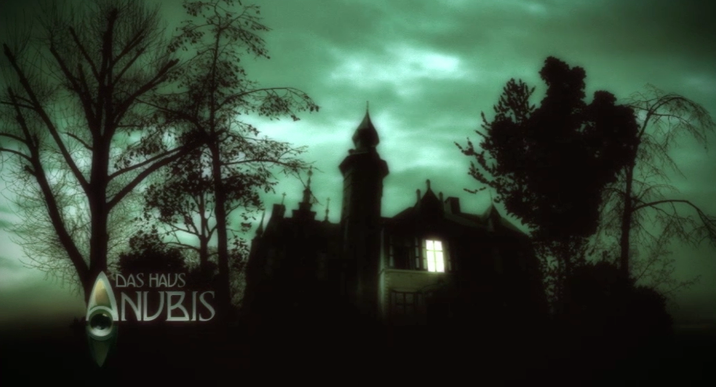
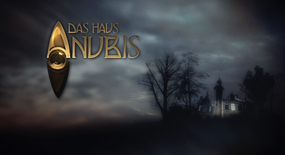
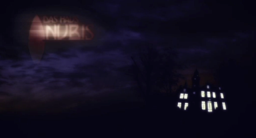
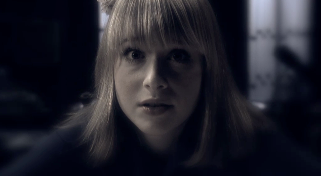
DAS HAUS ANUBIS
Concept Development, Multiplatform Strategy, Design, Animation, Editing, Trailer Script, Directing
TV Series Campaign, Nickelodeon, Nina Paysen, D/A/CH, 2009-2012
Starring Kristina Schmidt, Daniel Wilken, Marc Dumitru, Karim Günes, Florian Prokop, Franziska Alber, Alicia Endemann
Task: Build anticipation for a serial mystery format across broadcast communication.
Method: Narrative-to-campaign translation through suspense, rhythm disruption, staged reveal, and continuity. Designed and directed teasers and trailers for the entire series run. Created and executed the groundbreaking teaser and trailer campaigns, launching glitch signal interference teasers across three channels weeks before the premiere. This disrupted Nickelodeon programming, introduced the ghost house motif, and built intense viewer curiosity.
Result: A multi-phase campaign that turned on-air presence into part of the story arc. One of Nickelodeon Germany’s most disruptive and successful campaigns. The multi-phase campaign included cryptic teasers, full trailers, social media integration, and an online mystery game, leading to the series becoming Nickelodeon Germany’s most successful series launch with 380,000 viewers and a 22% youth market share.
Background: Das Haus Anubis is a mystery teen soap that premiered on Nickelodeon Germany in September 2009 . As Nick’s biggest ever local production at the time, it was a daily serialized drama about students uncovering secrets in a boarding school. Nickelodeon mounted an ambitious teaser and trailer campaign to build hype ahead of the launch, making Das Haus Anubis a breakthrough in German kids’ TV marketing. The show’s premiere drew Nick’s highest-ever early-evening ratings for a new series , reflecting the impact of its innovative promotional strategy.
Campaign Structure and Rollout
Nickelodeon Germany executed a multi-phase, 360° marketing campaign leading up to the show’s debut. In late summer 2009, mysterious teaser spots began airing on Nick, hinting at spooky happenings in “Haus Anubis” without fully revealing the show . These on-air teasers – directed by Nick’s in-house promo team – introduced the eerie boarding school setting and characters through cinematic visuals, setting a “Harry Potter”-like tone rather than a typical kids’ soap vibe . As the September 29 premiere approached, Nickelodeon rolled out full trailers showing the main plot (a new girl arriving and a classmate’s disappearance), escalating viewer curiosity. The network even leveraged sister channel VIVA to air trailers, reaching a broader teen audience. On premiere week, Nick aired daily promos to remind viewers, often pairing a new episode’s teaser with a rerun of the previous episode as lead-in . This structured drip-feed – from cryptic teasers to story-revealing trailers – successfully built anticipation over several weeks.
Innovative Elements of the Campaign
Nickelodeon’s campaign was groundbreaking in its multi-platform approach for a children’s series in 2009. Key innovative elements included:
• Social Media Integration: The show’s team partnered with SchülerVZ (a popular teen social network at the time) to create an official profile and interactive widget. Fans could add a Haus Anubis video gadget to their profile, which streamed teaser clips and later full episodes . This was an early use of social media for TV distribution – all episodes were made available online via an embedded player during the week of TV airing .
• Dedicated Web Hub: Nickelodeon launched dashausanubis.de as a richly interactive site for the show. The website served as a central campaign hub with character introductions, production diaries, quizzes, and exclusive “behind the scenes” content to deepen engagement . Crucially, it hosted streaming episodes (through Kyte player) and voting contests that tied into the broadcast. Within two weeks of launch, the site attracted about 100,000 visits and blog posts on the site were receiving hundreds of comments, signaling huge fan interest .
• Cross-Promotional Contests: The campaign extended to youth magazines and portals. Nickelodeon ran a “Scene of the Week” voting contest in collaboration with teen media like Mädchen.de, GoGirl, Wendy, and others. Each Friday, these partner sites would highlight a standout scene and drive readers to vote on the Haus Anubis website . This cross-media tie-in was novel for a kids’ show, merging TV and online fandom with traditional print/online teen outlets.
• Community Building: Anticipating a community craze, the network nurtured fan communities directly. The official SchülerVZ page (an “Edelprofil”) gathered thousands of fans even before the TV premiere, with kids posting messages “almost every minute” on its wall . The social team (run by agency Panorama3000) actively managed these communities – even recruiting fan moderators – to keep excitement high. This level of two-way engagement with a young audience was unprecedented for Nickelodeon at the time.
• Transmedia Storytelling: Beyond standard promos, Nick created an online mystery game tied to the show’s plot. By late 2009, the official Haus Anubis online game had over 35,000 registered players solving puzzles related to the show’s lore . This extended the narrative beyond TV and gave fans a hands-on way to participate in the mystery, blurring the line between marketing and entertainment.
Audience Reception and Fan Response
The teaser/trailer campaign for Das Haus Anubis generated massive buzz and record-breaking viewership. The show’s debut became Nickelodeon Germany’s most successful series launch ever in the 7PM slot . About 380,000 viewers tuned in daily during the first weeks, an unprecedented number for the channel, with youth market shares peaking above 22% . This means the series single-handedly won nearly a quarter of 8–15 year-old TV viewers at that hour – a testament to how well the marketing piqued kids’ interest. The audience kept growing, with ratings more than doubling (+100%) from the premiere as the season progressed .
Fan reception was equally enthusiastic online. Hype on social media soared: the official Haus Anubis group on SchülerVZ exploded in size – it “already exceed[ed] the member count of groups for established shows like GZSZ,” Germany’s longest-running soap . In other words, a Nickelodeon kids’ show outpaced a prime-time adult soap in fan-group size, illustrating how groundbreaking the youth engagement was. The show’s website saw page impressions jump 83% from October to November 2009, hitting 2.2 million page views per month . Fans flooded the site’s blog and forums to discuss clues and characters, showing a level of active participation rarely seen for a children’s program. Even in broader demos the show made a mark – the mystery storyline attracted some older teens and adults, giving Nick a boost in 14–49 ratings above its usual average . Industry observers noted that no children’s series had ever debuted with such multi-channel fanfare and payoff on German television.
Credible fan discussions at the time highlighted the novelty of the campaign. On forums, some older viewers were skeptical of a “mystery daily soap” for kids, but they remarked on the unusually intense promo push – for example, noticing trailers showing hazing rituals in the story (a new student forced to sleep in an attic) which were “pretty bold” content for a kids’ network . Meanwhile, tween fans on Nick’s own community boards were buzzing with excitement, sharing trailer Easter eggs and decoding secret symbols from the teasers. Many noted they hadn’t seen a kids’ show get this kind of thriller-style marketing before. The swift growth of fan groups and online commentary demonstrates that the target audience embraced the campaign’s immersive, interactive approach.
Industry Impact and Legacy
Das Haus Anubis’ teaser and trailer campaigns are remembered as a trailblazer for children’s TV marketing in several ways. First, the huge success validated Nickelodeon’s strategy of investing in local original content and multi-platform storytelling. Nickelodeon executives cited Das Haus Anubis’ “great start and positive resonance” as proof that high-concept daily content could pay off . The show’s popularity “surpassed all expectations,” holding its own against much bigger competitors in the time slot . This encouraged Nick to greenlight a quick Season 2 and continue with ambitious promotions. In the wake of Haus Anubis, the network launched similar daily teen series (like Hotel 13 in 2012) and continued to integrate TV narratives with online experiences – a formula now common in kids’ programming.
The campaign’s influence was also felt industry-wide. Transmedia marketing for youth content, which was relatively new in 2009, gained momentum after Das Haus Anubis. The series became a case study in how to engage young viewers on all fronts – TV, web, and social – to build a franchise. Its approach foreshadowed the now-standard practice of releasing supplemental web content and fostering online fandoms for TV shows. Moreover, the German adaptation’s success (boosted by the promotional campaign) fed into the decision to create an English-language House of Anubis for the UK/US markets soon after . Nickelodeon’s global team noted the German show’s strong performance as a reason to believe the concept could work internationally .
In summary, the teaser and trailer campaigns for Das Haus Anubis were groundbreaking due to their 360-degree execution, early adoption of social media and online video integration, and the unprecedented fan engagement they sparked. By cleverly structuring the campaign in stages and leveraging novel platforms, Nickelodeon Germany turned a new show into a full-fledged phenomenon. The result was not only top ratings and a devoted audience, but also a template for how to launch youth-oriented series in the digital age – a legacy still visible in kids’ TV promotions today.
Sources:
• Panorama3000 agency case study on Das Haus Anubis social media strategy .
• Nickelodeon/Viacom press release “Das Haus Anubis schreibt Erfolgsgeschichte” (Dec. 2009)
• DWDL.de news coverage of Nickelodeon launching the series (Aug. 2009) .
• Nickelodeon Germany 2010 press summary (MTV Networks Germany) – on success and renewal .
• Fan forum reactions (Massengeschmack/FKTV) discussing the trailers and concept .
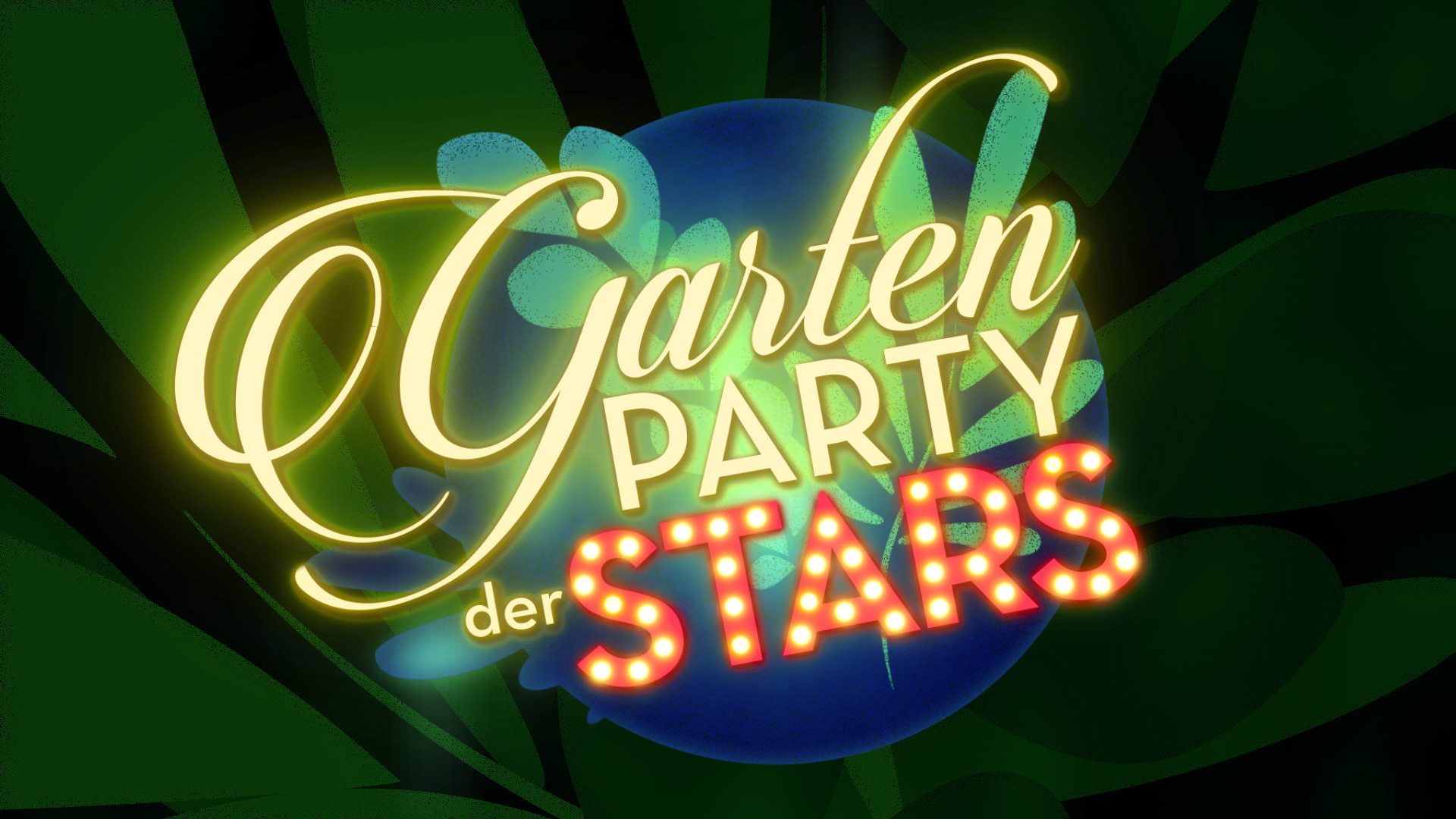
GARTENPARTY DER STARS
Illustration, Title Design, Stage Loops, Animation
Prime Time Show, ORF, 2021
Task: Give a live entertainment format a clear broadcast identity across opening and stage media, combining elegance, Schlager, and garden party atmosphere.
Method: Event-to-screen translation through logo design and behavior, and stage rhythm.
Result: A logo, opening, and stage-loop system giving the live show an elegant, joyful visual presence. This event was among the first live entertainment shows produced by ORF during the COVID-19 pandemic and attracted approximately 405,000 viewers, achieving a market share of 15%.
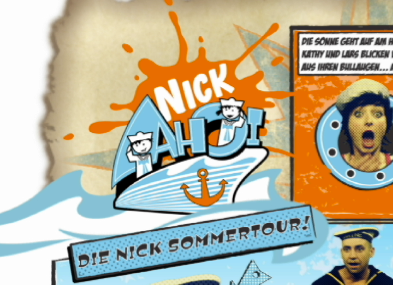
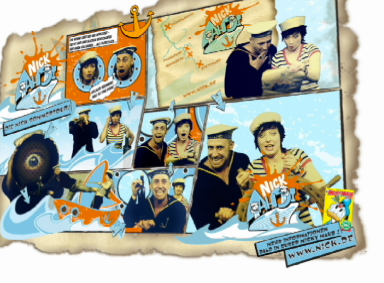
NICK AHOI!
Concept Development, Multidimensional Strategy, Script Writing, Identity Design, Directing, Editing, Motion Design, Animation
Starring Bürger Lars Dietrich, Katy Weber
Nickelodeon, D/A/CH, Hagen Biewer, Regina Farke, Susanne Hoffmann
Task: Create the on-air campaign language for Nickelodeon’s national summer tour built around an orange event ship, live children’s programming, and city stops across Germany.
Method: Designed and directed the on-air package for the eight-city tour from 16 July to 13 August 2006, using a hybrid visual system: real actors inside a cartoon-style treasure-map world, turning the tour logic into a navigational broadcast identity.
Result: A successful children’s event format giving kids across Germany free access to a Nickelodeon playground, star encounters, and an immersive branded ship environment. Continued beyond 2006: 7 harbors in 2007, 6 harbors in 2008. Up to 2000 kids entered the ship per station.
ROBOT CHICKEN
Trailer Design, Animation, Editing, Concept Storytelling
VIVA, Henry Förster, 2014
Task: Create a premiere trailer for Robot Chicken on VIVA.
Method: Show-to-promo translation through yellow-press newspaper logic, tabloid layout, cutout imagery, loud typography, fast montage, and trash-TV exaggeration.
Result: A trailer that framed the premiere as a sensational tabloid event, turning the show’s absurd pop-culture humor into a fun fake yellow-press news world.
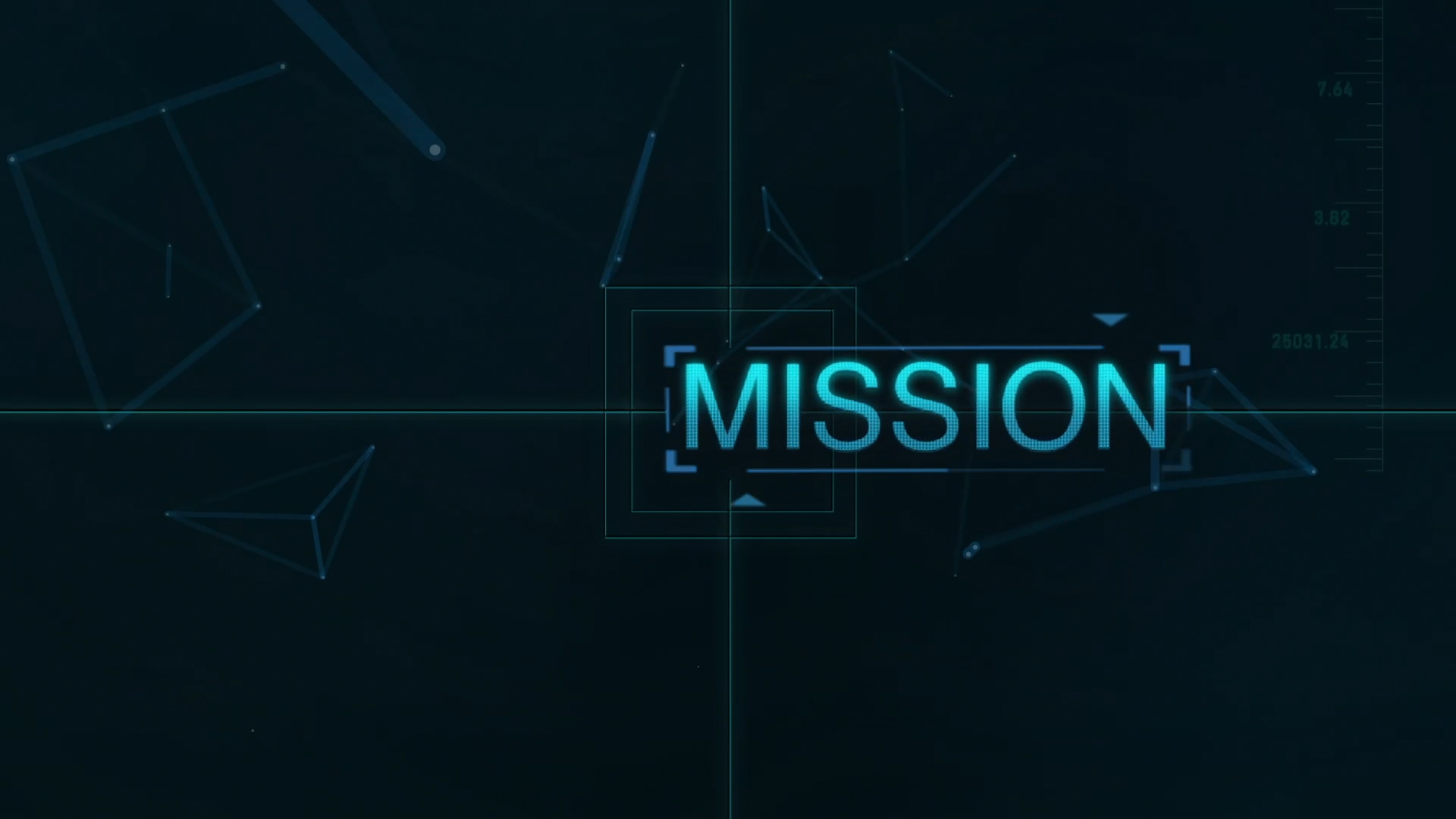
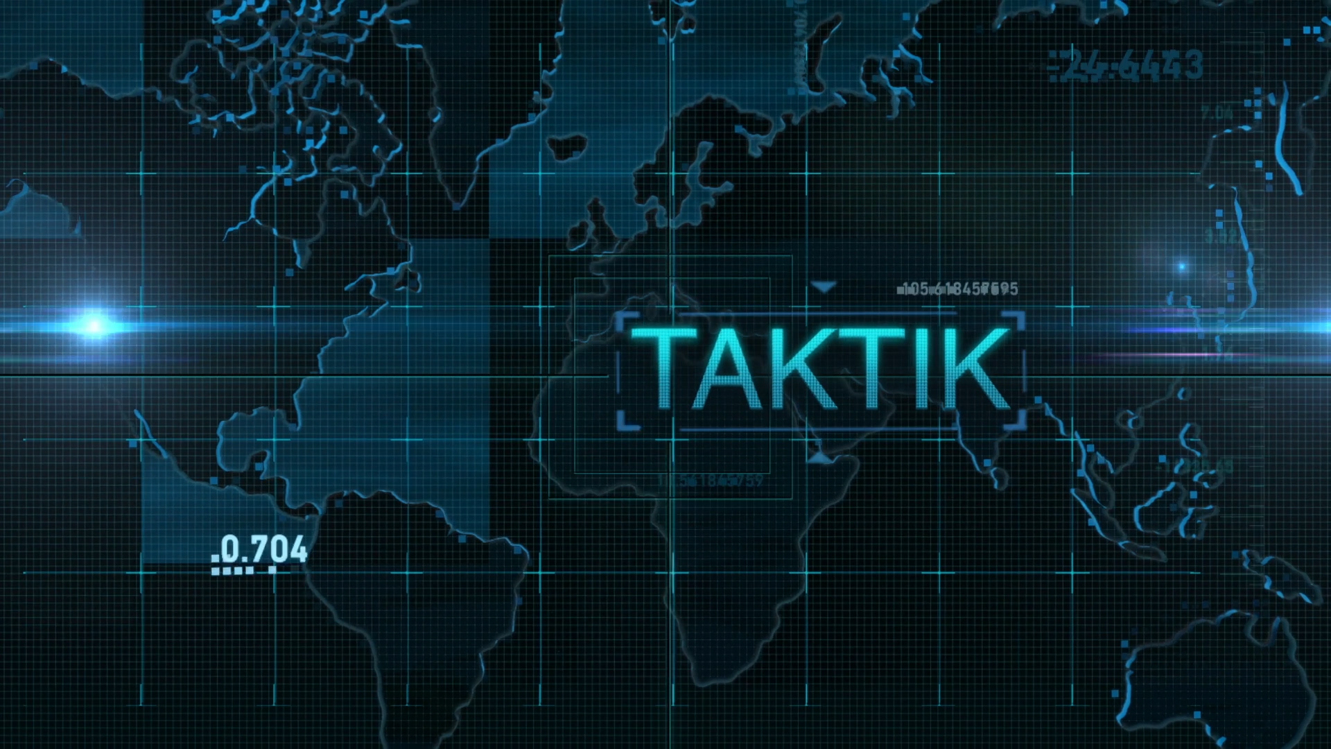
TOM CLANCEY'S GHOST RECON
Trailer Concept, Illustration, Title Design, Animation, Editing
Pro7 Games, Aeria, Games, OM Studios, Ian Otto, Falk Prahl
Task: Create a game trailer that translates the tactical-agent world of Ghost Recon into a compact cinematic sequence.
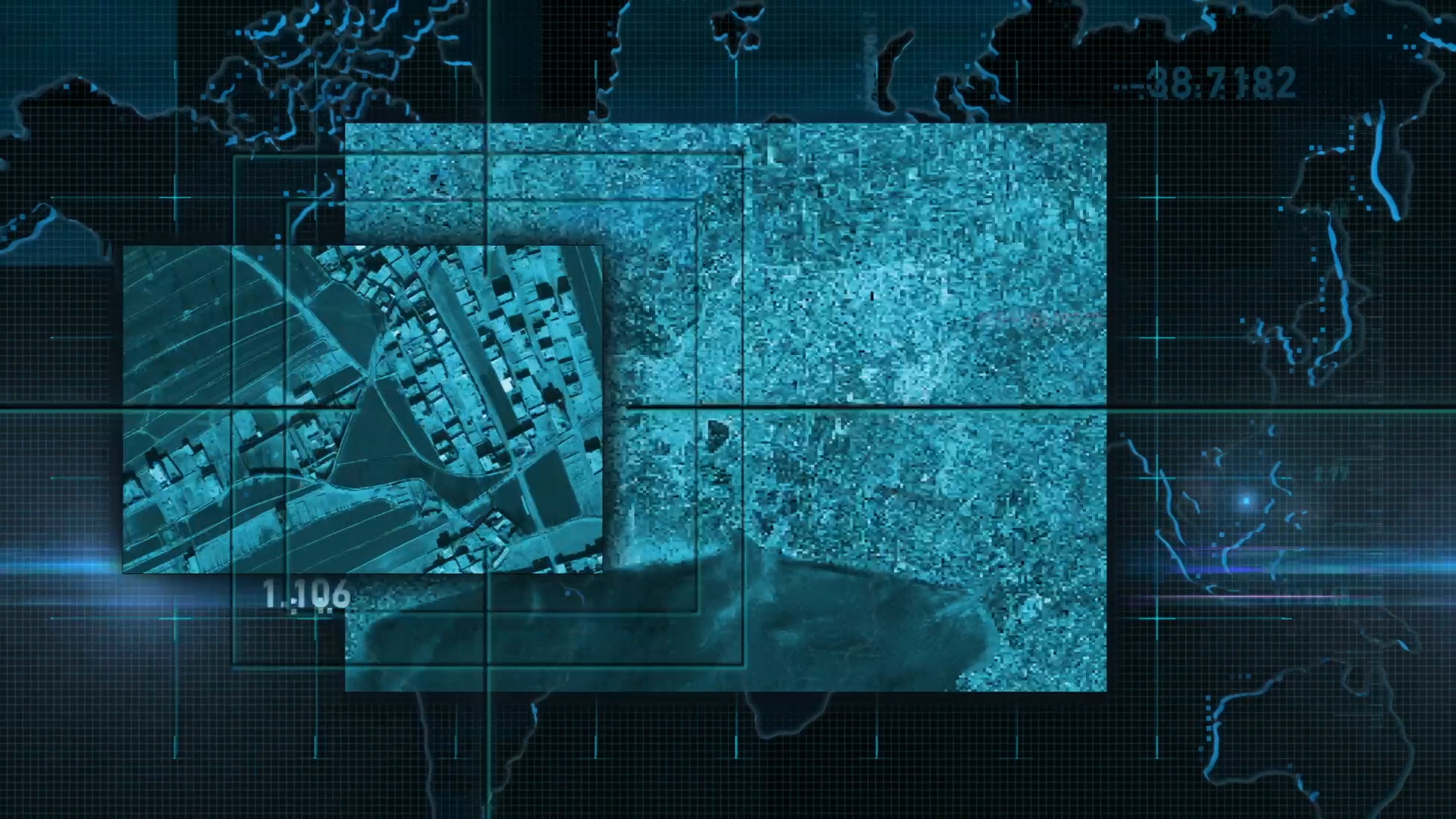
Method: Game-to-trailer translation through digital surveillance interfaces, area search, map logic, mission typography, agent assembly, signal graphics, and thriller pacing.
Result: An animated trailer system that frames the game through reconnaissance, tactical coordination, mission build-up, and high-tech military suspense.
For more information about Carolin Vedder, Design Futures, Multisensory Design, and Sensory Branding, please visit: